Spotify HYPE+
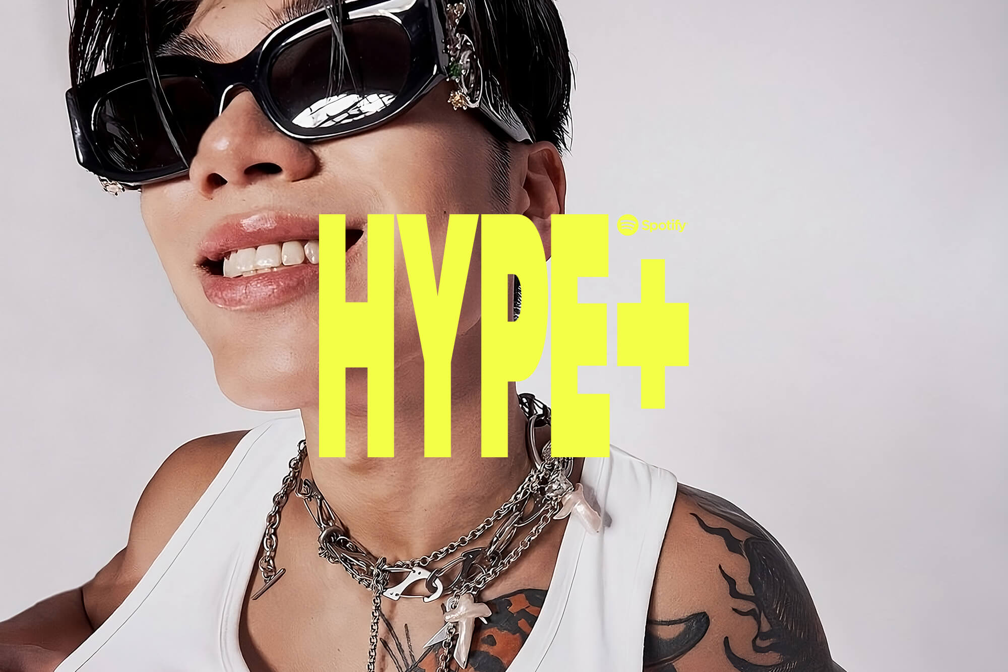
Visual identity for HYPE+, Spotify’s editorial curation of the Hong Kong rappers making waves in the dense hip-hop scene.




Project Information
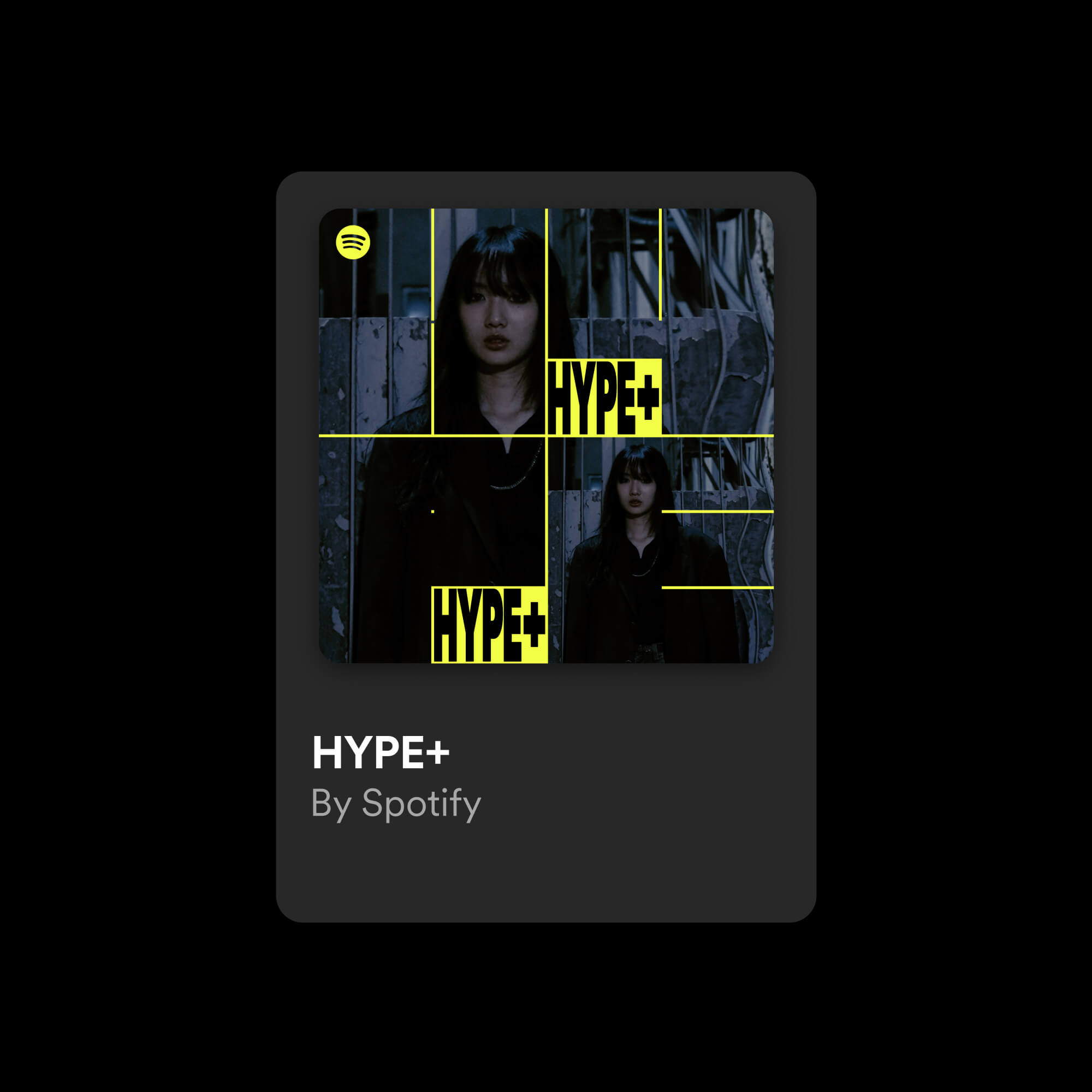
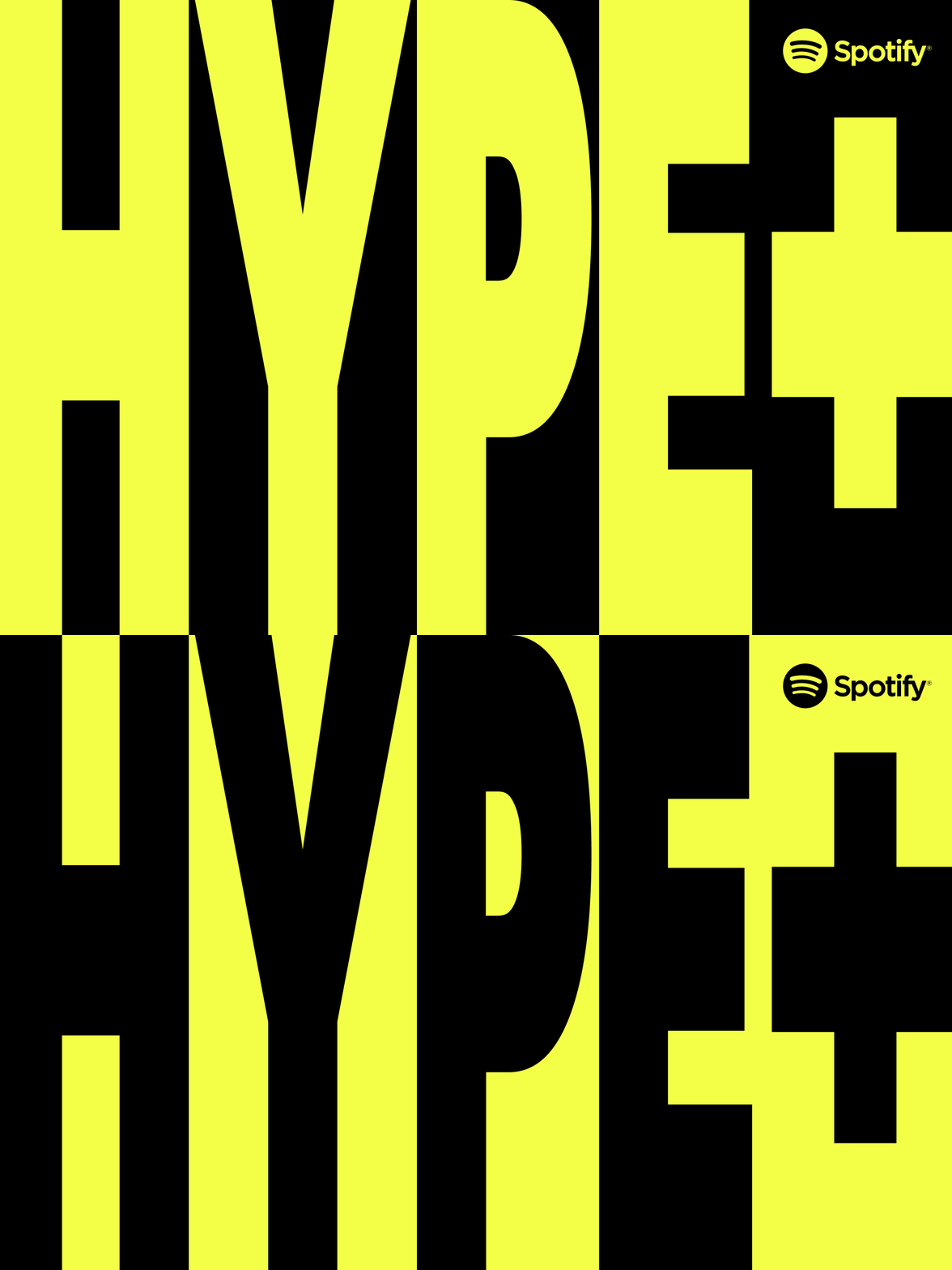
For HYPE+, an editorial playlist dedicated to showcasing emerging hip-hop artists and rappers in Hong Kong, Spotify commissioned the creation of a visual identity. This identity is crafted with a brand strategy tailored specifically for the editorial platform, ensuring resonance with the local target audience. True to its name, the playlist features the most buzzed-about artists in a city of over 8 million people. Drawing inspiration from Hong Kong and the creative process, the concept centers around a unique grid reflecting the meticulously planned effort people put into their dreams to stand out in this crowded urban environment. Within this framework, the letters “HYPE+” are presented abstractly as a framing device, allowing artists to be showcased in various ways and ensuring they receive the recognition they deserve. This strategic approach enables artists to creatively appear in multiple spaces within the grid, mirroring how they make waves in the music scene.
Credits
Made in collaboration with Studio Herrström.
Spotify
Car Chan
Eve Tan
Marta Vargas
Michelle Pham
Loren Lee
