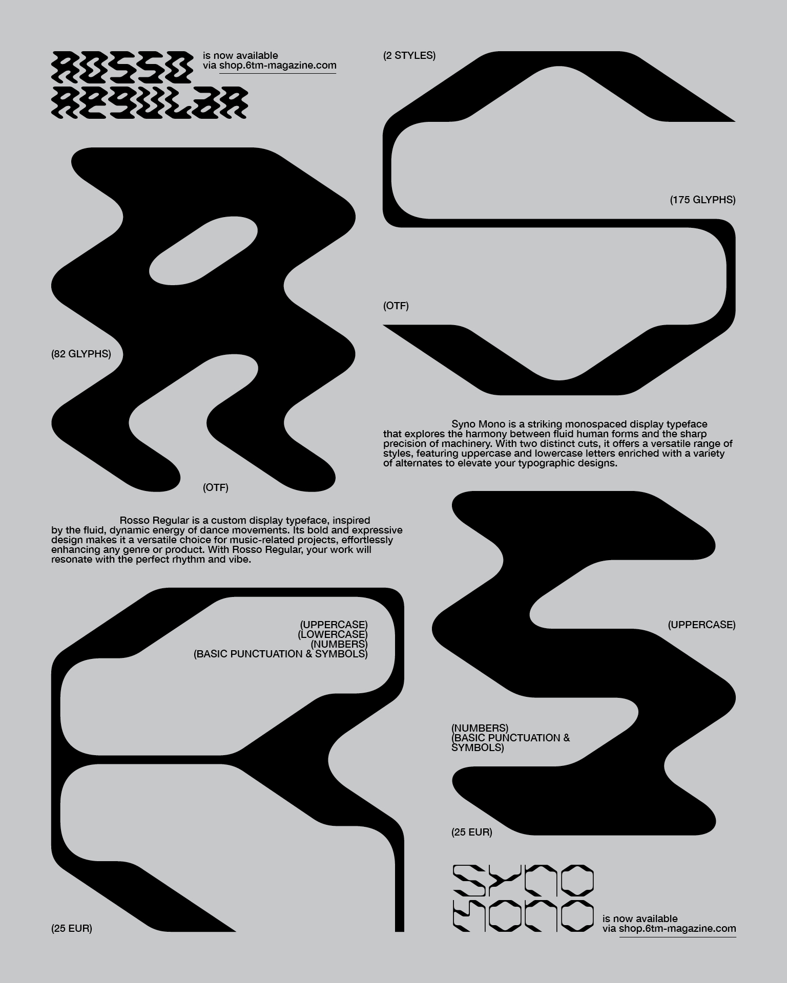
Rosso Regular and Syno Mono, are now available via 6TM Magazine.
![]()
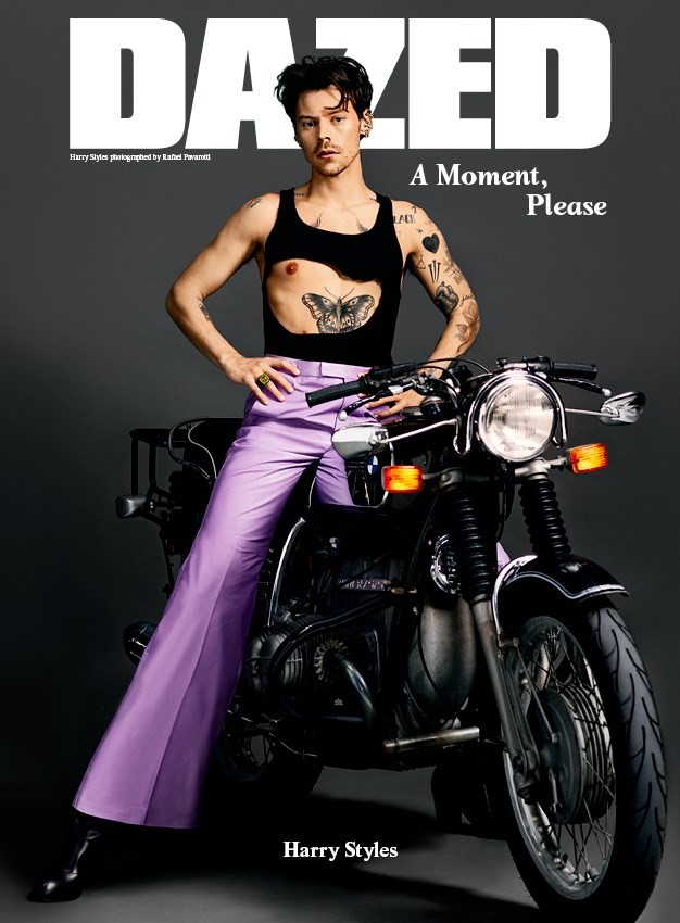
The custom typeface, UNKNOWN, was used across multiple editorial spreads in the Dazed magazine issue 274.
![]()
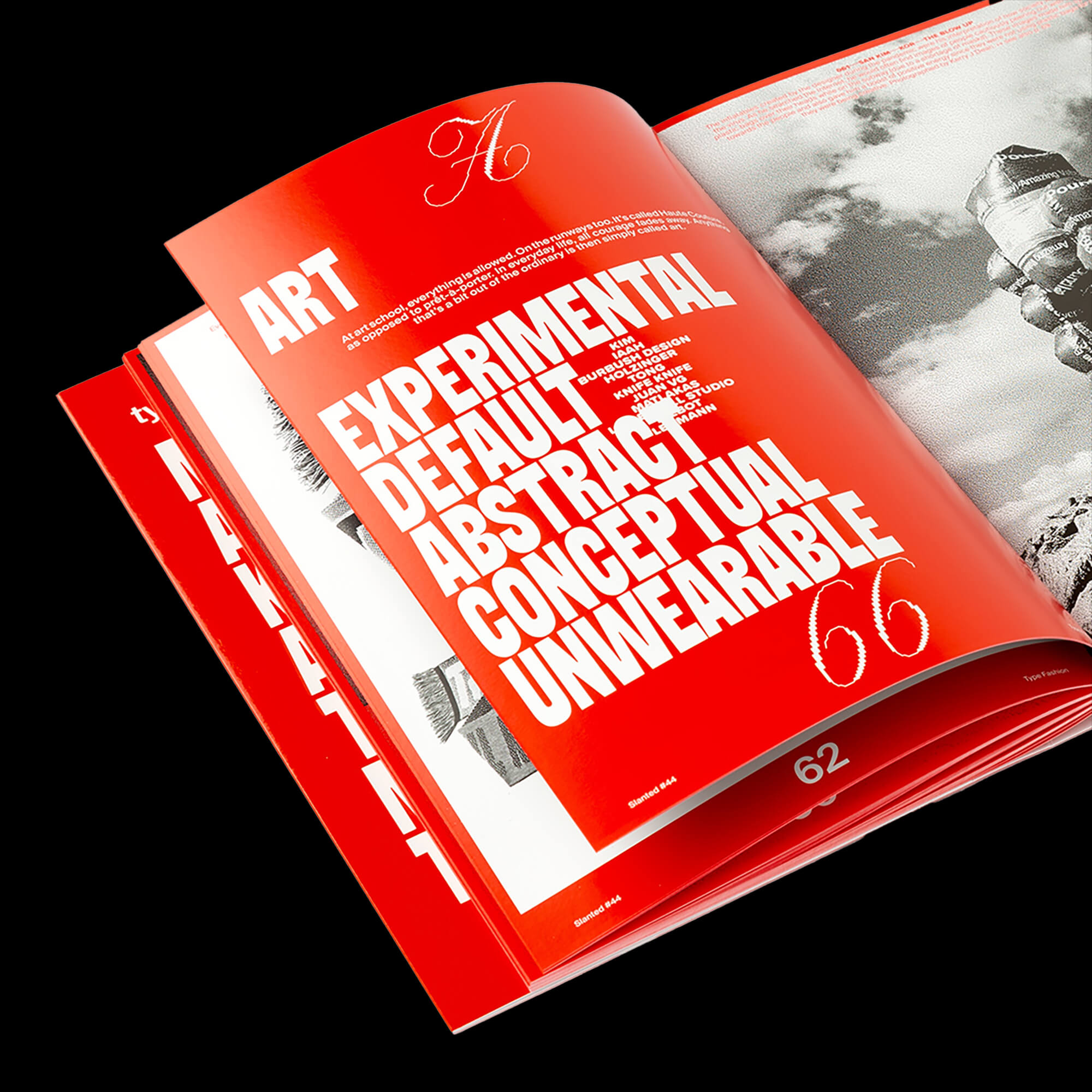
365 Days of TAU is featured in the latest issue of Slanted, showcasing outstanding projects at the intersection of typography and fashion.
![]()
Part of the exhibition New Aesthetic in Paris.
![]()
“3D scans and surrealistic sceneries converted into limited trading cards.” Read more about the Spektrum 4 project for TAU on Slanted.
![]()
The branding for BAN BAB won Bronze twice at the CCA Venus Awards in the categories of Corporate Branding and Art Direction.
![]()
“Working for the music industry gives artistic freedom and space for unconventional design solutions across different fields of media.” Read more in the interview with People of Print.
![]()
“Unknown is a typeface that reminds us to revisit our old notebooks.” Read more about it on It’s Nice That.
![]()
The project Spektrum 4 for TAU won Bronze at the CCA Venus Awards in the category of Art Direction.
![]()
“Spektrum - a record label pulls out all the stops.” Read more about it on Grafikmagazin.
![]()
Lukas Haider is a jury member of The CCA Venus Awards, Austria’s most prestigious creative award. It annually recognizes the best ideas in the communications industry for the Austrian marketplace and spotlights both their creators and clients.
![]()
“Branding is like a song that resonates deeply.” Discussing music and design with Erik Herrström and Lukas Haider on The Brand Identity.
![]()
The custom typeface Unknown was featured in the printed publication New Aesthetic, which collects the best of experimental and independent type design.
![]()
“Today we’re showcasing a hypnotic design that brings whimsical vibes to the site. “ Read more about TAU Spektrum 3 on Mindsparkle Mag.
![]()
“Oh Vienna! Not just the birthplace of action art, but also the home of Lukas Haider, whose beautiful poster designs had us browsing round his superbly designed site for many glorious moments.” Read more about the poster series done for the Adana Twins on It’s Nice That.
![]()
The creation process of Unknown was captured in this interview with Collide24, a platform highlighting the power of collaboration.
![]()
The custom typeface, UNKNOWN, was used across multiple editorial spreads in the Dazed magazine issue 274.
365 Days of TAU is featured in the latest issue of Slanted, showcasing outstanding projects at the intersection of typography and fashion.
Part of the exhibition New Aesthetic in Paris.

“3D scans and surrealistic sceneries converted into limited trading cards.” Read more about the Spektrum 4 project for TAU on Slanted.

The branding for BAN BAB won Bronze twice at the CCA Venus Awards in the categories of Corporate Branding and Art Direction.

“Working for the music industry gives artistic freedom and space for unconventional design solutions across different fields of media.” Read more in the interview with People of Print.
“Unknown is a typeface that reminds us to revisit our old notebooks.” Read more about it on It’s Nice That.

The project Spektrum 4 for TAU won Bronze at the CCA Venus Awards in the category of Art Direction.

“Spektrum - a record label pulls out all the stops.” Read more about it on Grafikmagazin.

Lukas Haider is a jury member of The CCA Venus Awards, Austria’s most prestigious creative award. It annually recognizes the best ideas in the communications industry for the Austrian marketplace and spotlights both their creators and clients.
“Branding is like a song that resonates deeply.” Discussing music and design with Erik Herrström and Lukas Haider on The Brand Identity.

The custom typeface Unknown was featured in the printed publication New Aesthetic, which collects the best of experimental and independent type design.

“Today we’re showcasing a hypnotic design that brings whimsical vibes to the site. “ Read more about TAU Spektrum 3 on Mindsparkle Mag.

“Oh Vienna! Not just the birthplace of action art, but also the home of Lukas Haider, whose beautiful poster designs had us browsing round his superbly designed site for many glorious moments.” Read more about the poster series done for the Adana Twins on It’s Nice That.

The creation process of Unknown was captured in this interview with Collide24, a platform highlighting the power of collaboration.

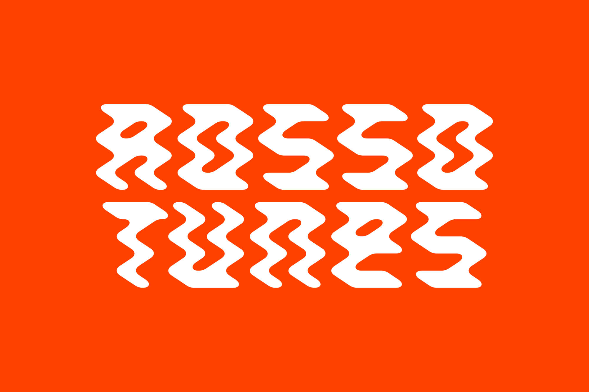
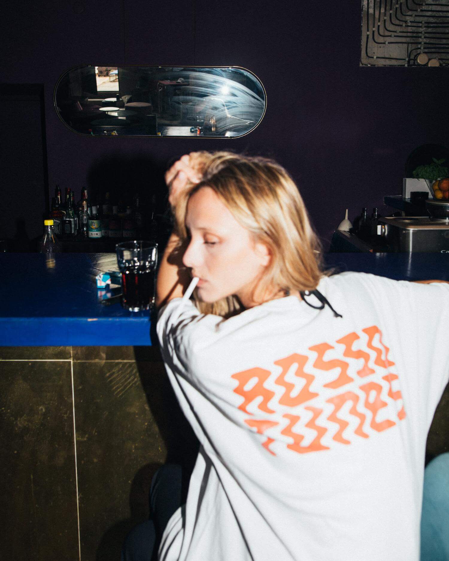
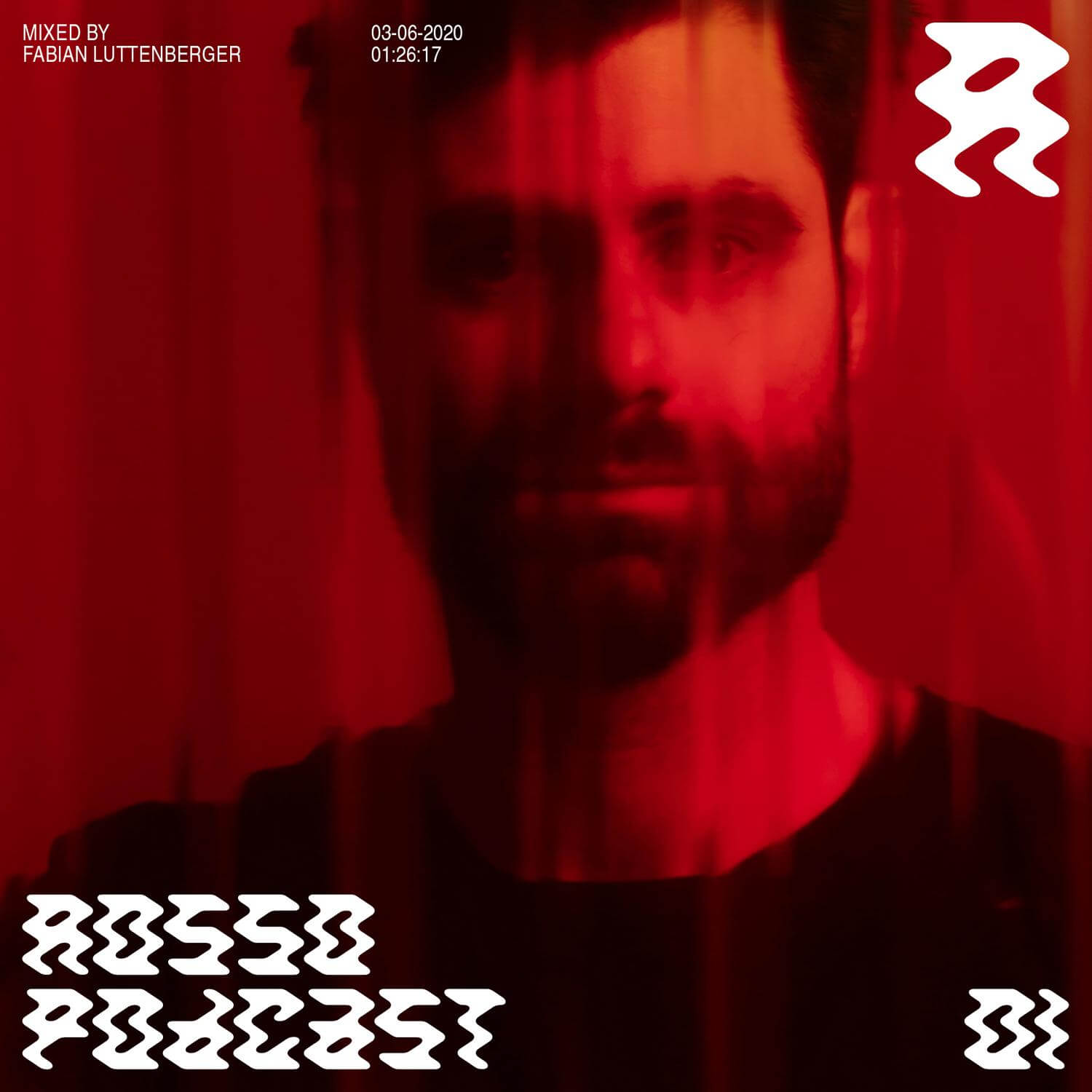
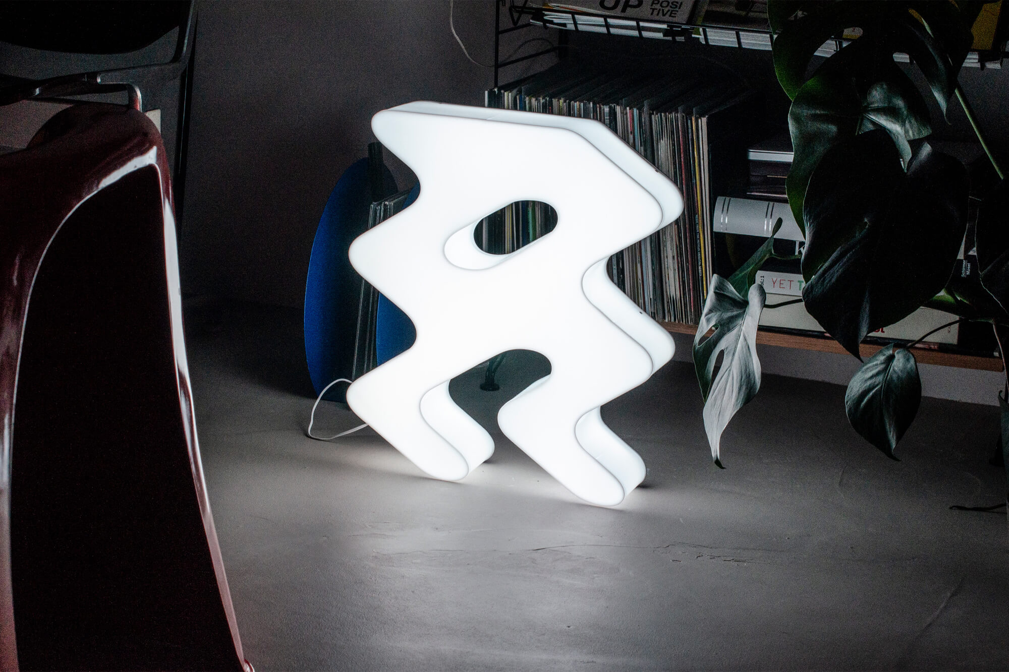
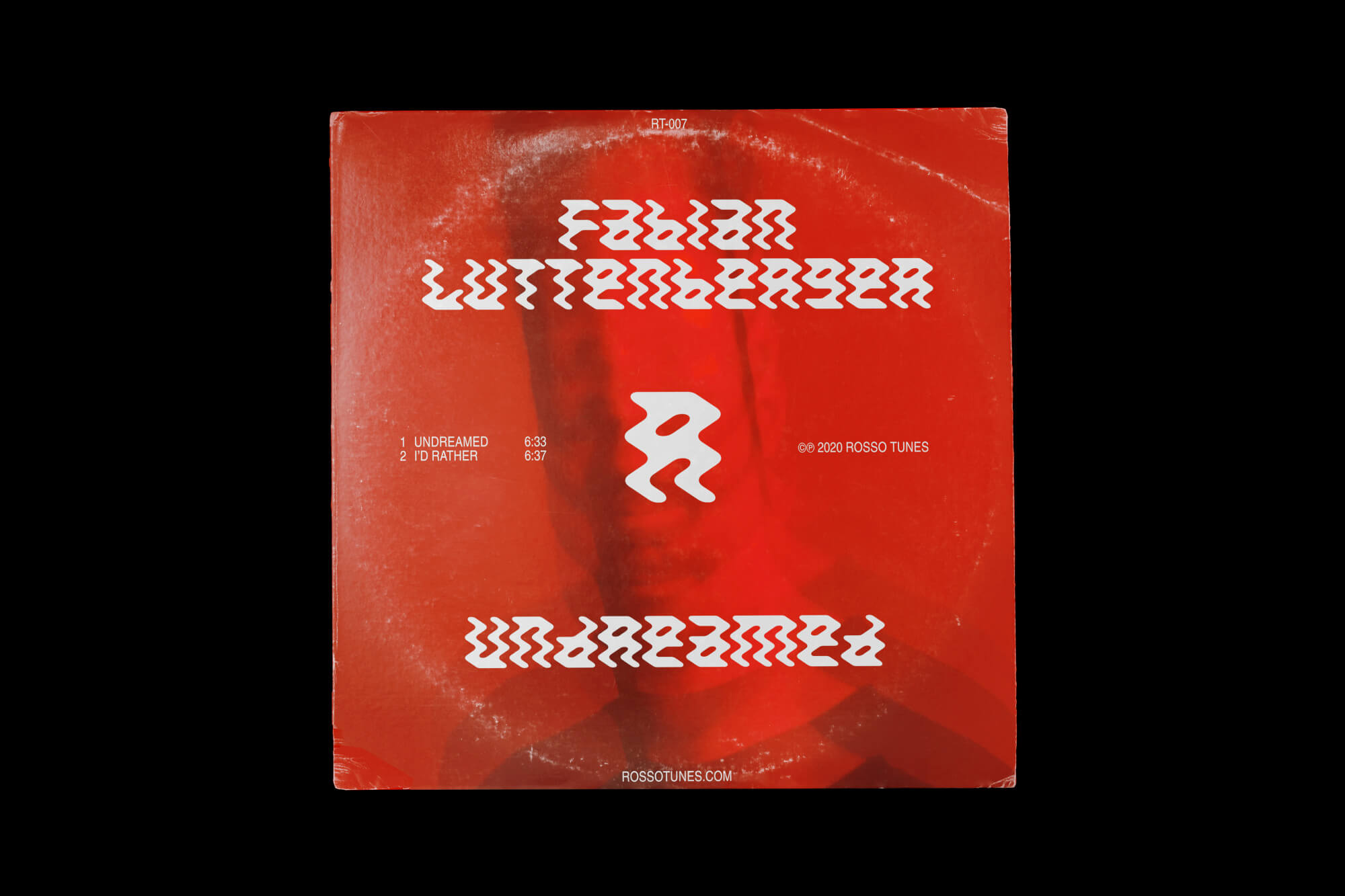
Rosso Tunes
A dynamic identity built around a custom typeface, inspired by energetic dancefloor movements, capturing the energy and passion that the record label brings to its music and events.


Project information
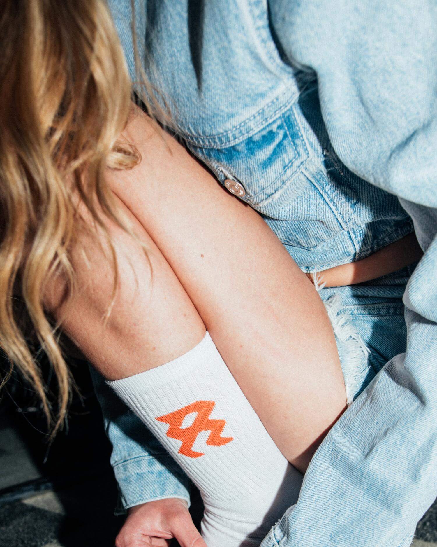
Rosso Tunes is a record label that releases music in the genres of house and techno. Additionally, DJs from all over the world are invited to be part of the regular podcast series. A special collection of inspiring mixtapes can also be found on Spotify, curated by friends of the label. Derived from the Italian word “Rosso”, Lukas Haider created a branding centered around a solid, vivid red color scheme. A custom-designed typeface, inspired by the dynamic movements of dancers on the floor, was created to capture the energy and passion that Rosso Tunes brings to its music, parties, and overall vision. With these two main elements, a consistent system was created and implemented across digital and physical assets, including covers, T-shirts, tote bags, socks, scarves, and LED signs — essentially everything to interact with the community.
Credits
Photography by Mario Ilic.