Spotify HYPE+
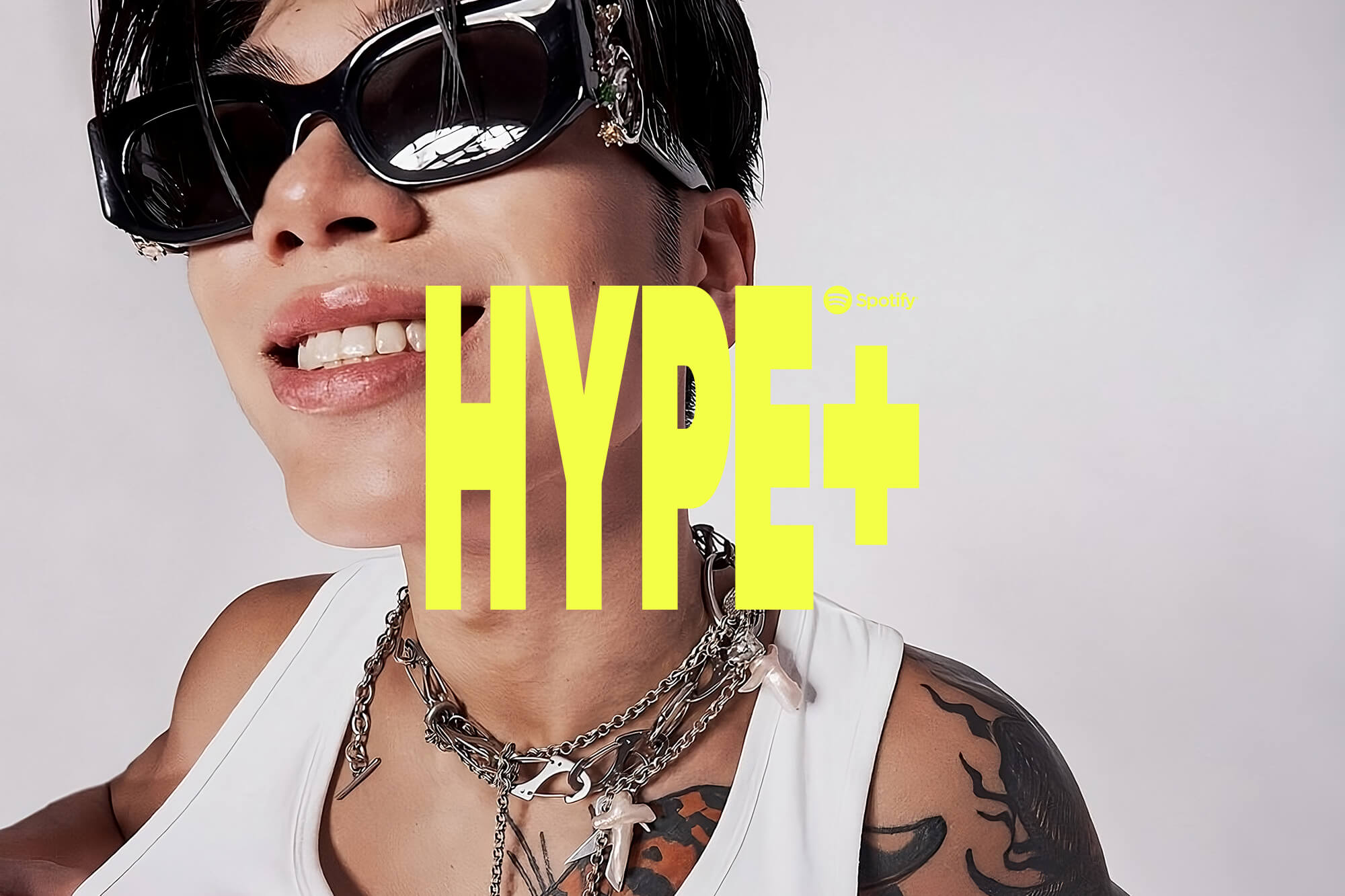
Visual identity for HYPE+, Spotify’s editorial curation of the Hong Kong rappers making waves in the dense hip-hop scene.




Project Information
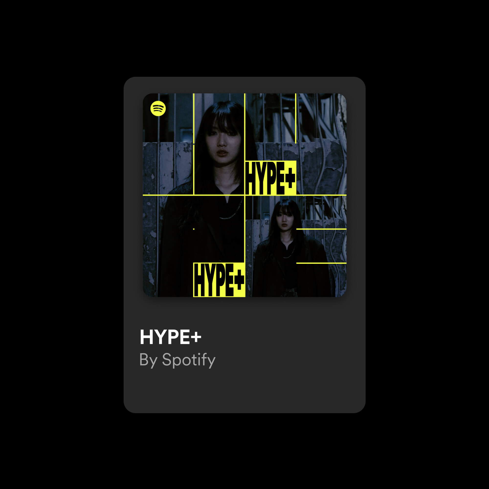
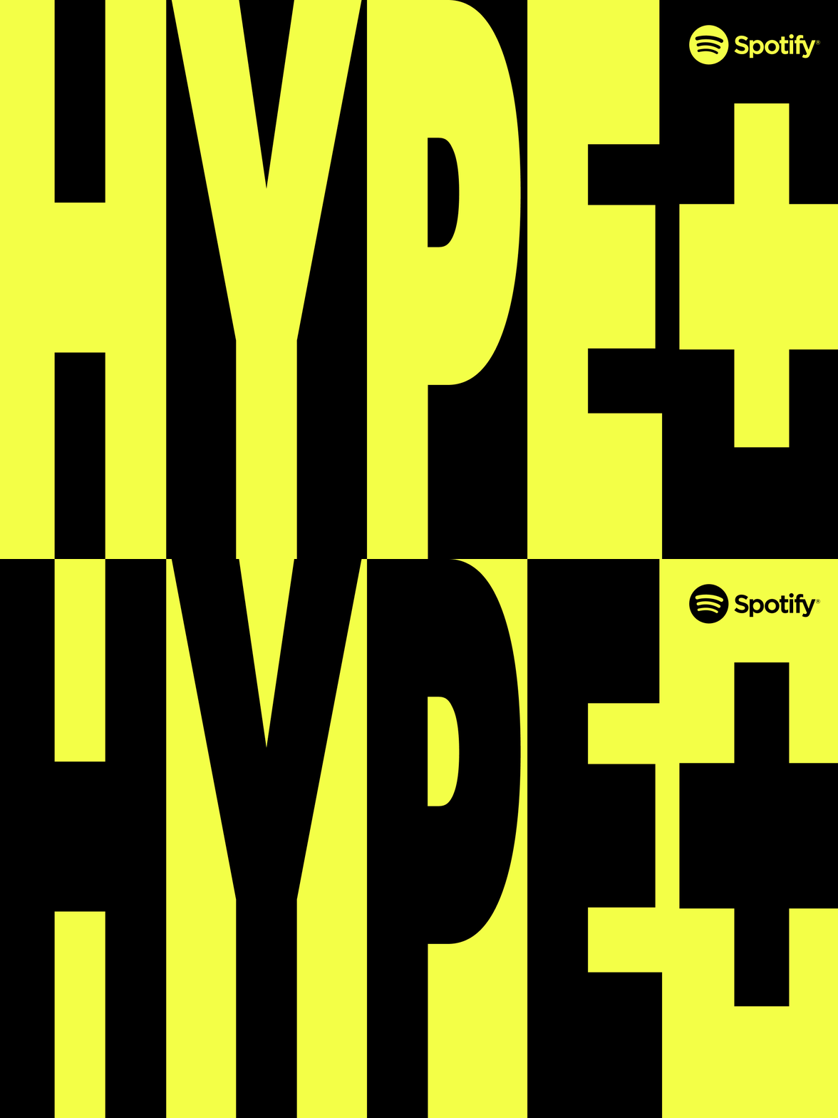
For HYPE+, an editorial playlist dedicated to showcasing emerging hip-hop artists and rappers in Hong Kong, Spotify commissioned the creation of a visual identity. This identity is crafted with a brand strategy tailored specifically for the editorial platform, ensuring resonance with the local target audience. True to its name, the playlist features the most buzzed-about artists in a city of over 8 million people. Drawing inspiration from Hong Kong and the creative process, the concept centers around a unique grid reflecting the meticulously planned effort people put into their dreams to stand out in this crowded urban environment. Within this framework, the letters “HYPE+” are presented abstractly as a framing device, allowing artists to be showcased in various ways and ensuring they receive the recognition they deserve. This strategic approach enables artists to creatively appear in multiple spaces within the grid, mirroring how they make waves in the music scene.
Credits
Made in collaboration with Studio Herrström.
Spotify
Car Chan
Eve Tan
Marta Vargas
Michelle Pham
Loren Lee
Stage
With competition at its core, the platform of Stage is focused on how we can discover the next generation of stars in music.


Project Information
Stage focuses on discovering the next generation of stars. Combining the best aspects of The Voice and TikTok, Stage’s unique round-by-round competition format allows aspiring artists to showcase their talents and gain visibility among supportive fans and audiences, all within one app. At the core of Stage’s branding is a carefully crafted design system centered around a symbol with multiple meanings. It represents an elimination tournament bracket while also serving as a play button and an abstract equalizer, creating a bold visual element that captures the essence of the platform. The Stage coin symbol was also designed, acting as a reward for winning competitions in the app. From the coin symbol, a pattern was developed that references the career paths of evolving artists. These two symbols, in combination with the career-path pattern, create a dynamic design system that works across all touchpoints of the brand and product.
Credits
Made in collaboration with Studio Herrström.
TAU Palo Santo
An unconventional music release transporting you away from the stresses of today’s world and into a place of transcendence.



Project Information
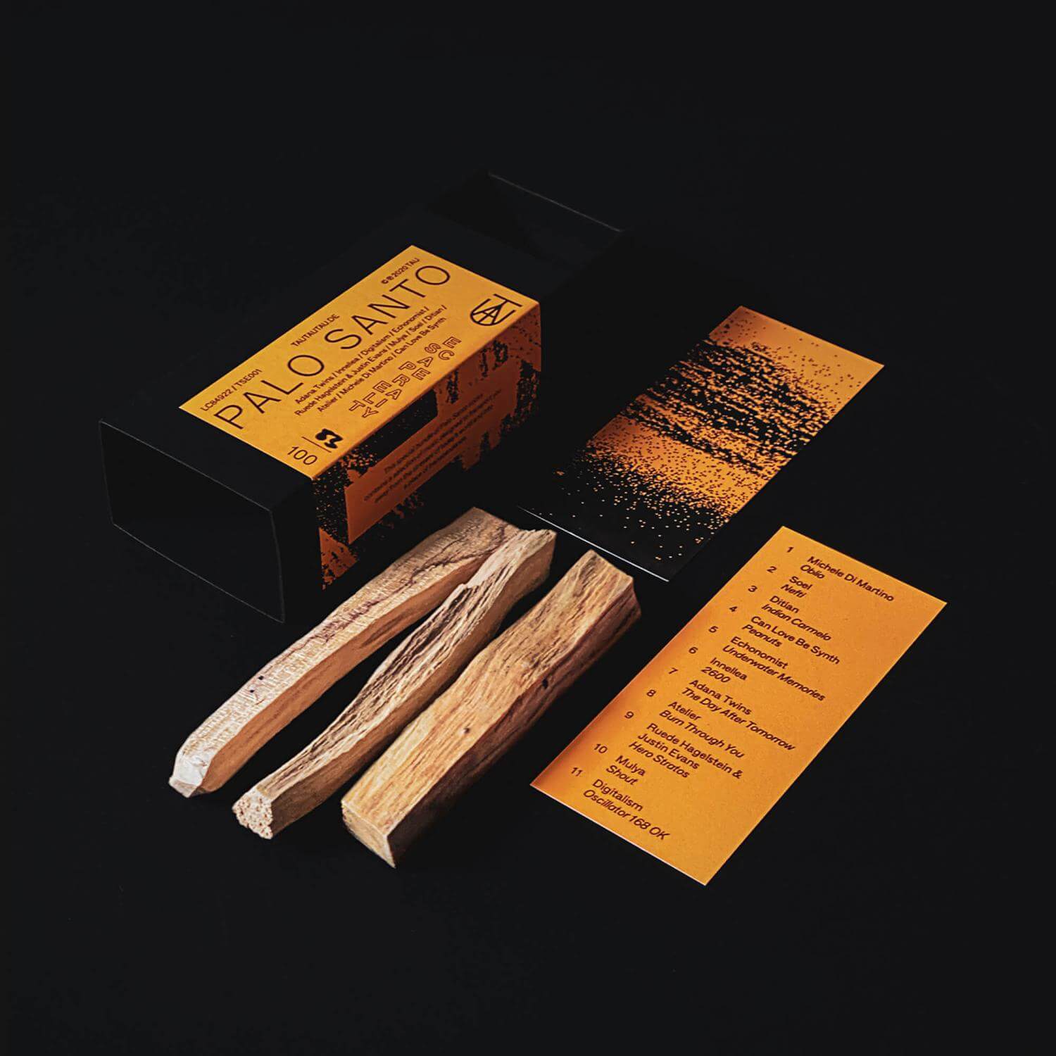
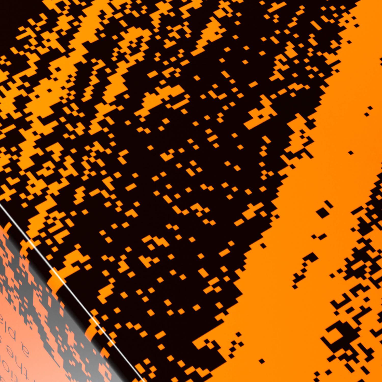
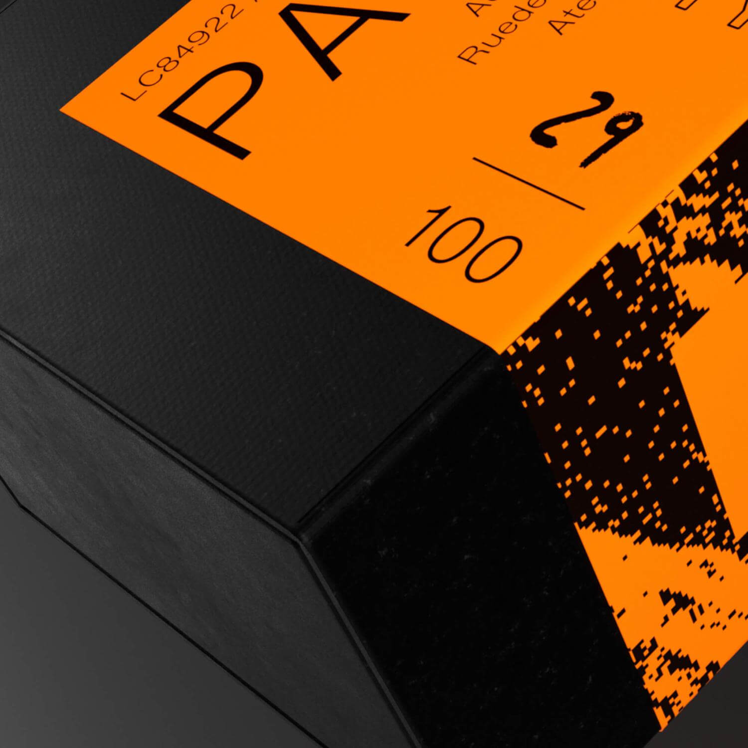
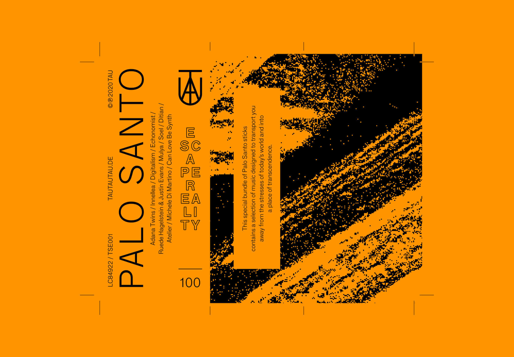
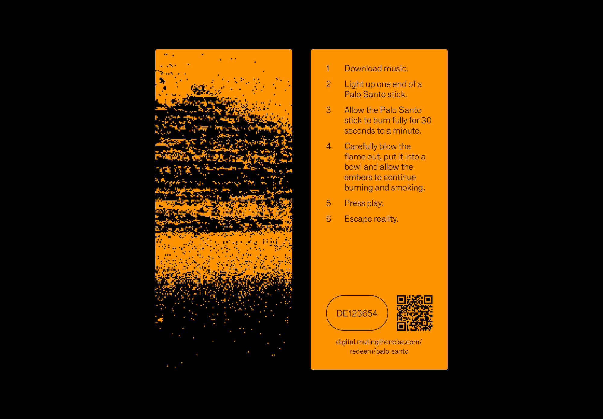
“Palo Santo” is a special release from the record label TAU, founded by the famous German DJ duo Adana Twins. This limited edition box contains a curated selection of music designed to transport you away from the stresses of today’s world and into a realm of transcendence. Palo Santo, meaning “Holy Wood”, is a revered scented stick obtained from the wood of the sacred South American tree. It is used in ceremonies and by spiritually-conscious individuals to clear negative energy from spaces and create a peaceful atmosphere. Within this compilation, you’ll discover ambient and calming productions that complement the soothing aroma of the wonderful Palo Santo sticks. So, light one up, kick back, and drift away into the ether. To promote this release, Lukas Haider has developed a complete visual identity, which is based on a neon orange color scheme, a custom pattern inspired by scanned Palo Santo sticks, various animated 3D product visualizations, the actual packaging design, and numerous animated social media assets.
Credits
3D by Computer Vincent.
Miyavi Roxy
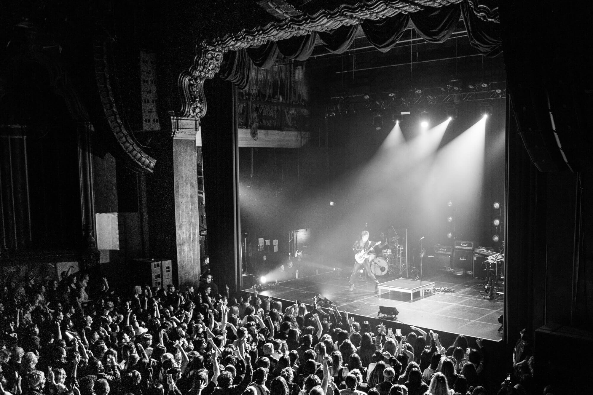
A holistic release journey for the Japanese guitarist and singer-songwriter MIYAVI, promoting his show at the famous Roxy Theatre in West Hollywood, as well as his single “Broken Fantasy”.



Project information
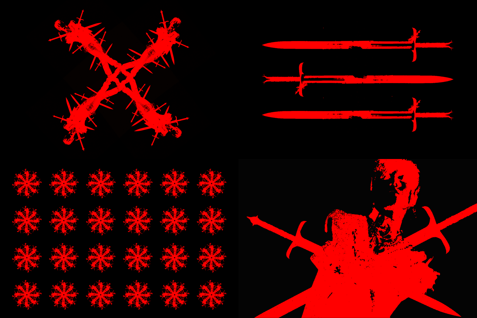
The task was to create a holistic release journey across various touchpoints with his fanbase to promote the upcoming single, “Broken Fantasy” by the Japanese guitarist and singer-songwriter MIYAVI. Together with LA-based photographer Evers, a dark and bloody art direction was developed to provide a contrast during the festive season when the release plan began. Mysteriously appealing teasers, combined with sharp typography (Vengeance Serif) paying homage to the samurai guitarist, led to hints and an invite-only secret release show called “Tragedy Of Us” at the famous Roxy Theatre in West Hollywood. Elements from the teaser were incorporated as live visuals during the actual show. Various merchandise pieces translated the created identity into physical space, leading up to the design of the digital single cover.
Credits
Made in collaboration with Studio Herrström.
Management by Richard Frias.
Photography/Art Direction by Evers.
Event Photography by Ana Wigmore.
Rosso Tunes
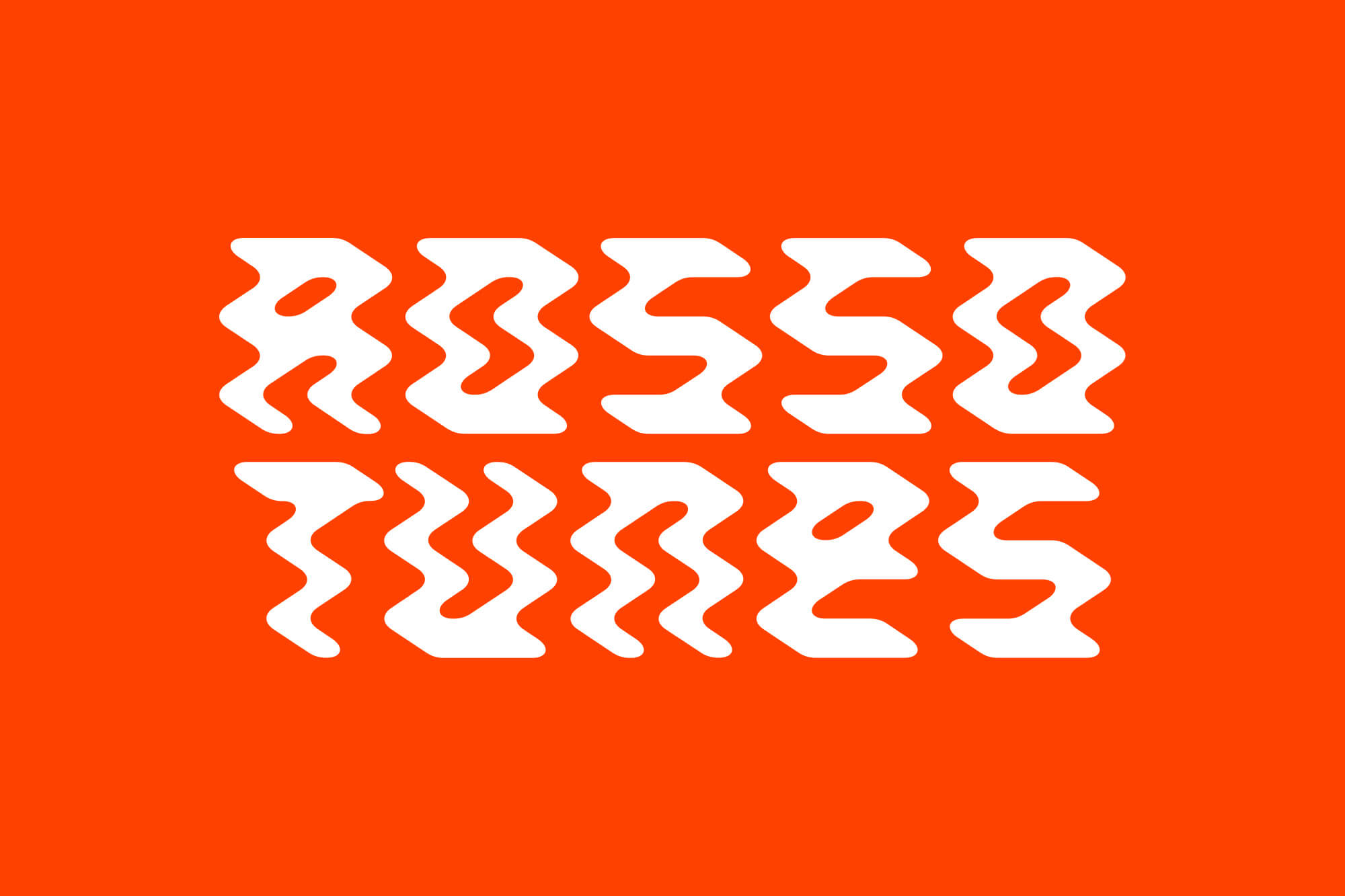
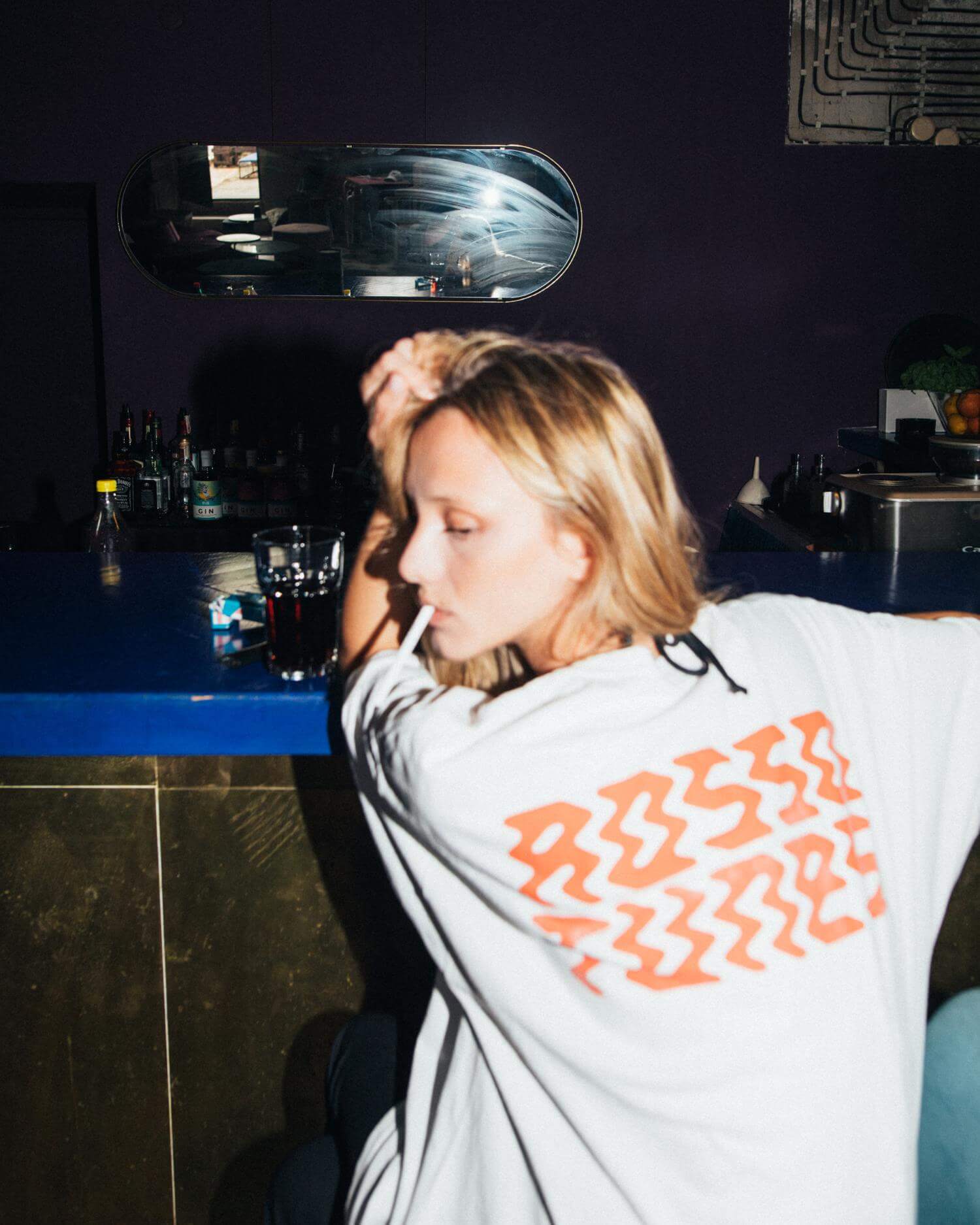
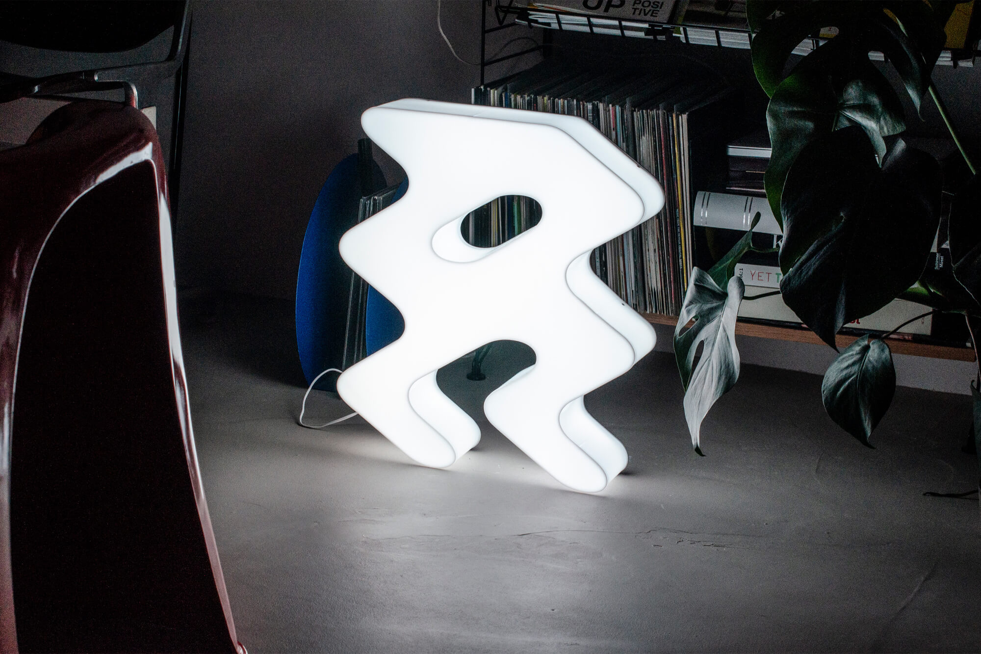
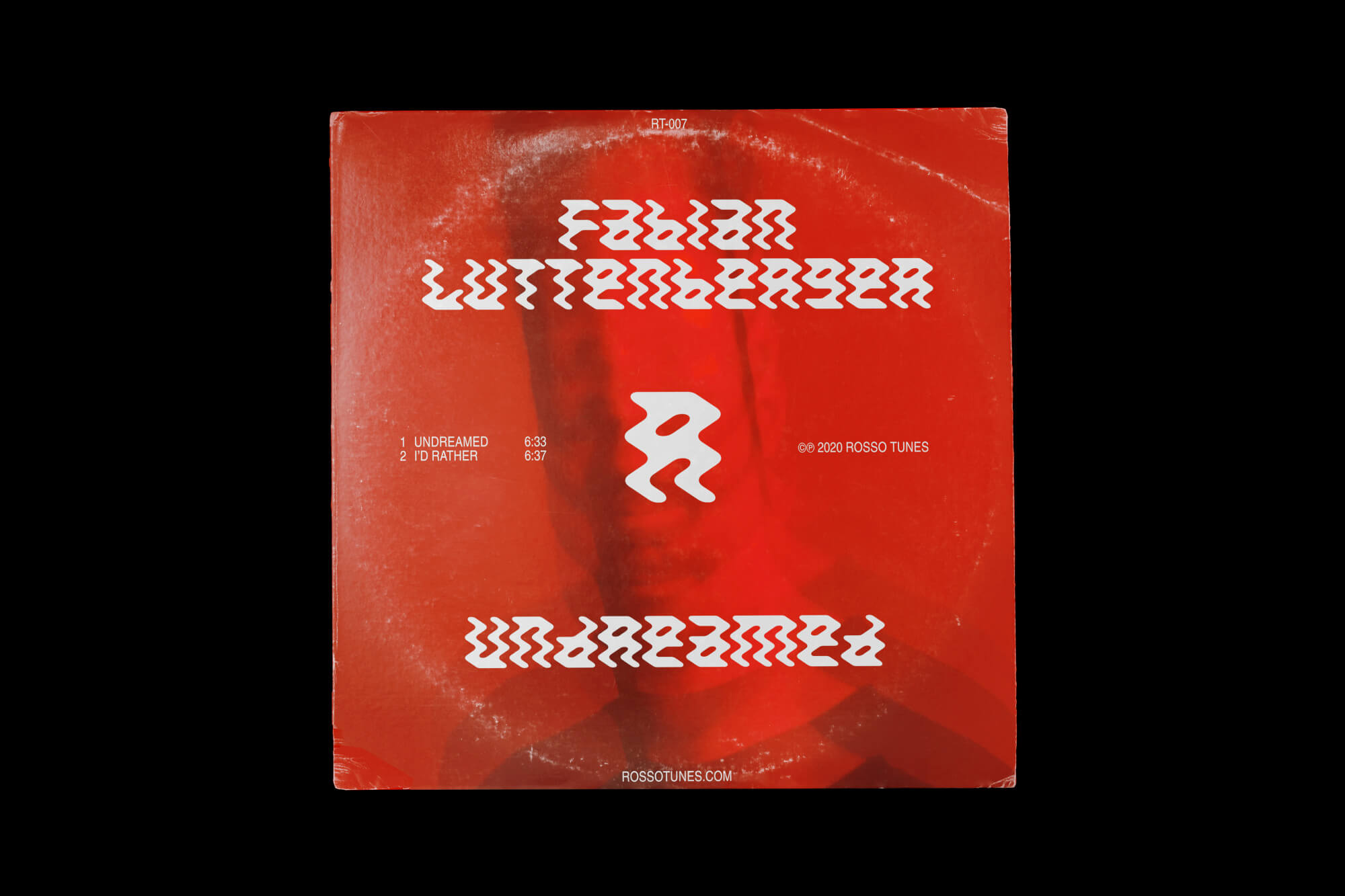
A dynamic identity built around a custom typeface, inspired by energetic dancefloor movements, capturing the energy and passion that the record label brings to its music and events.









Project information
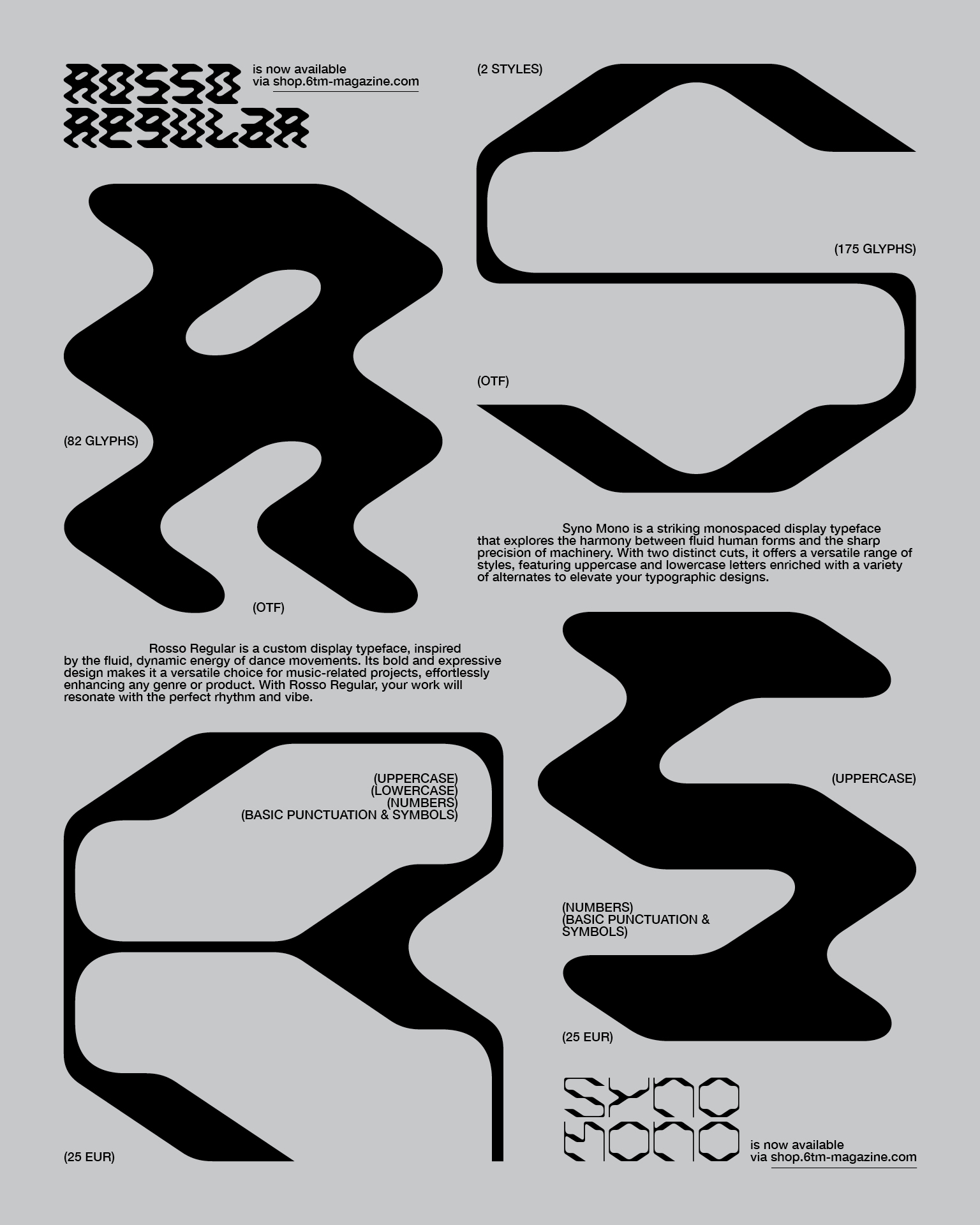
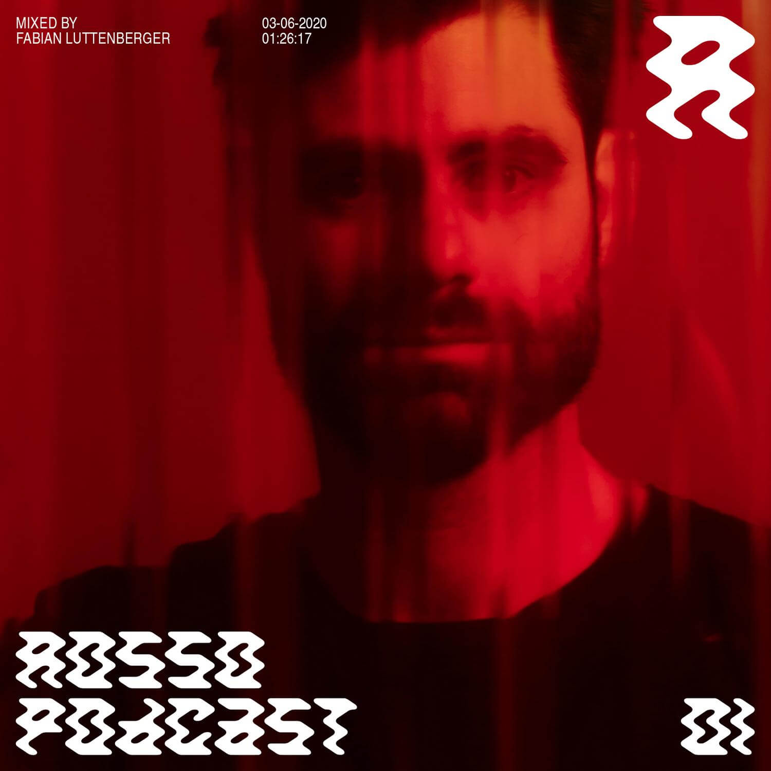
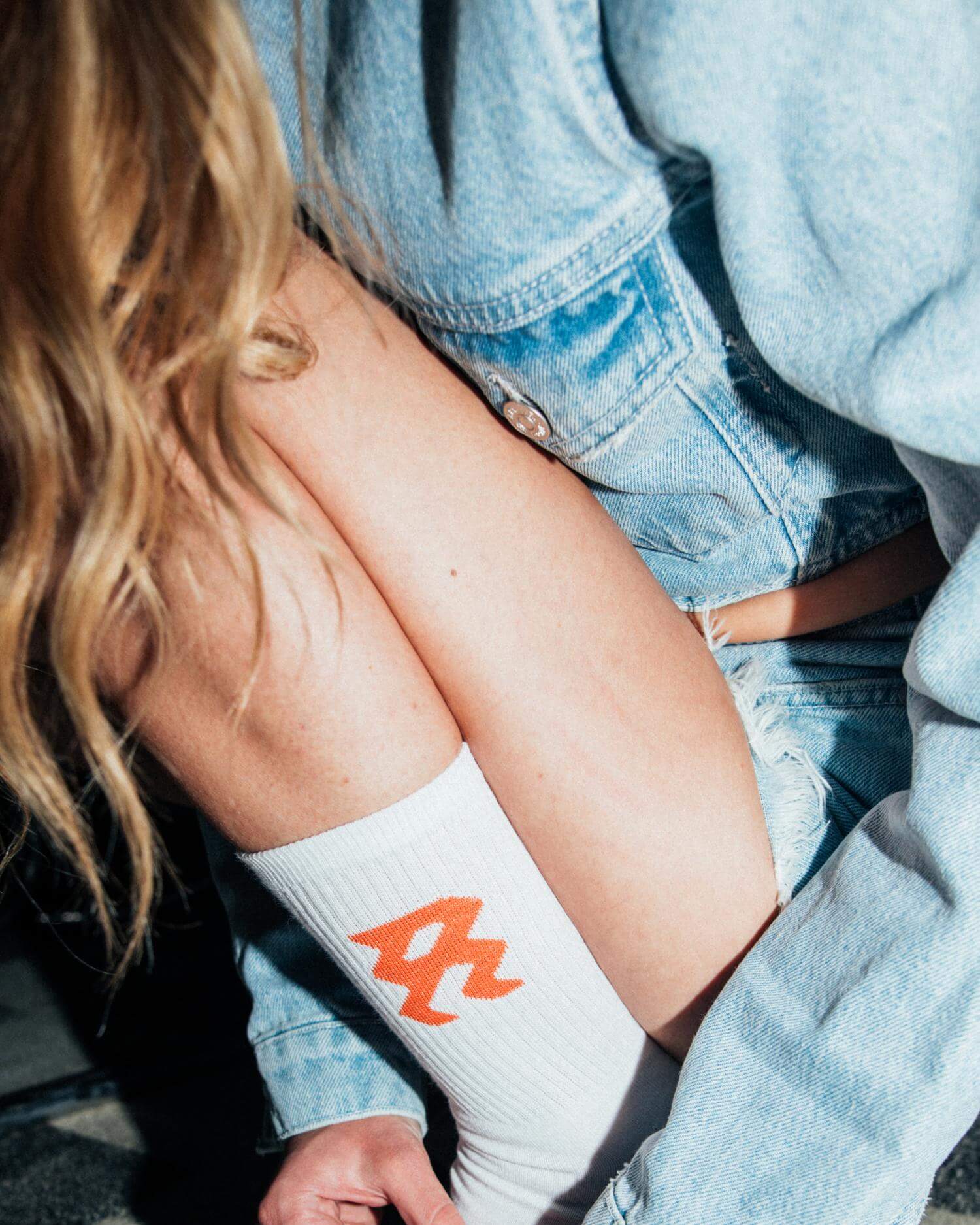
Rosso Tunes is a record label that releases music in the genres of house and techno. Additionally, DJs from all over the world are invited to be part of the regular podcast series. A special collection of inspiring mixtapes can also be found on Spotify, curated by friends of the label. Derived from the Italian word “Rosso”, Lukas Haider created a branding centered around a solid, vivid red color scheme. A custom-designed typeface, inspired by the dynamic movements of dancers on the floor, was created to capture the energy and passion that Rosso Tunes brings to its music, parties, and overall vision. With these two main elements, a consistent system was created and implemented across digital and physical assets, including covers, T-shirts, tote bags, socks, scarves, and LED signs — essentially everything to interact with the community.
Credits
Photography by Mario Ilic.
TAU Spektrum 4
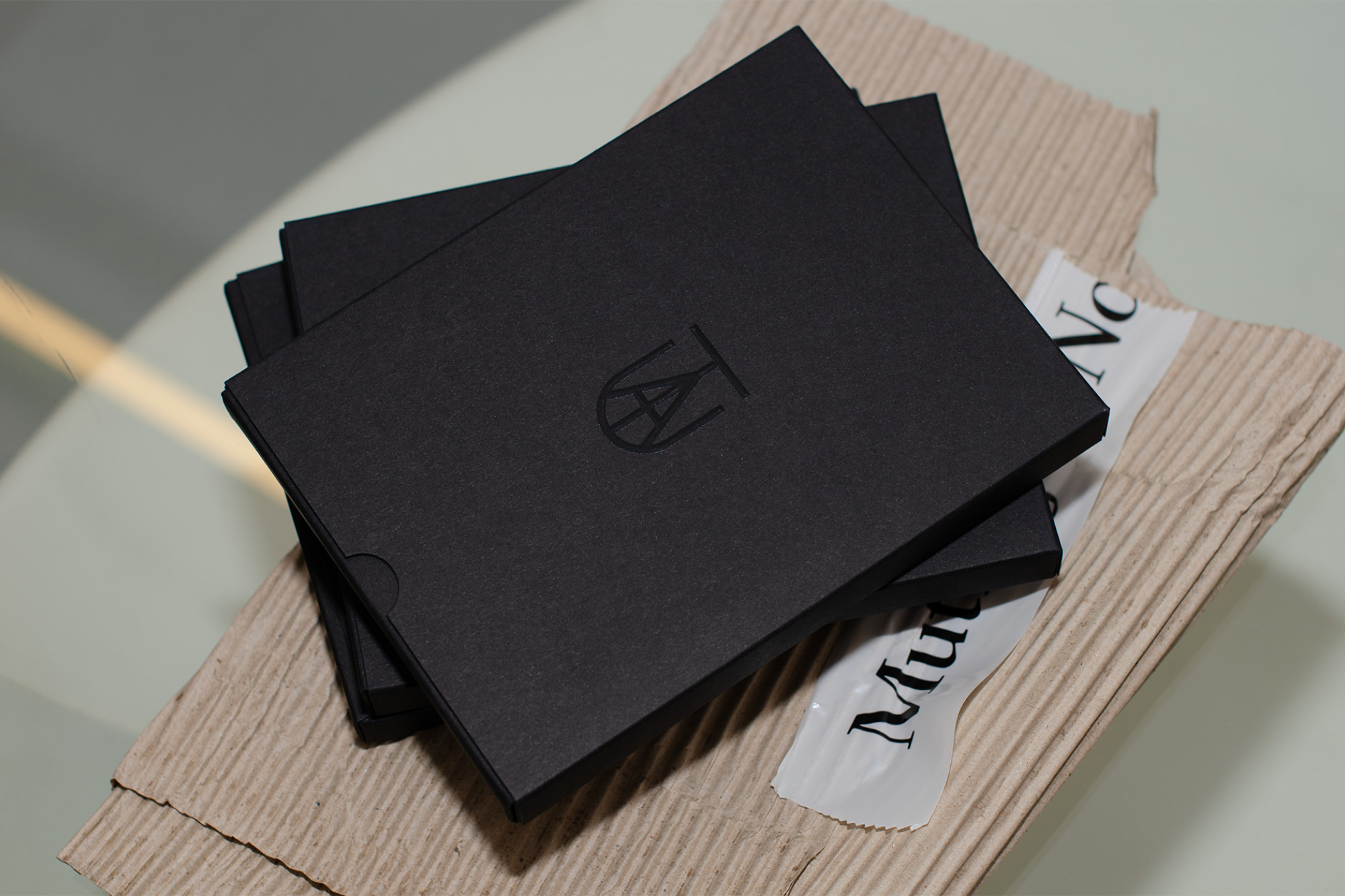
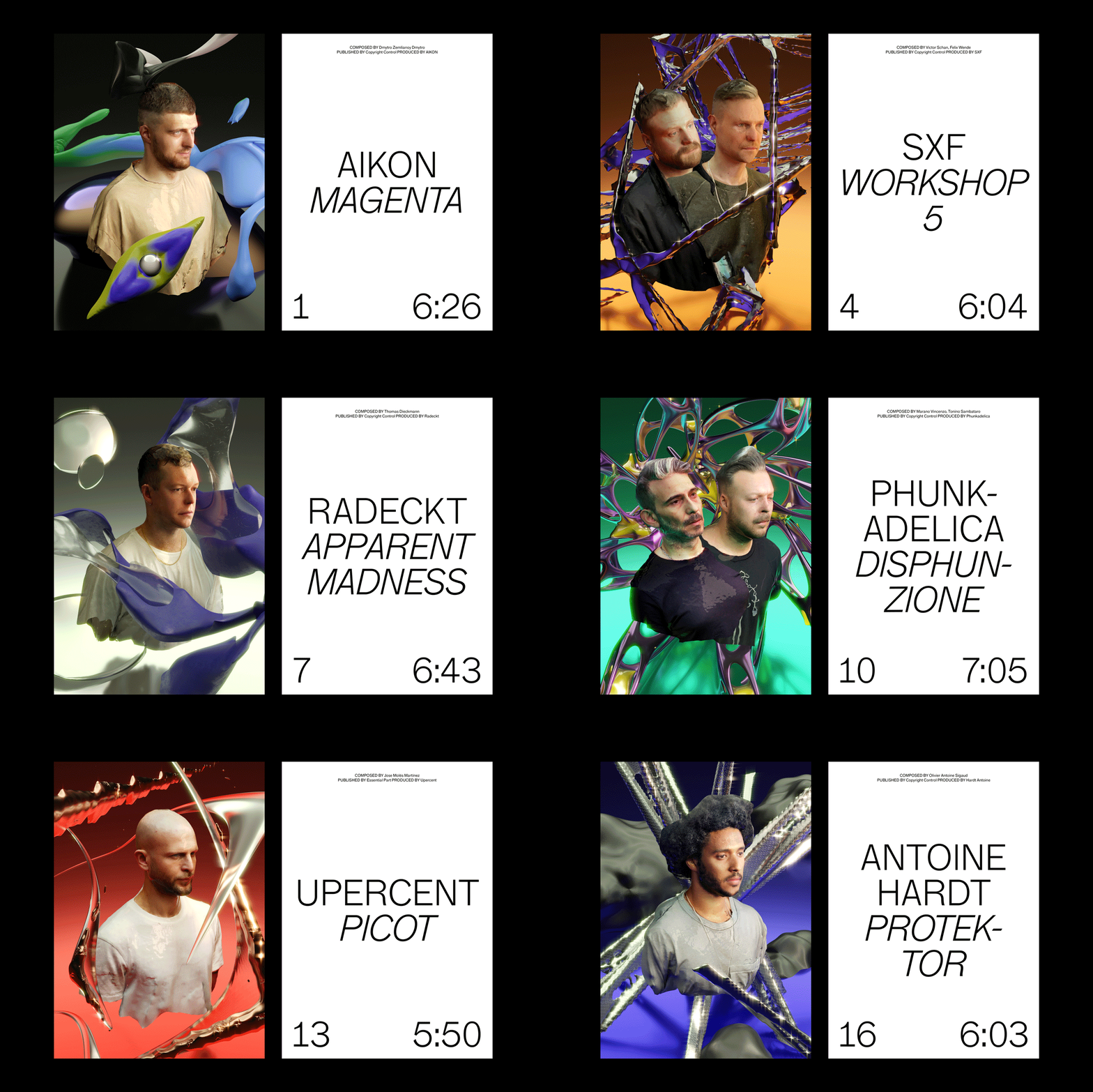
3D scans combined with surrealistic sceneries converted into limited trading cards, wrapped in a collector's box, including a music compilation download code.



Project Information
TAU Spektrum 4 is the fourth compilation by the Hamburg-based record label TAU, dedicated to forward-thinking electronic music from a range of rising artists and founded by the Adana Twins. In charge of the creative direction since the label’s inception, the Spektrum series is characterized by unconventional release solutions in terms of the chosen media, ultimately aiming to connect with the fanbase on a deeper level. For the fourth installment, a limited collector’s edition was introduced, featuring 16 trading cards of each artist, along with an individual download code for the music compilation. Each contributing artist was 3D-scanned and placed in a surrealistic CGI environment matching the mood of their individual songs, creating unique artworks. In addition to the physical appearance of the trading cards, a series of animations was created to bring the cards to life in the digital space, intended to be shared on all social media platforms throughout the release.
TAU Spektrum 4 is the fourth compilation by the Hamburg-based record label TAU, dedicated to forward-thinking electronic music from a range of rising artists and founded by the Adana Twins. In charge of the creative direction since the label’s inception, the Spektrum series is characterized by unconventional release solutions in terms of the chosen media, ultimately aiming to connect with the fanbase on a deeper level. For the fourth installment, a limited collector’s edition was introduced, featuring 16 trading cards of each artist, along with an individual download code for the music compilation. Each contributing artist was 3D-scanned and placed in a surrealistic CGI environment matching the mood of their individual songs, creating unique artworks. In addition to the physical appearance of the trading cards, a series of animations was created to bring the cards to life in the digital space, intended to be shared on all social media platforms throughout the release.
Adana Twins Tour
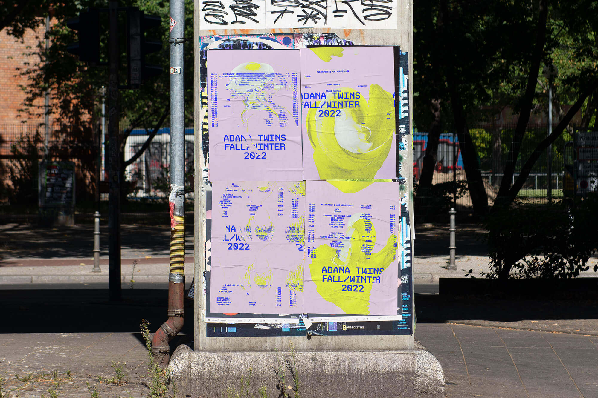
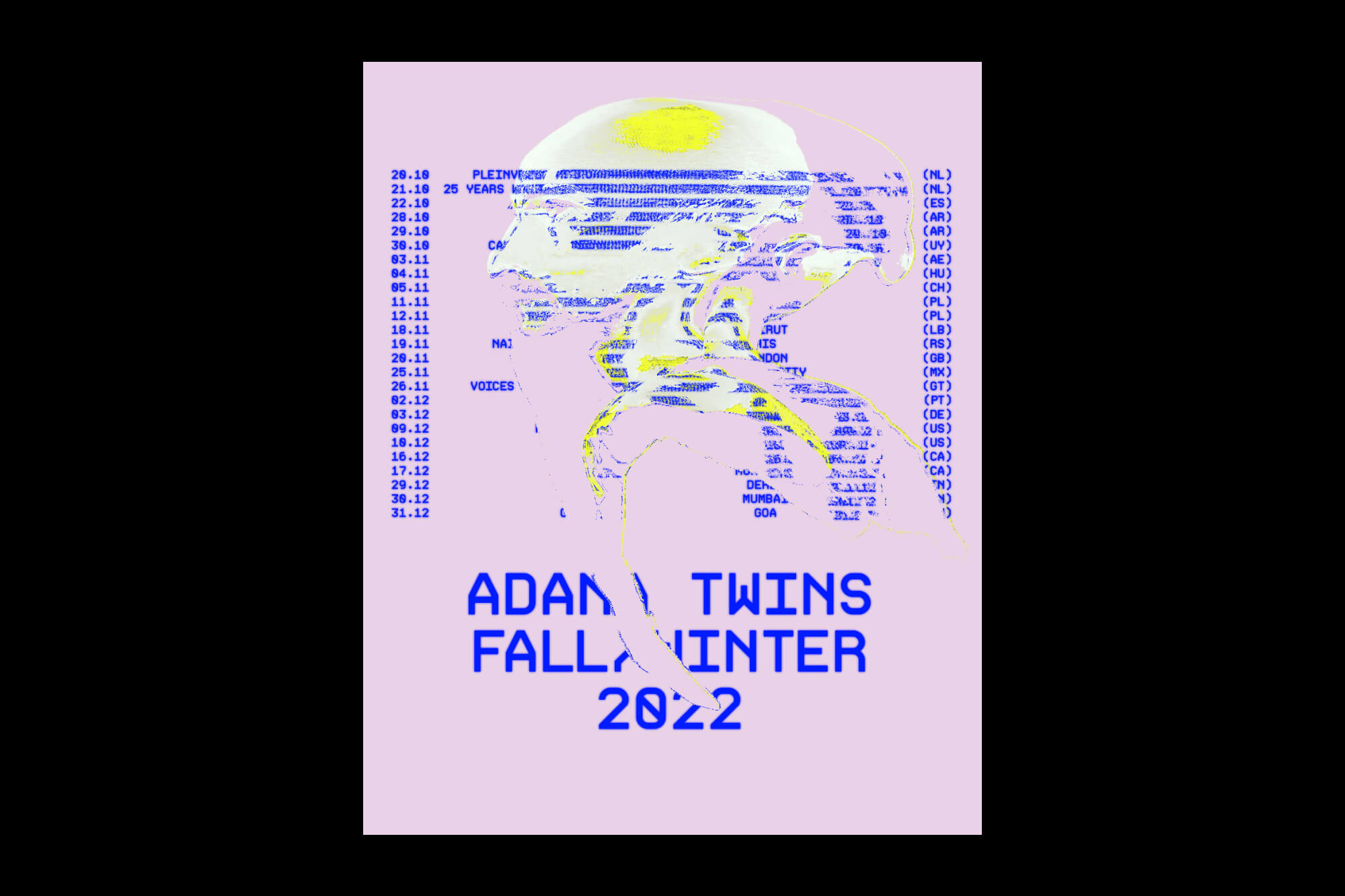
Giving tour promotion a whole new spin with 3D face scan technology.






Project Information
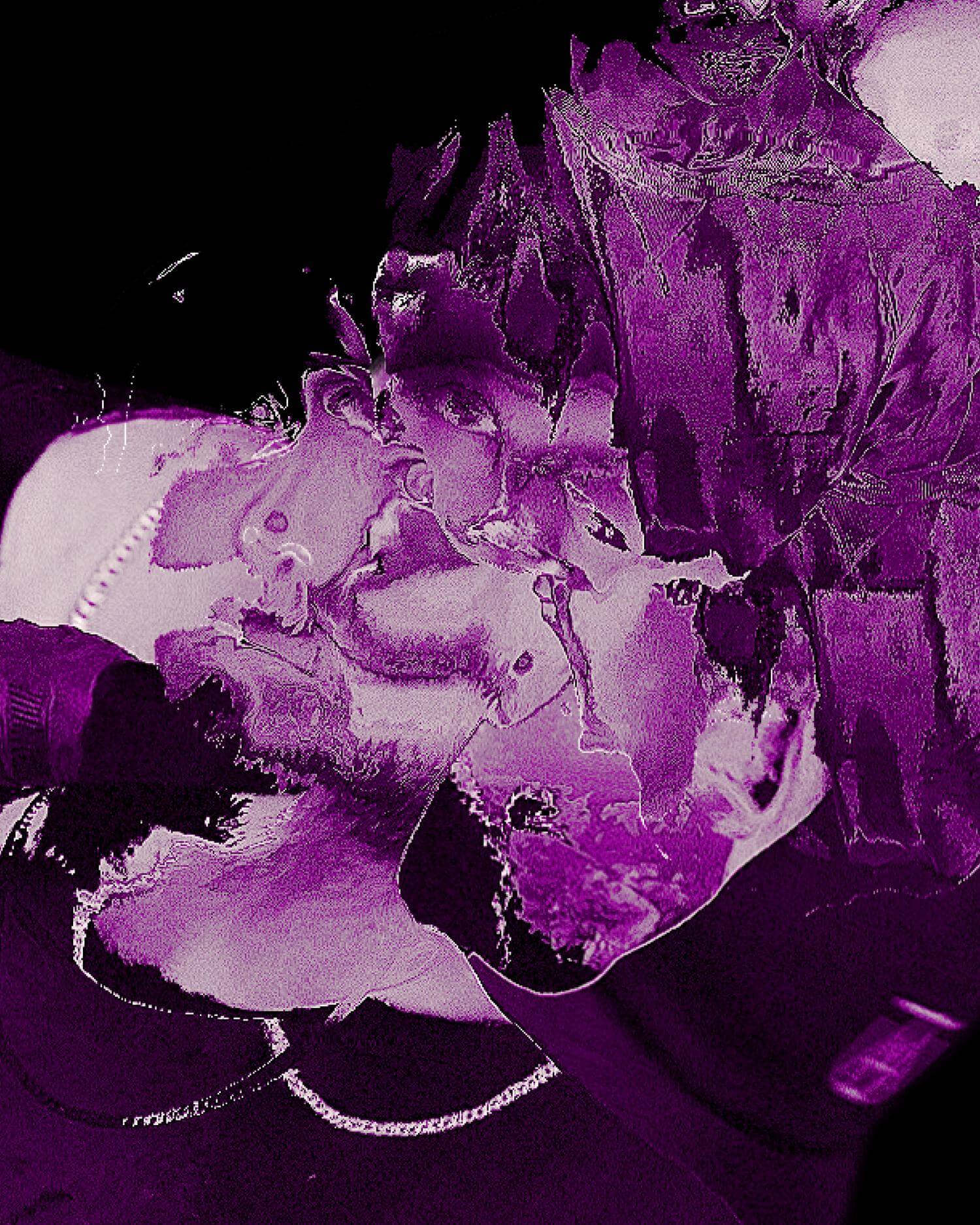
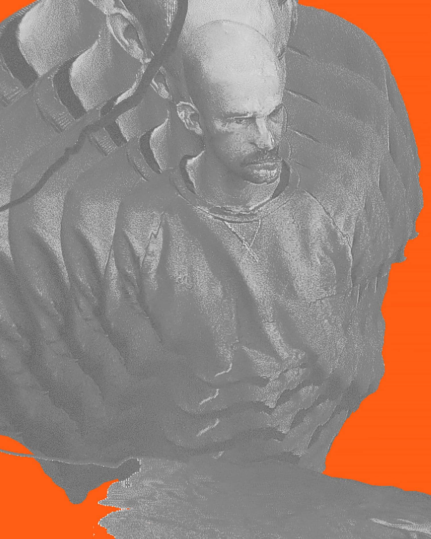
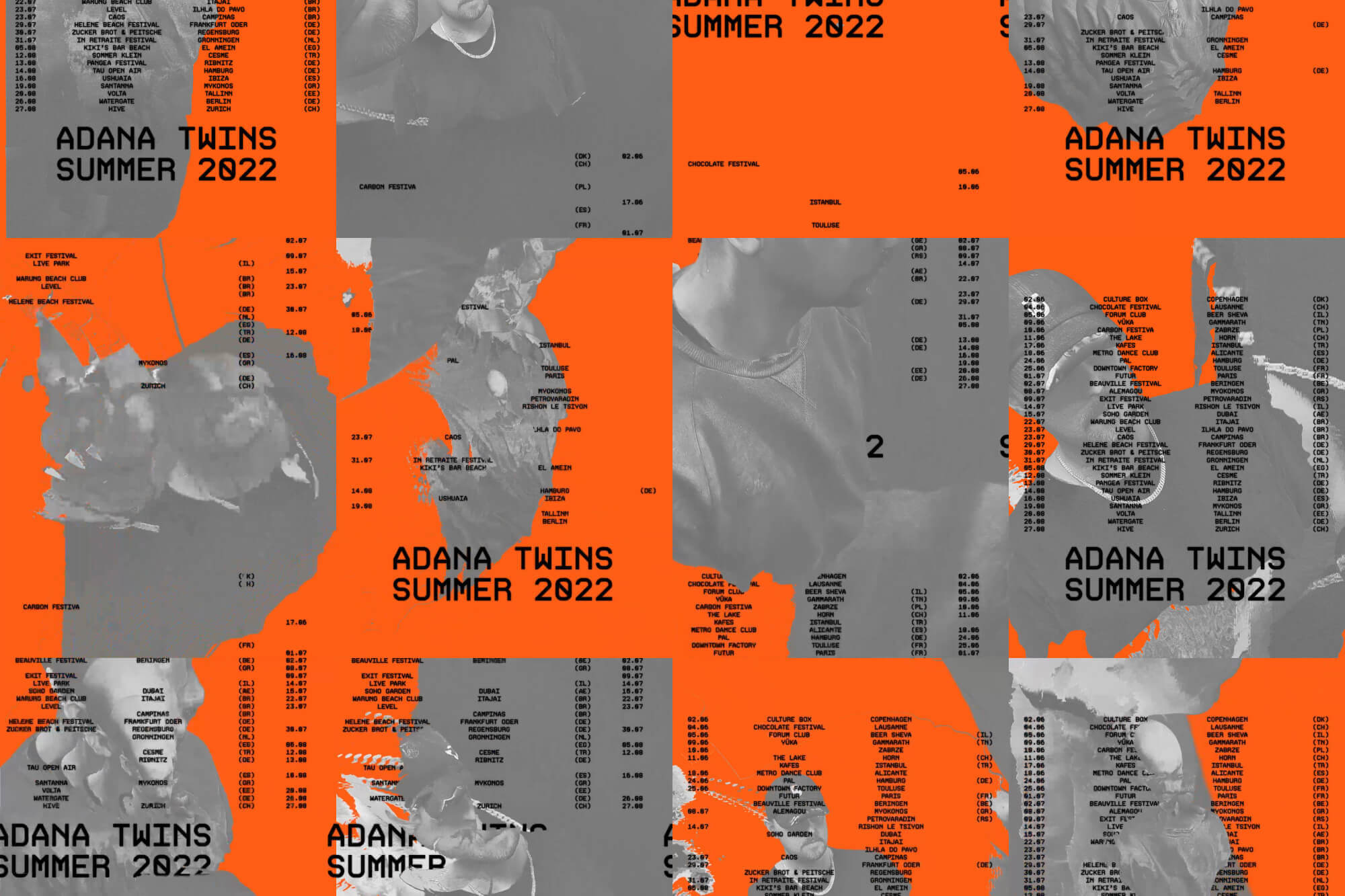
Teaming up with the Adana Twins, Lukas Haider gave tour promotions a whole new spin. Instead of sticking to repetitive photography, 3D face scans of the artists were used as the main element. This switch-up made the visuals more diverse and prevented them from looking the same all the time. This approach, combined with duotone color schemes, experimental typography, and motion, injected new energy into every tour’s vibe. It opened up tons of exciting possibilities and made the campaign really stand out, whether you saw it online, in print, or on stage.
Teaming up with the Adana Twins, Lukas Haider gave tour promotions a whole new spin. Instead of sticking to repetitive photography, 3D face scans of the artists were used as the main element. This switch-up made the visuals more diverse and prevented them from looking the same all the time. This approach, combined with duotone color schemes, experimental typography, and motion, injected new energy into every tour’s vibe. It opened up tons of exciting possibilities and made the campaign really stand out, whether you saw it online, in print, or on stage.
Project Information
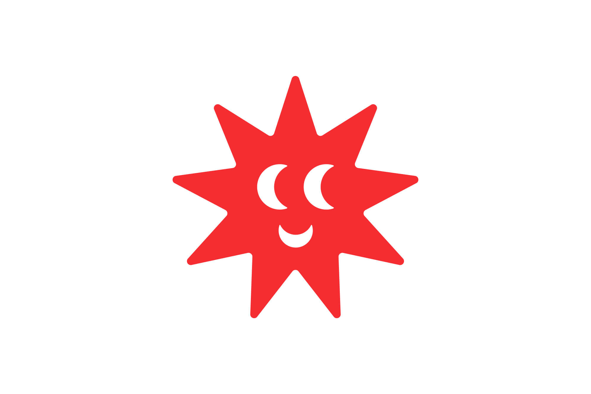
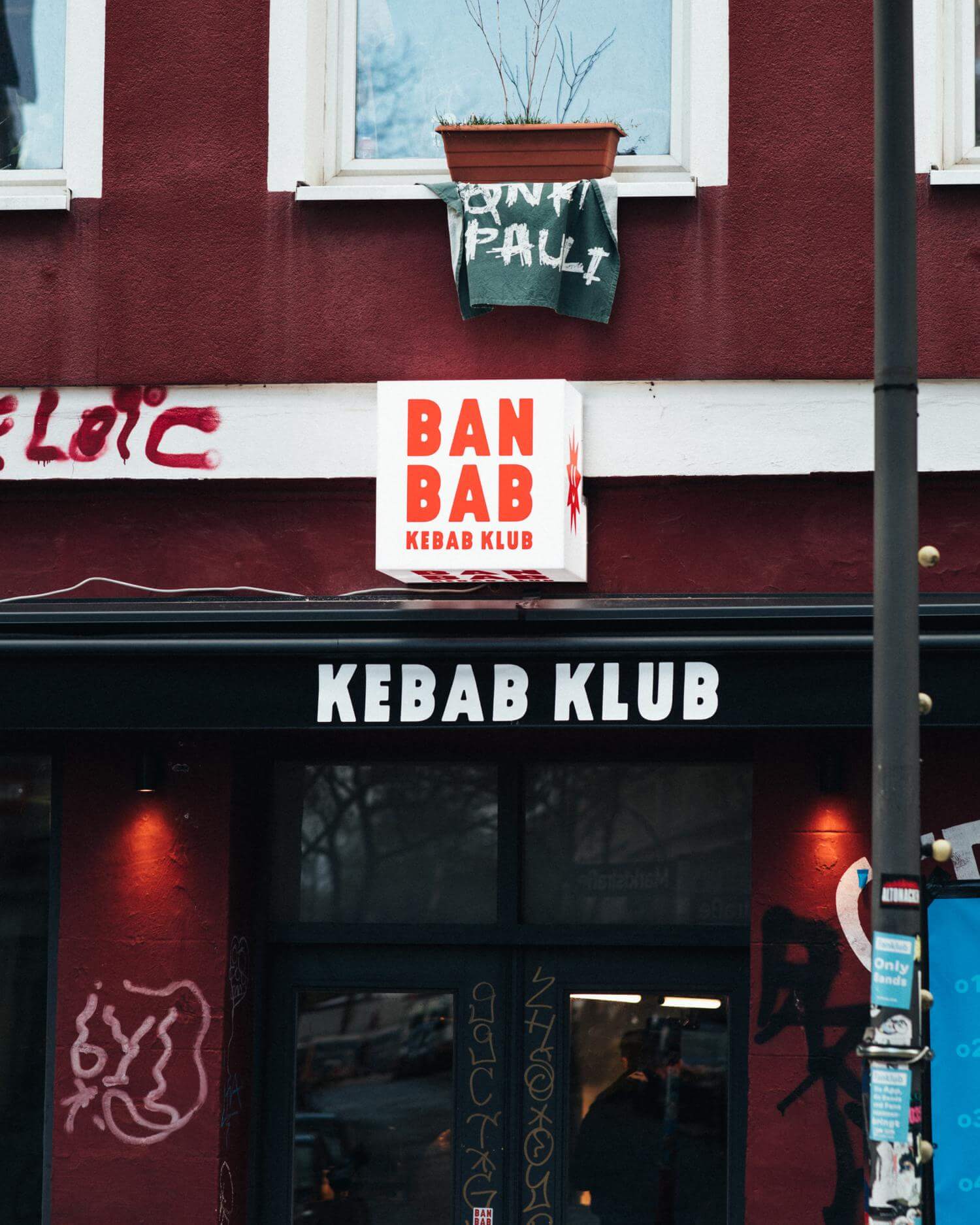
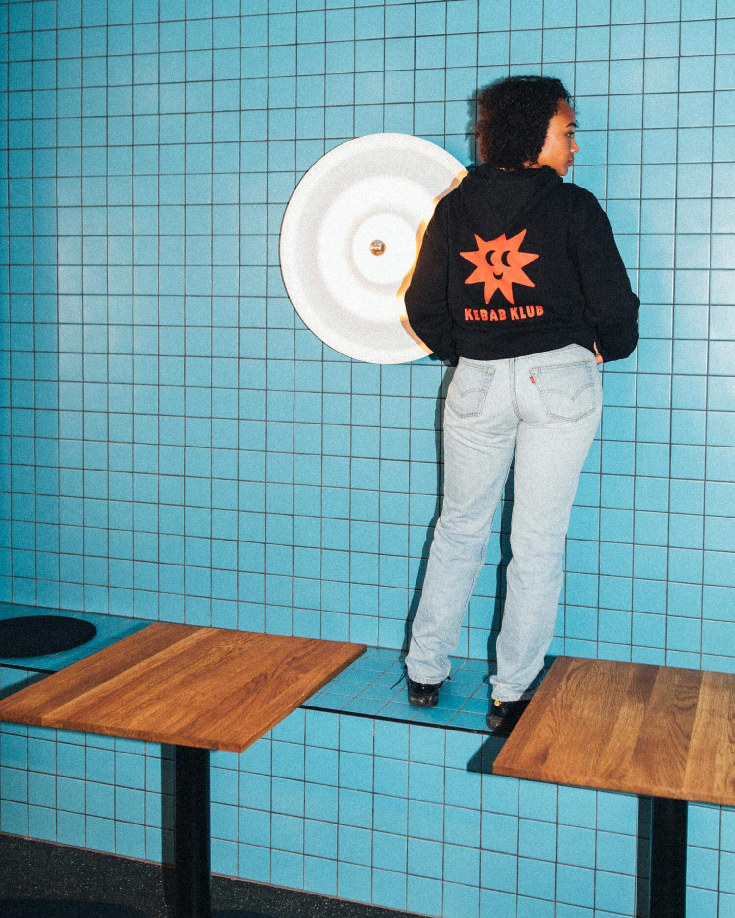
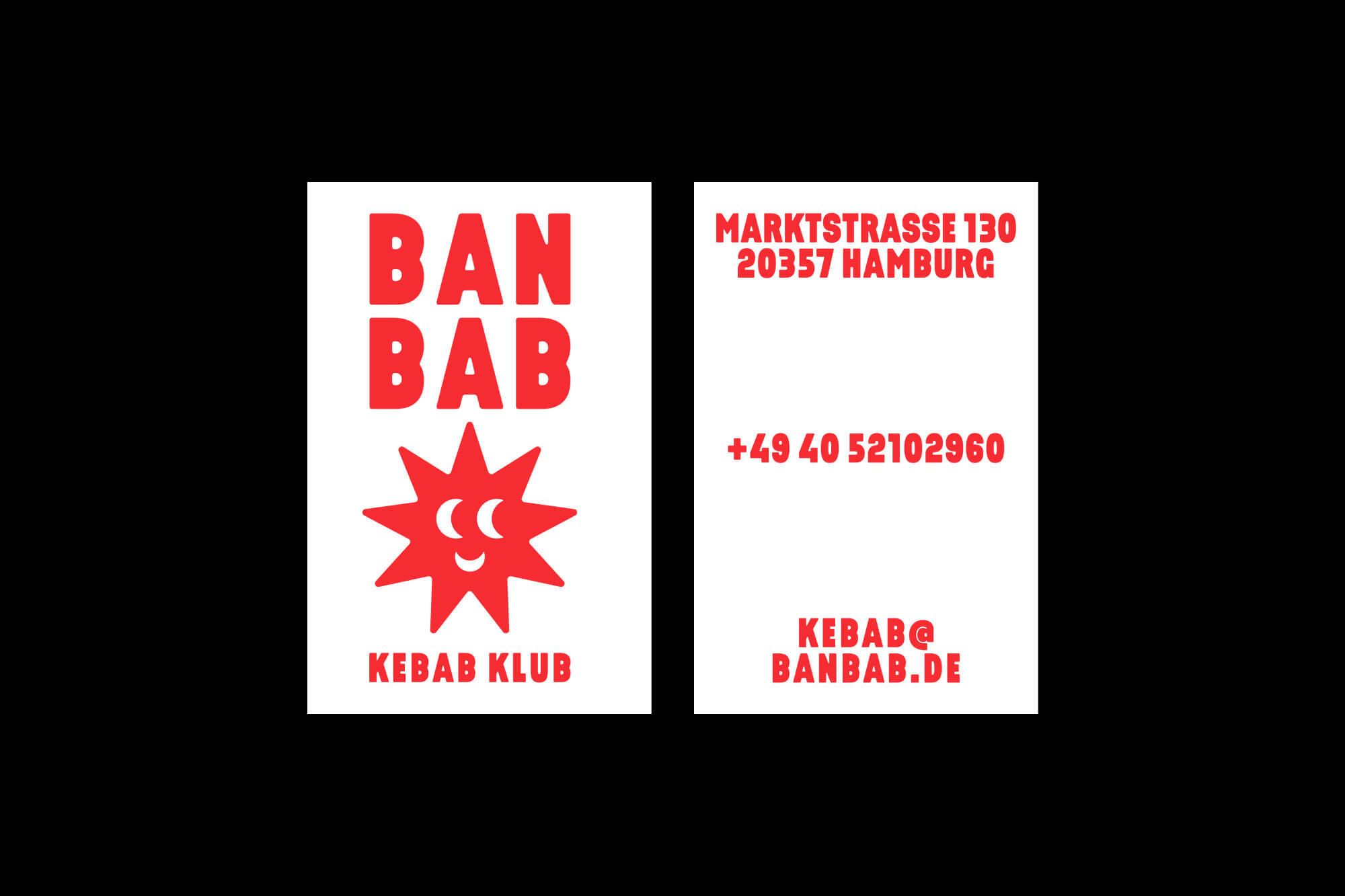
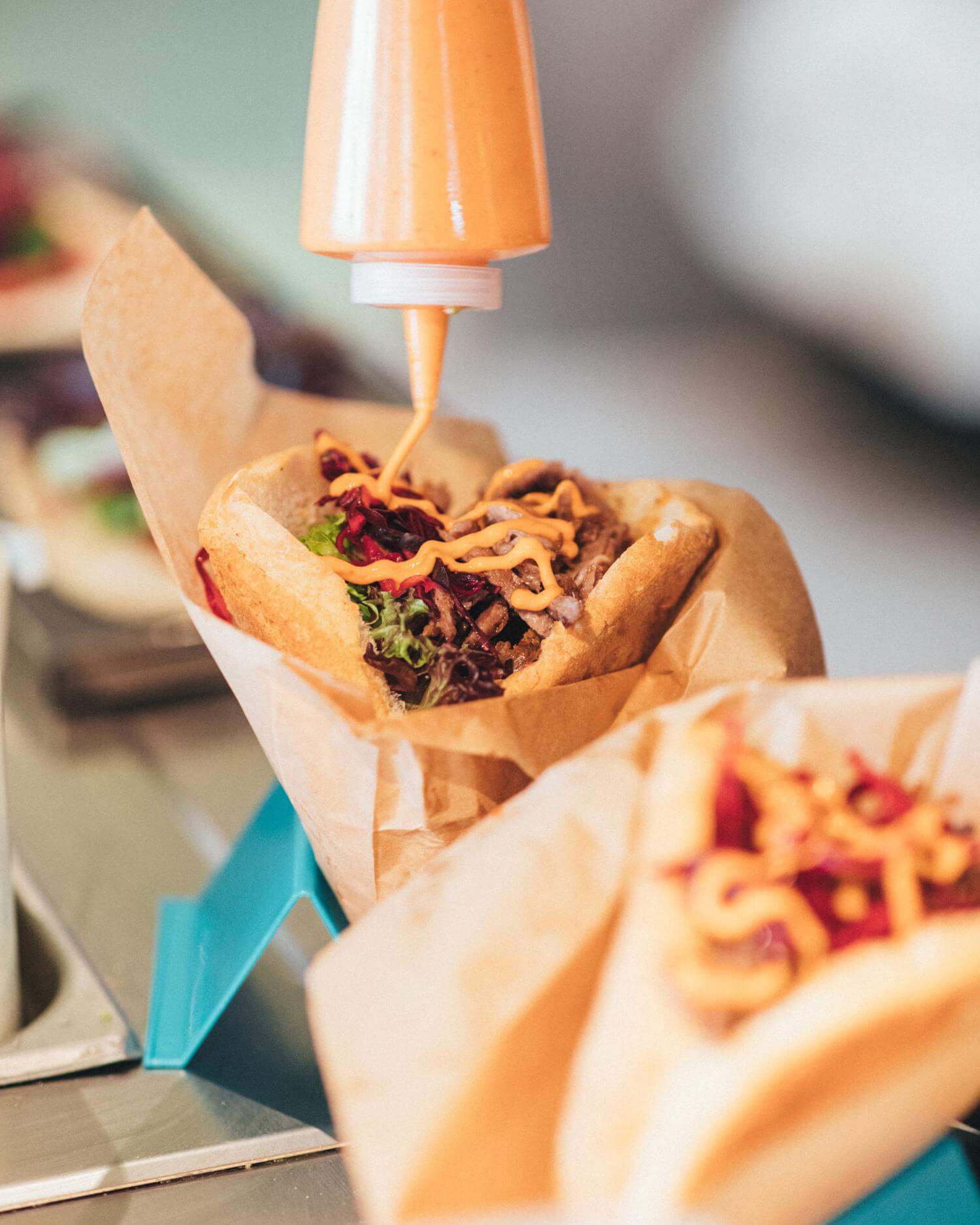
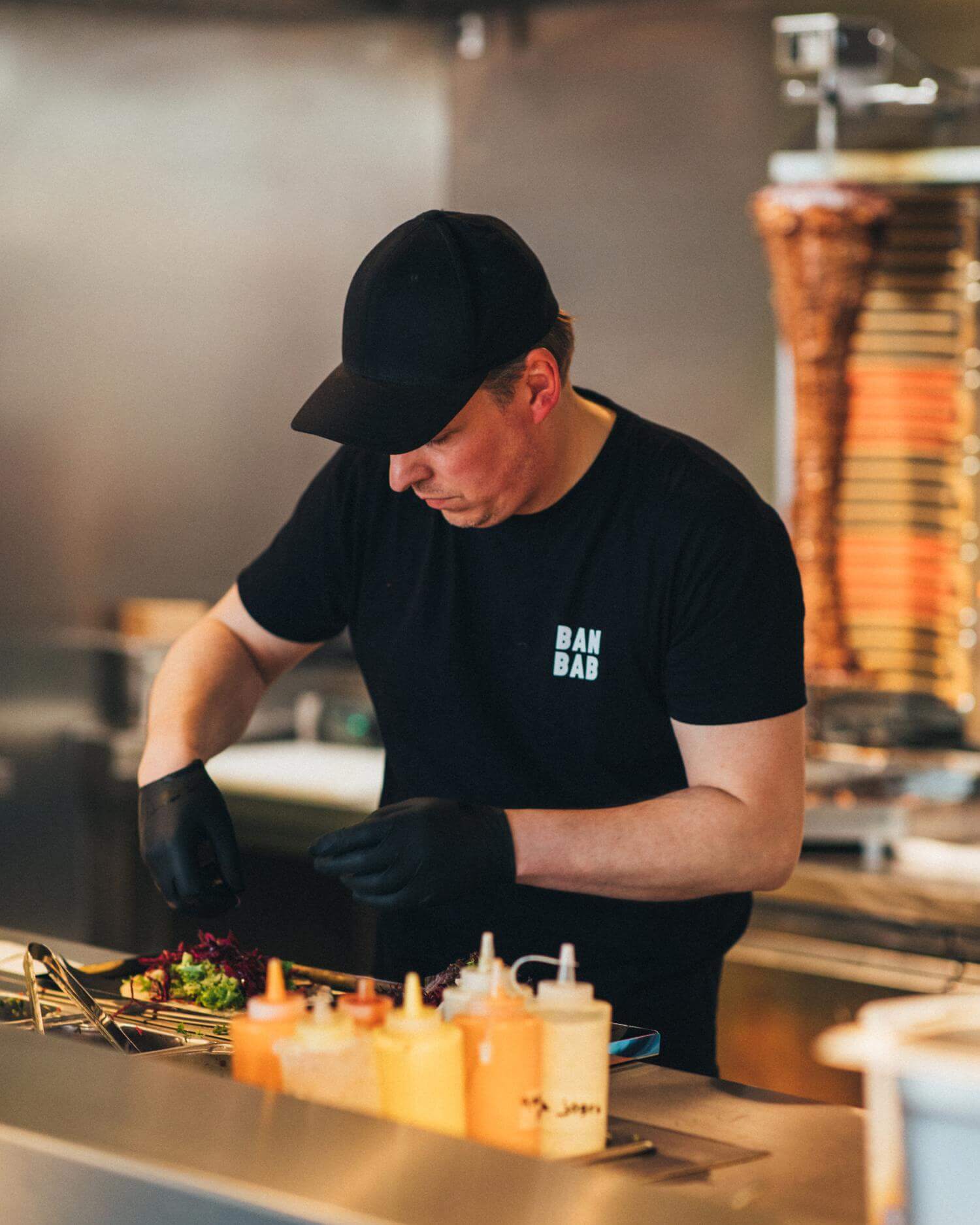
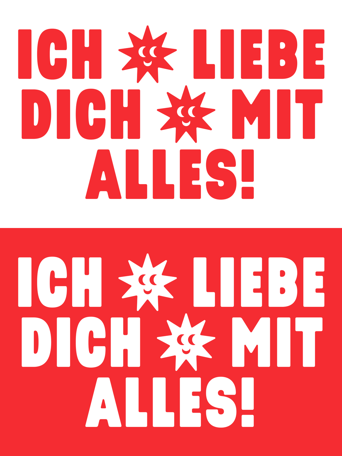
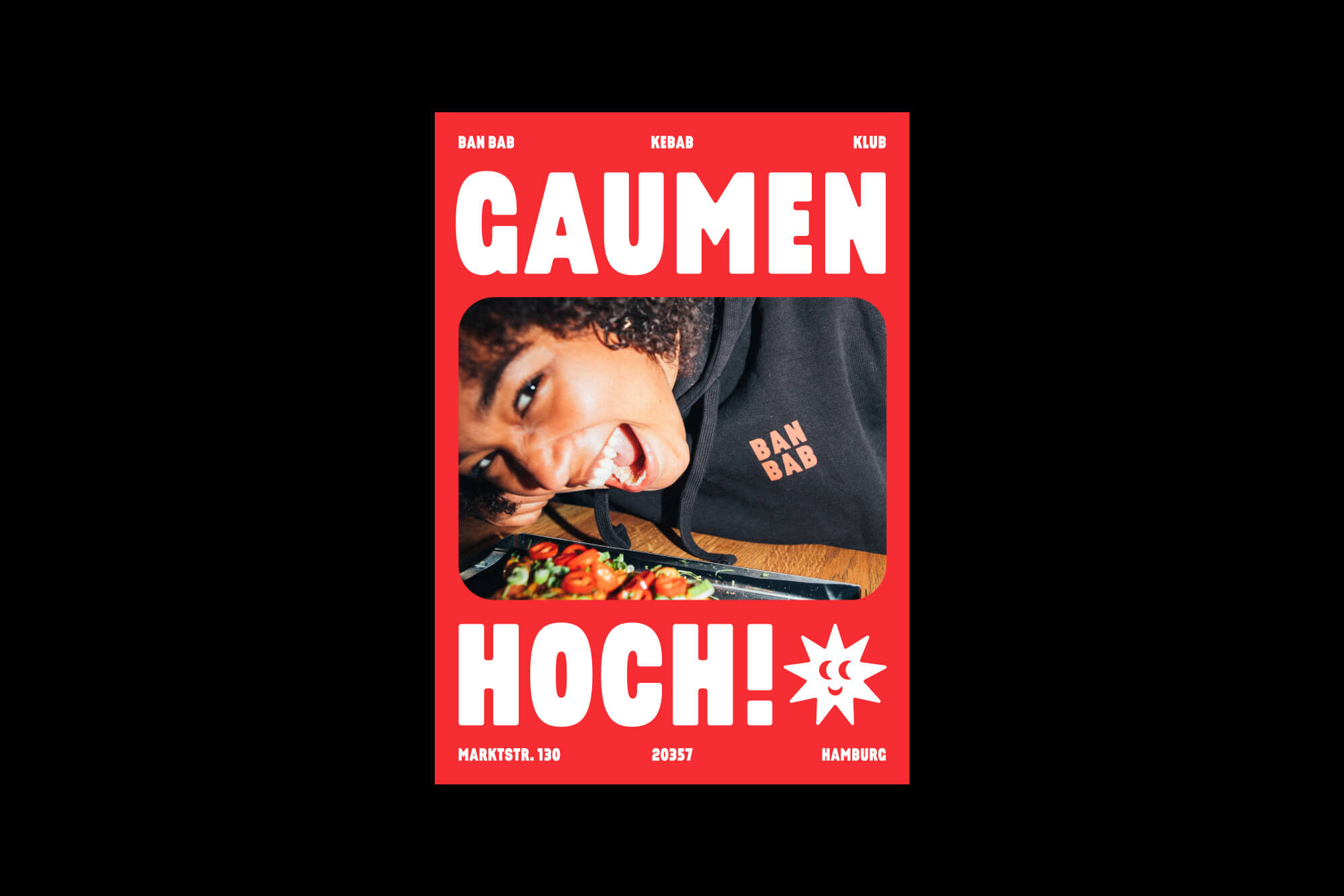
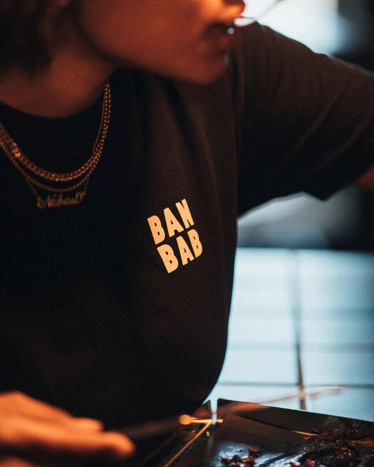
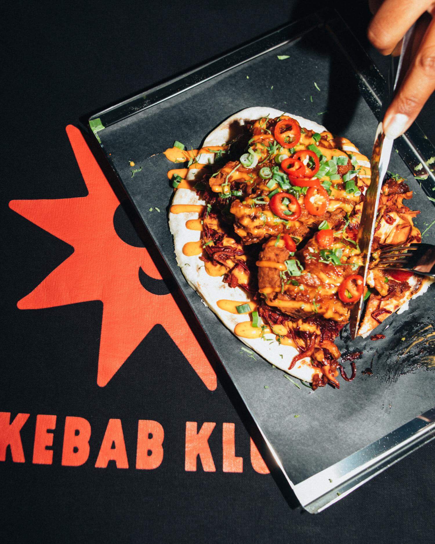
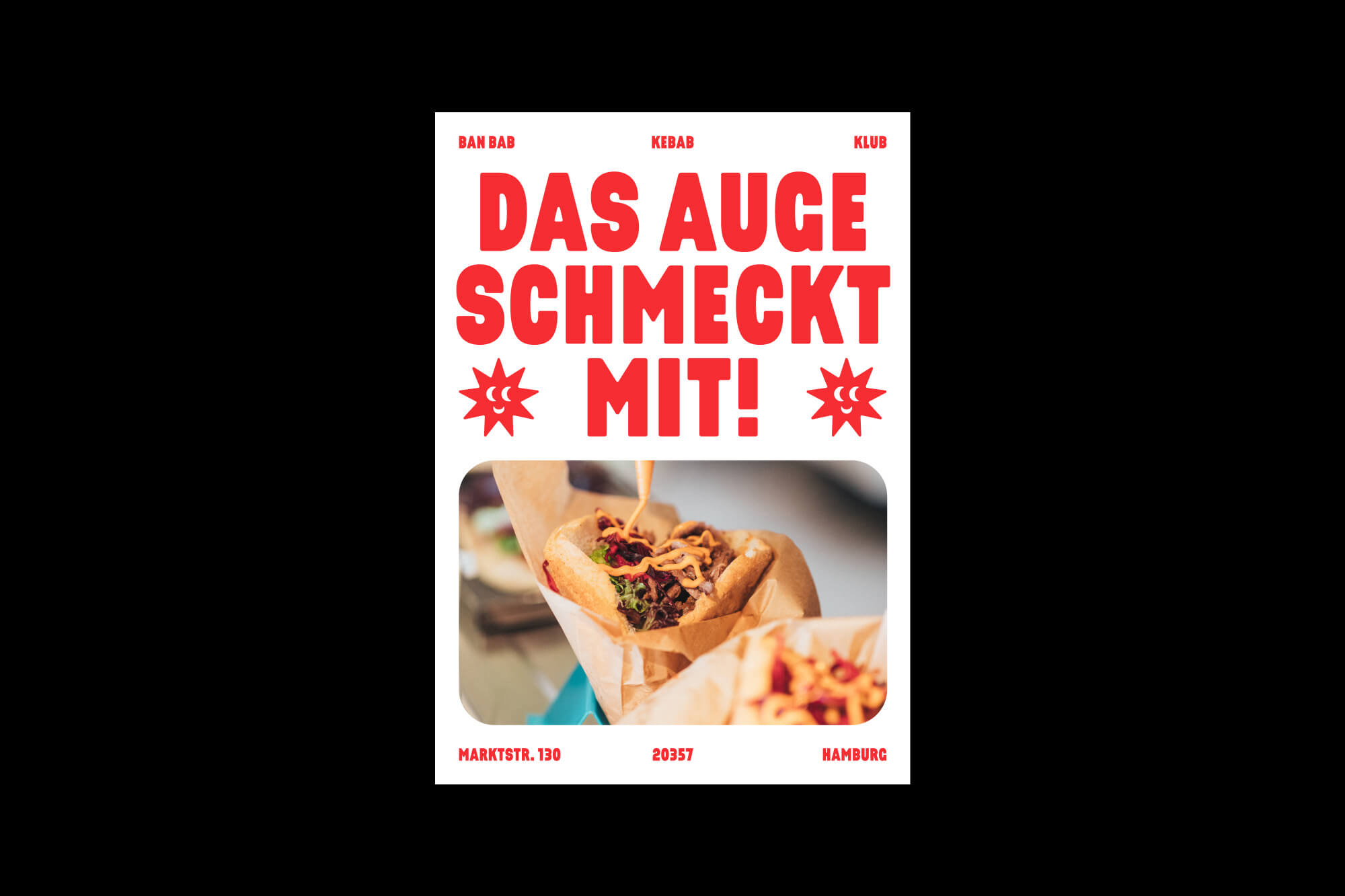
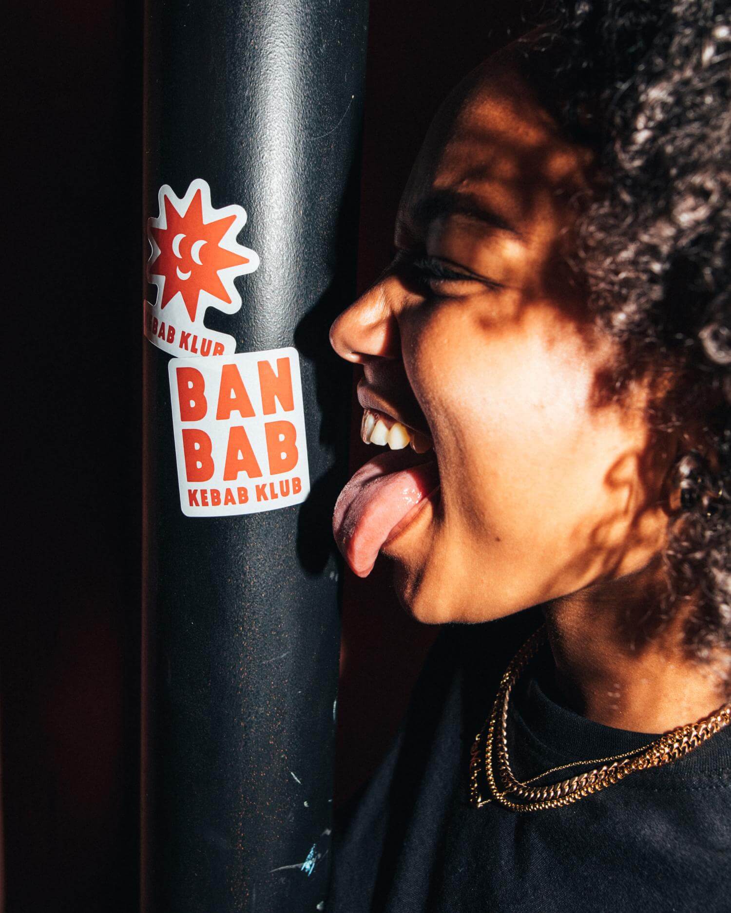
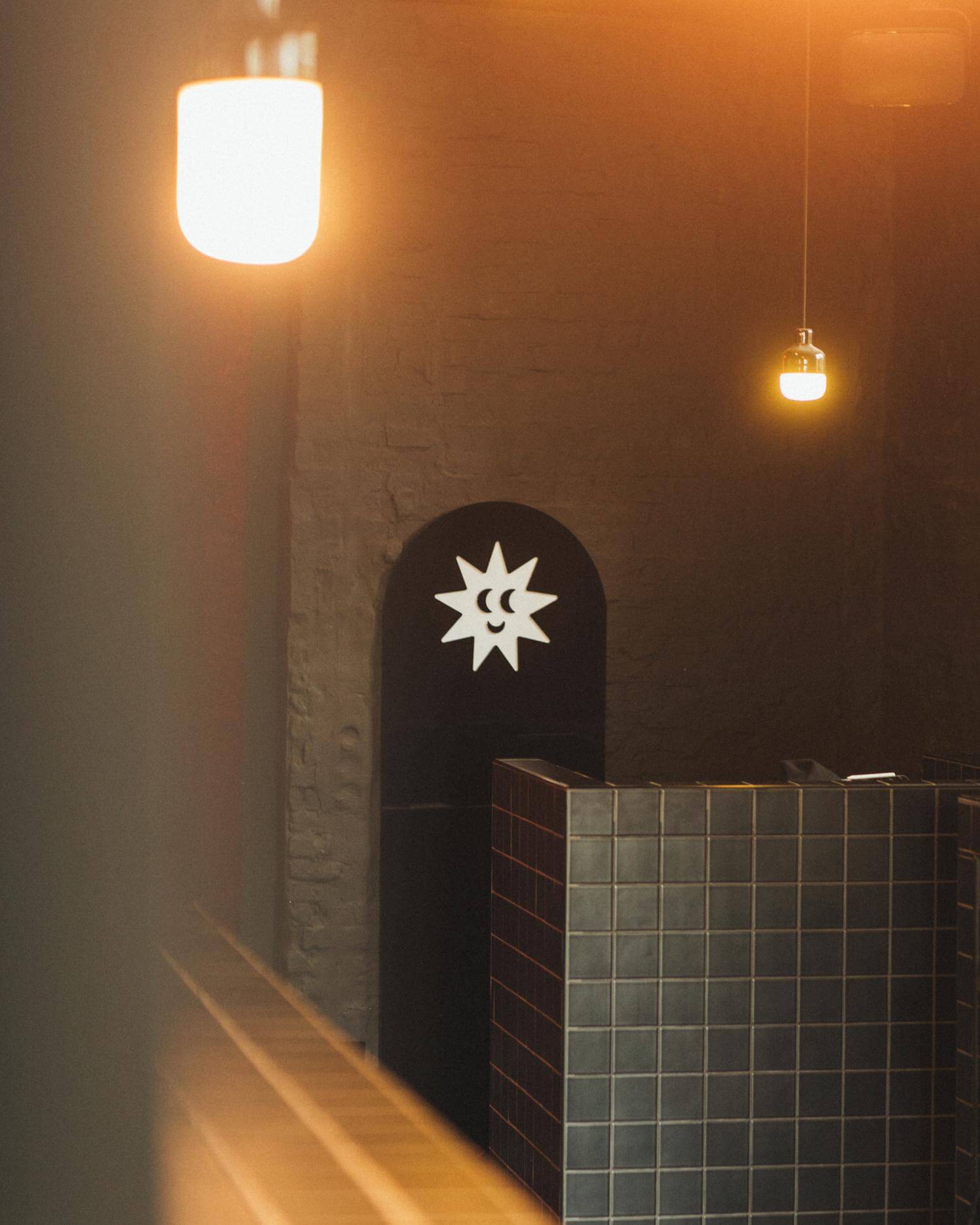
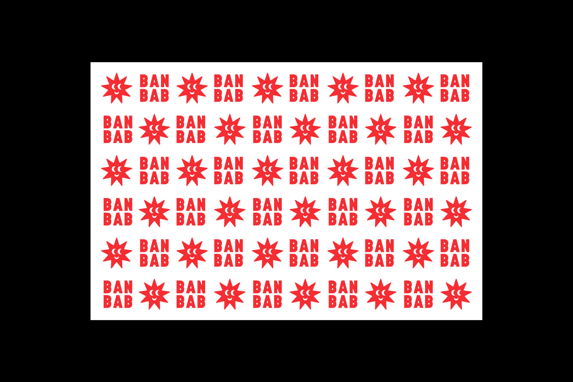
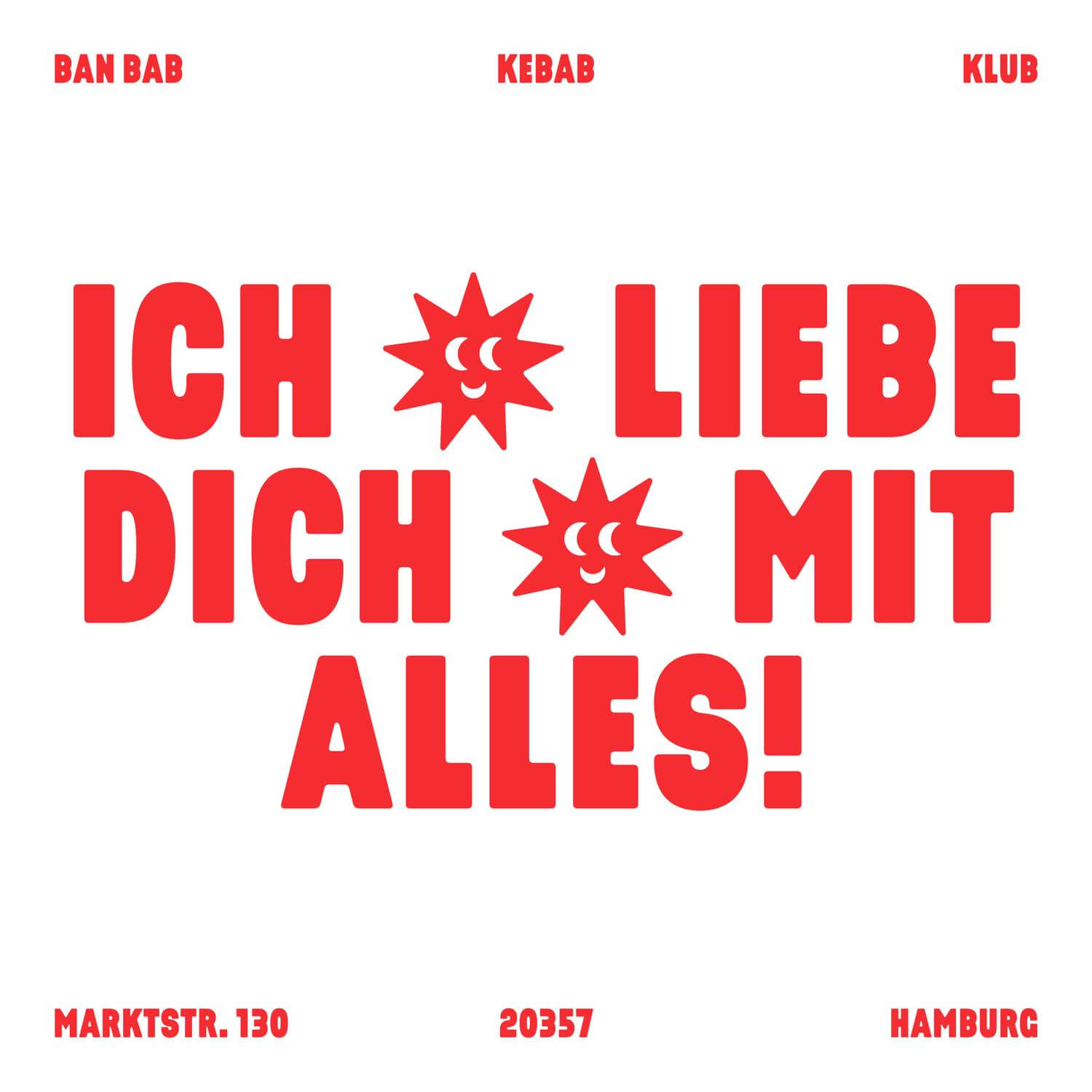
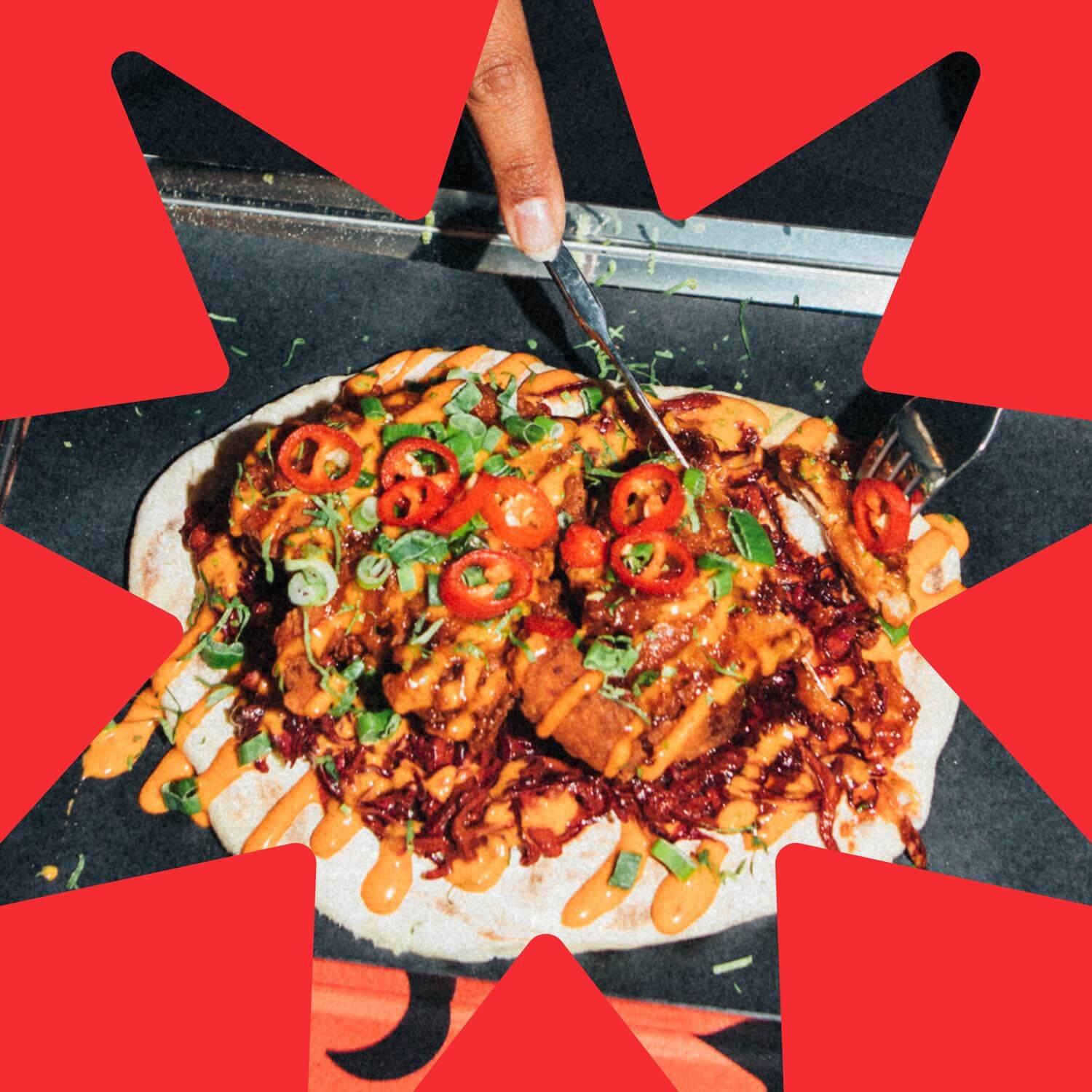
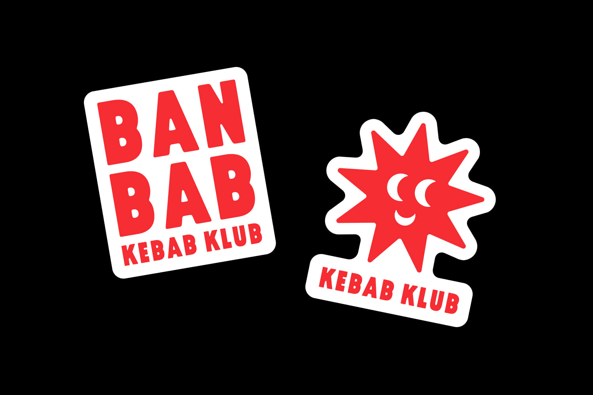
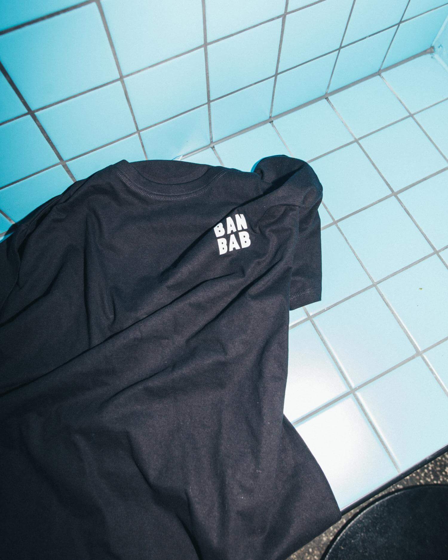
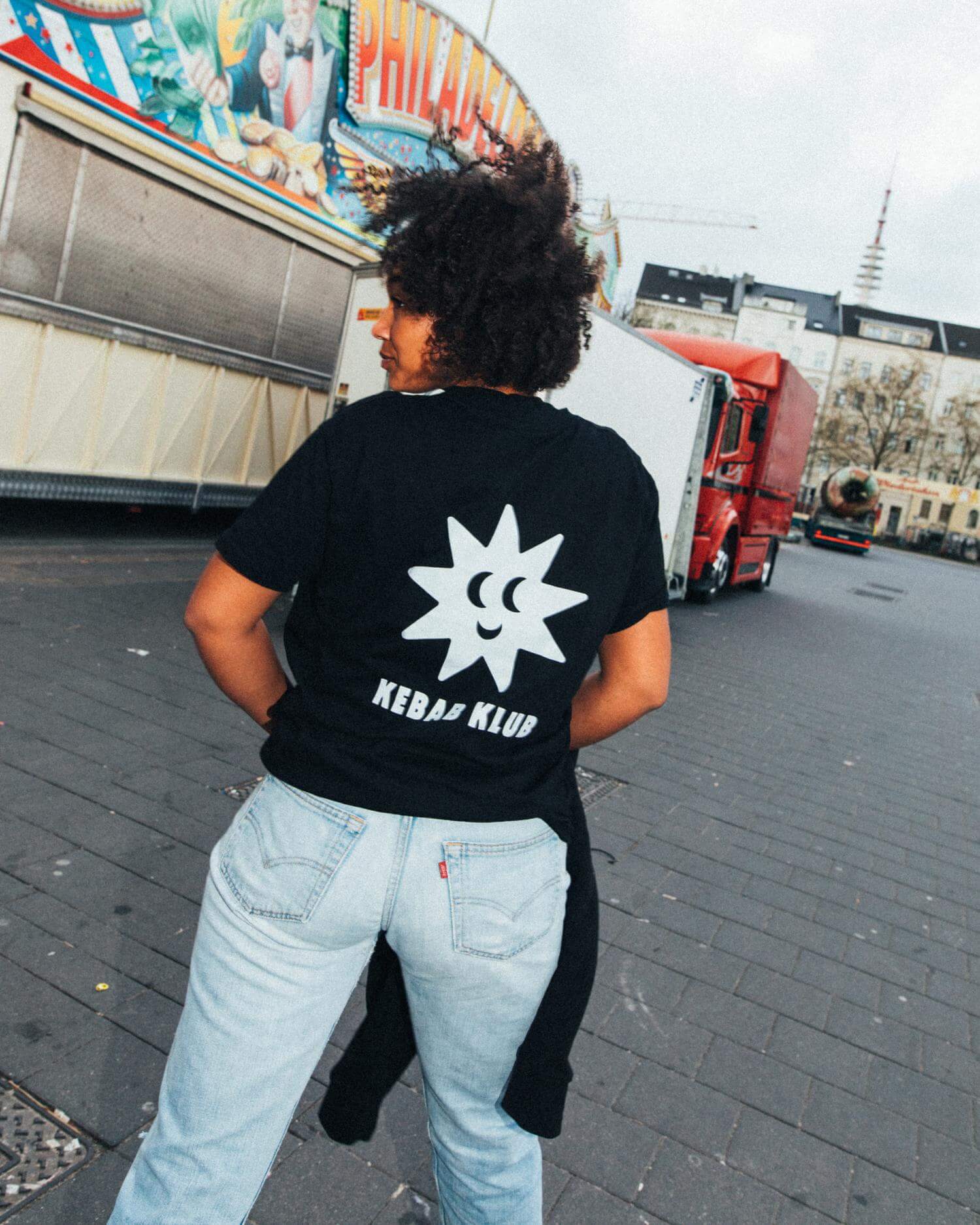
Introducing the branding for BAN BAB - a fresh and innovative destination for kebab enthusiasts in the heart of Hamburg. The story behind this place: it was founded by a Turkish and Vietnamese duo with the aim of combining the best of both worlds. Taking inspiration from this, the name is a wordplay on the Turkish “Kebab” and the Vietnamese word “Banh Mi”, resulting in BAN BAB. Another similarity found between these two nations is the symbols, such as stars and moons, in their country flags. These were playfully rearranged to form a star face with moon eyes as the main logo of the kebab club, expressing the welcoming joy of the restaurant. This little mascot, in combination with bold typography, clear messaging, and the single bright color red, with a little eye-twinkling homage to the classic kebab knife guy, forms a recognizable visual language. This branding extends to the space, merchandise, packaging, and posters, and is spread out on social media for maximum brand recognition.
Credits
Photography by Mario Ilic.
Spotify Inđậm Indie
The best of Vietnamese indie music in one playlist. A visual identity that draws inspiration from lo-fi, movie like analog aesthetics interpreted in a modern way.
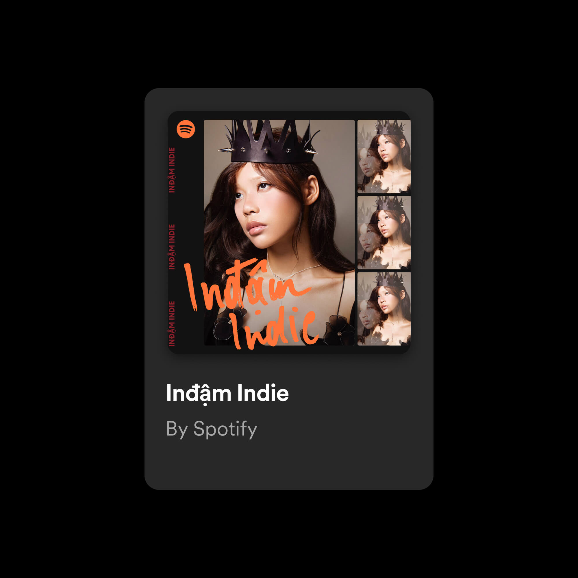


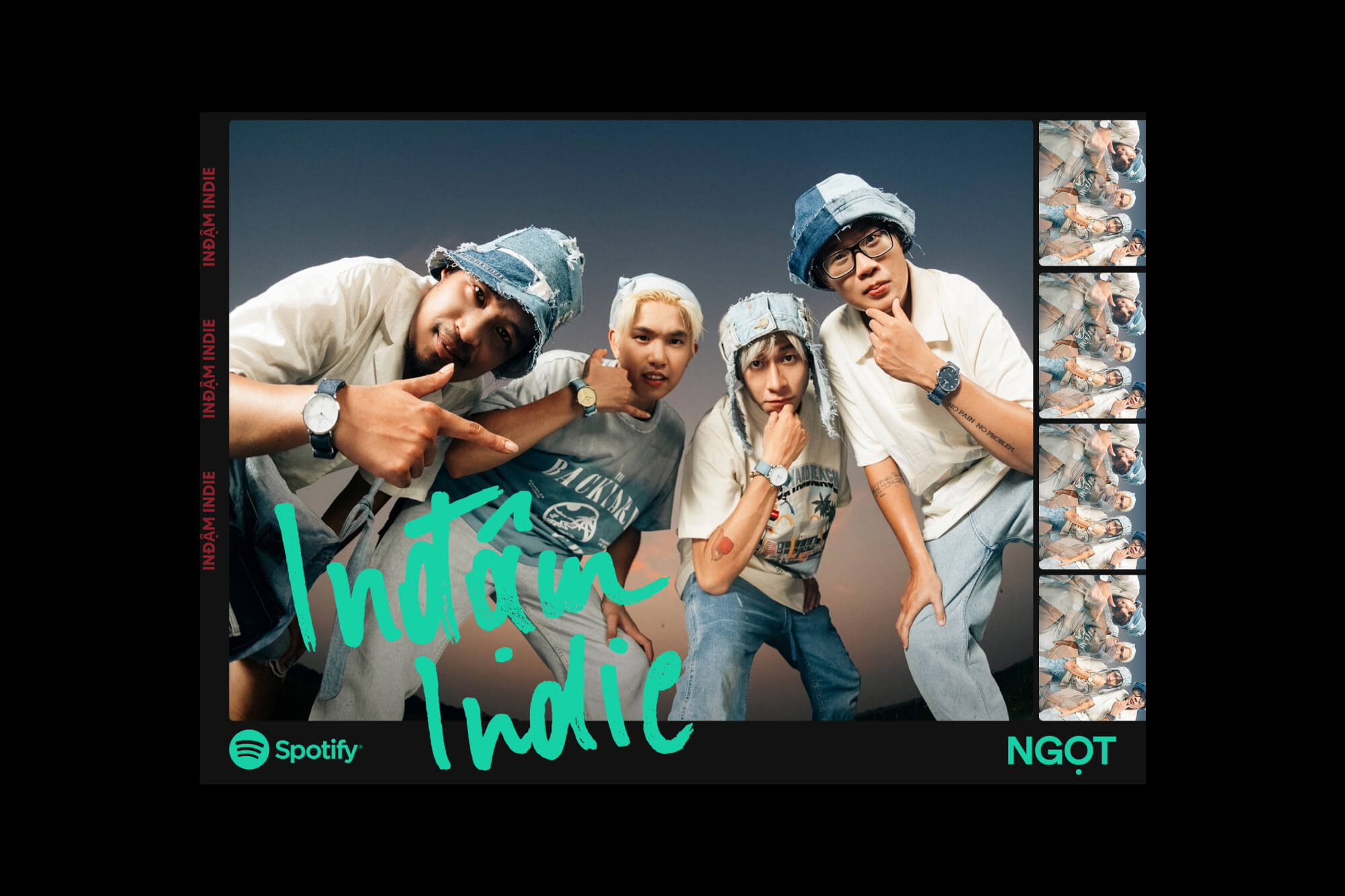
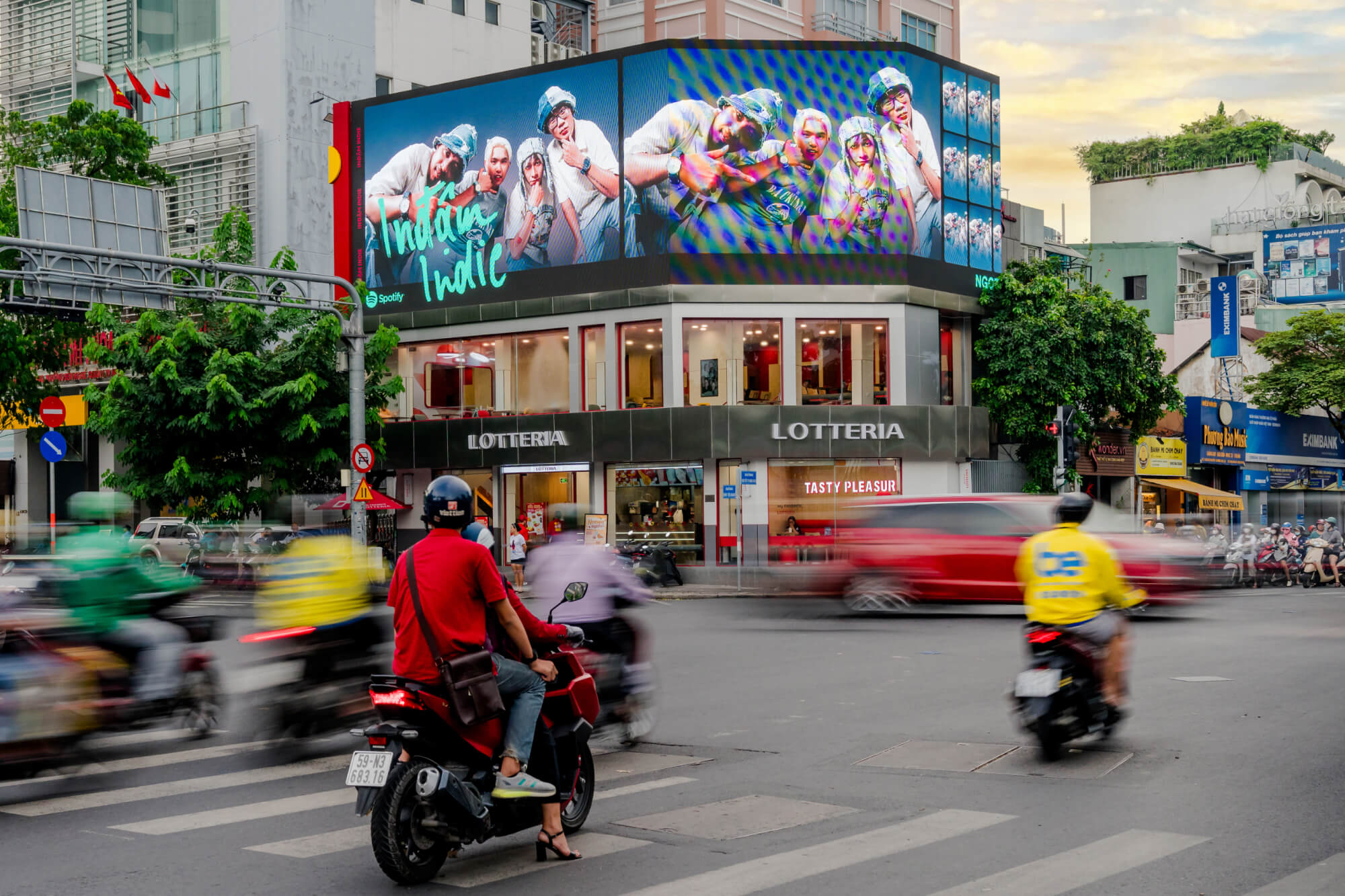


Project information
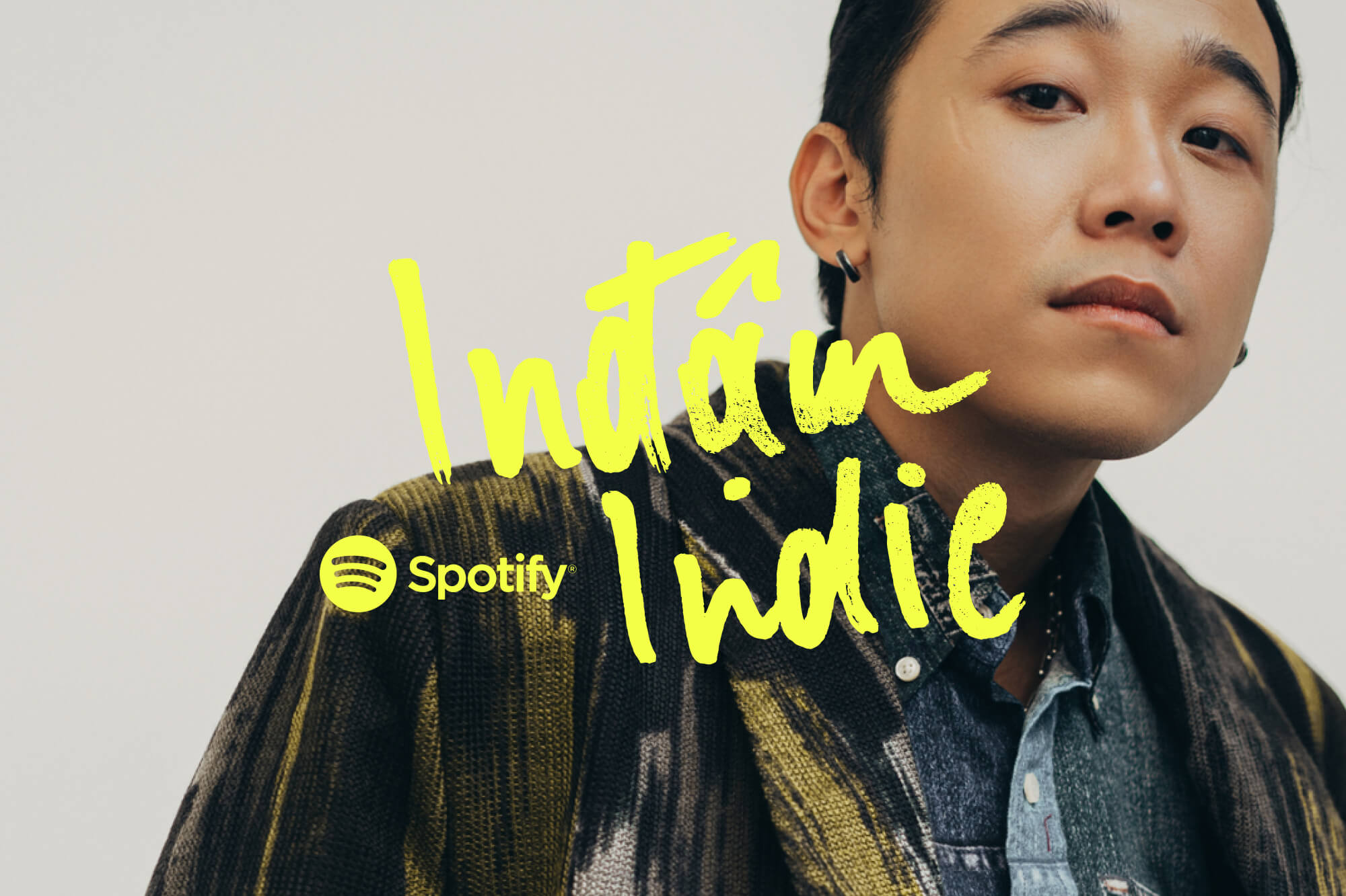
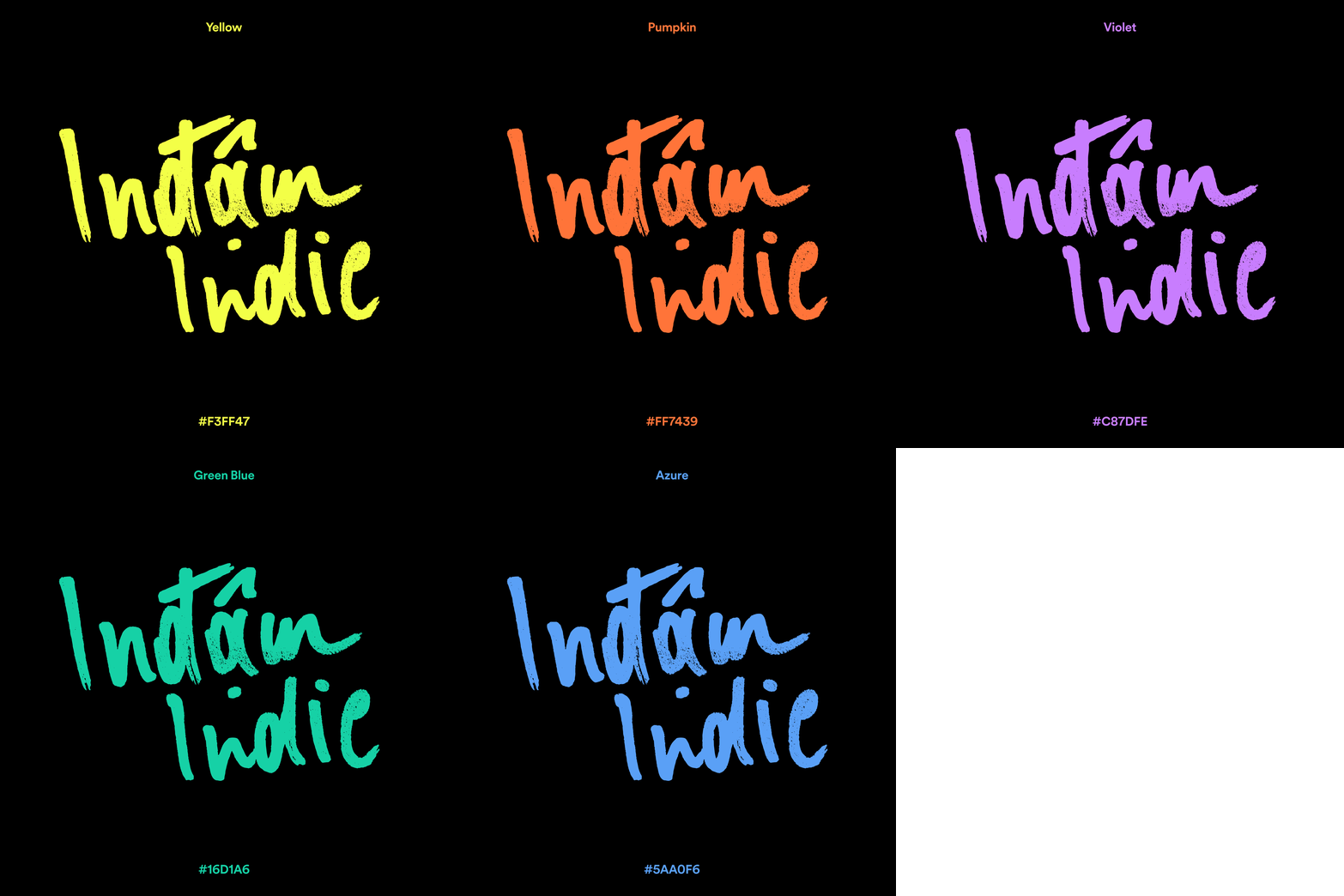
The Spotify Indam Indie playlist serves as the flagship for Vietnamese indie music on Spotify. In collaboration with local editors, a concept was crafted to deepen the connection with the main listeners and expand the playlist’s reach across borders. With this in mind, a concept was created to unite indie music lovers worldwide. For indie music, sometimes you and your guitar are enough to tell your individual story in a truly honest and pure way. It’s like sharing your cherished memories directly with your audience. Drawing inspiration from that puristic approach, these moments are visually brought to life with lo-fi, movie-like analog aesthetics, interpreted in a modern way. This led to a flexible cover design with custom handmade typography in combination with a new take on analog photography frame with double exposure picture treatments.
Credits
Made in collaboration with Studio Herrström.
Spotify
Shahin Haghjou
Michelle Pham
Loren Lee
Ho Quyen
Belle Tran
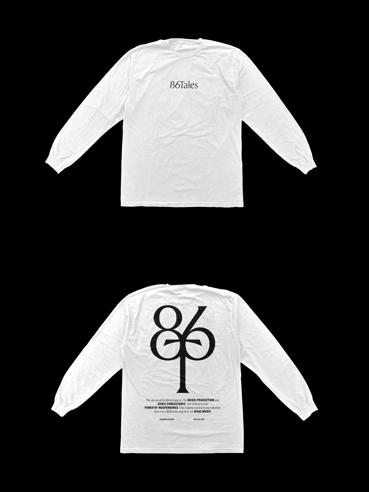
86Tales
A visual identity centered around a powerful symbol and wordmark helps the sound agency establish a unique appearance and allows collaborators to connect with their brand DNA.


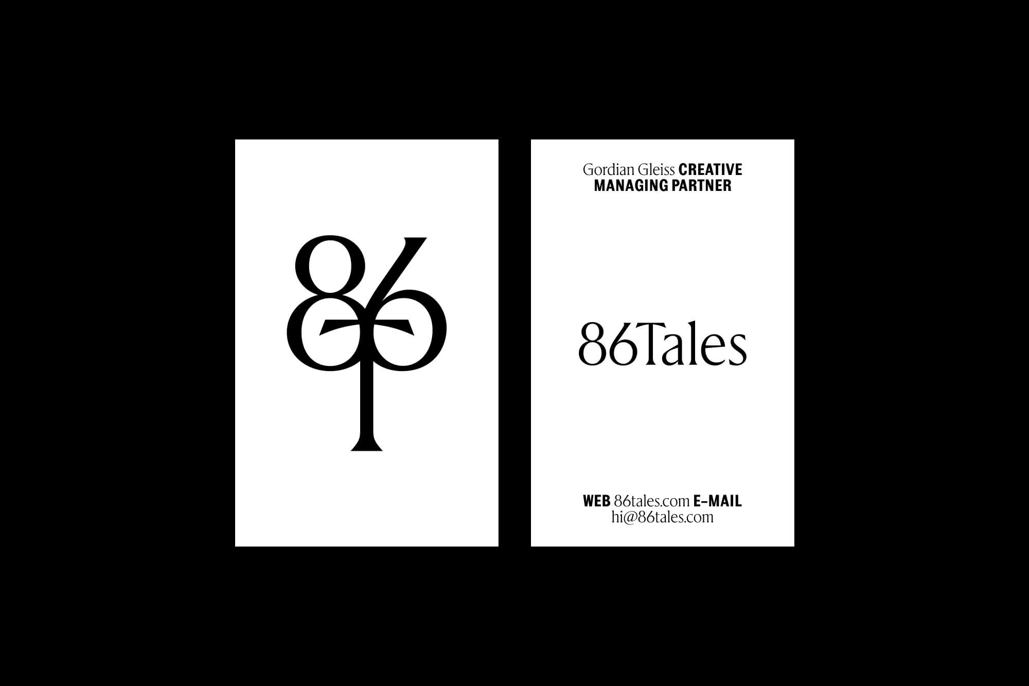


Project Information
86Tales is an artist-driven agency that offers music supervision and bespoke composition for commercials, TV, and film. The created branding is centered around a powerful symbol and wordmark, helping the agency establish a unique appearance that sets them apart from competitors and allows collaborators to easily recognize and connect with their brand. In addition to the minimalistic typography and black & white color scheme, powerful imagery from case studies perfectly rounds out the identity.
Credits
Made in collaboration with Hyperfocus.
Project Information
Colombian techno artist Human Machine Interface reached out to Lukas Haider to develop a release strategy and design for his full-length album, Futurespective. In collaboration with the artist, a comprehensive online experience was created to showcase the individual songs as a buildup to the entire album. The overall art direction was based on the theme of machines interacting with humans, expressing the tension between digital creations and organic human structures. This concept inspired the creation of two custom typefaces serving as main elements on the website, singles, and album artwork, along with the use of a duotone color palette representing these contrasting worlds.
Credits
Made in collaboration with Alexander Raffl.
Adana Twins Isolation
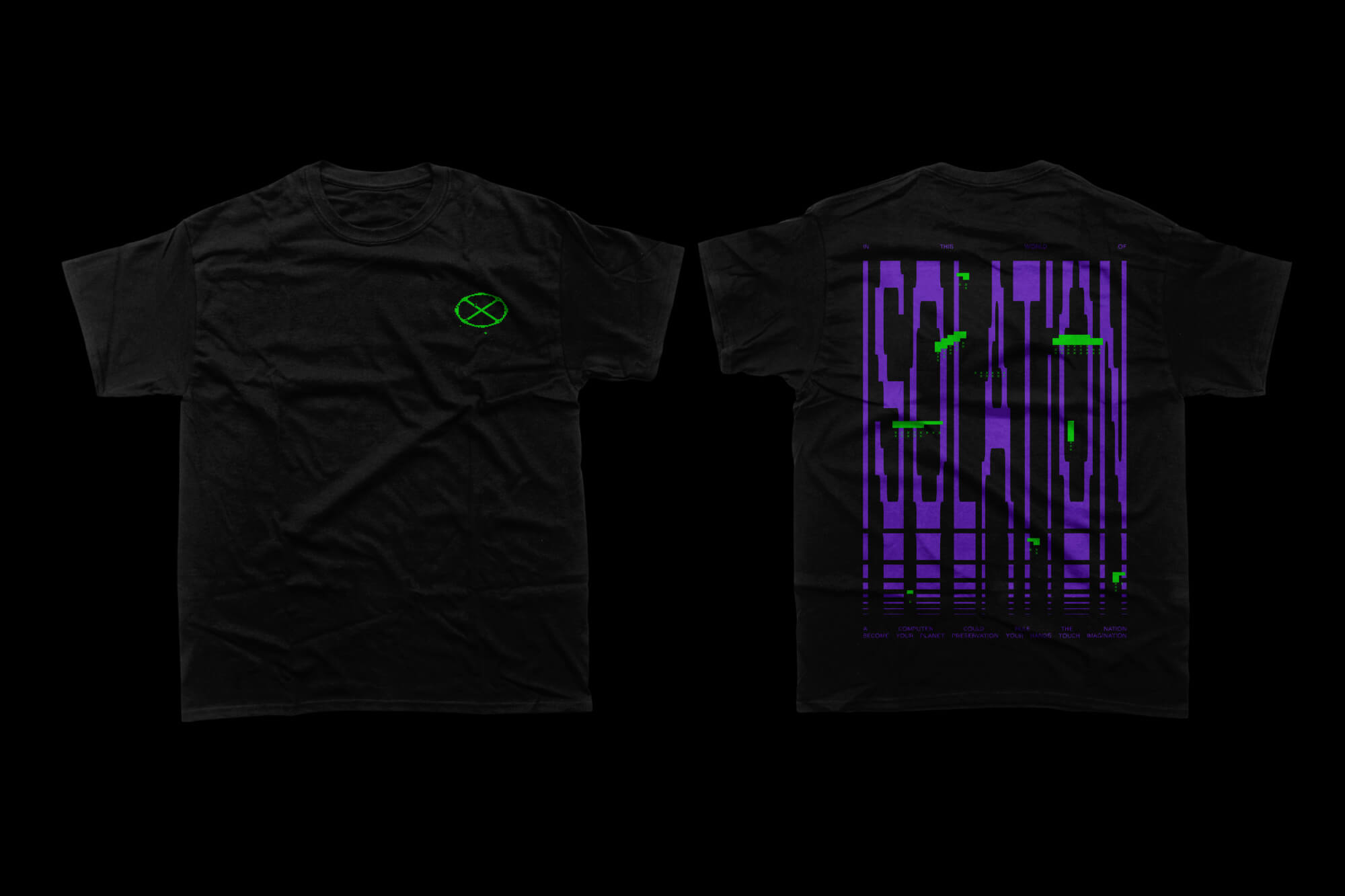
A lyric-inspired merchandise fan piece for the German DJ duo Adana Twins, brought to life both physically and digitally.


Project Information
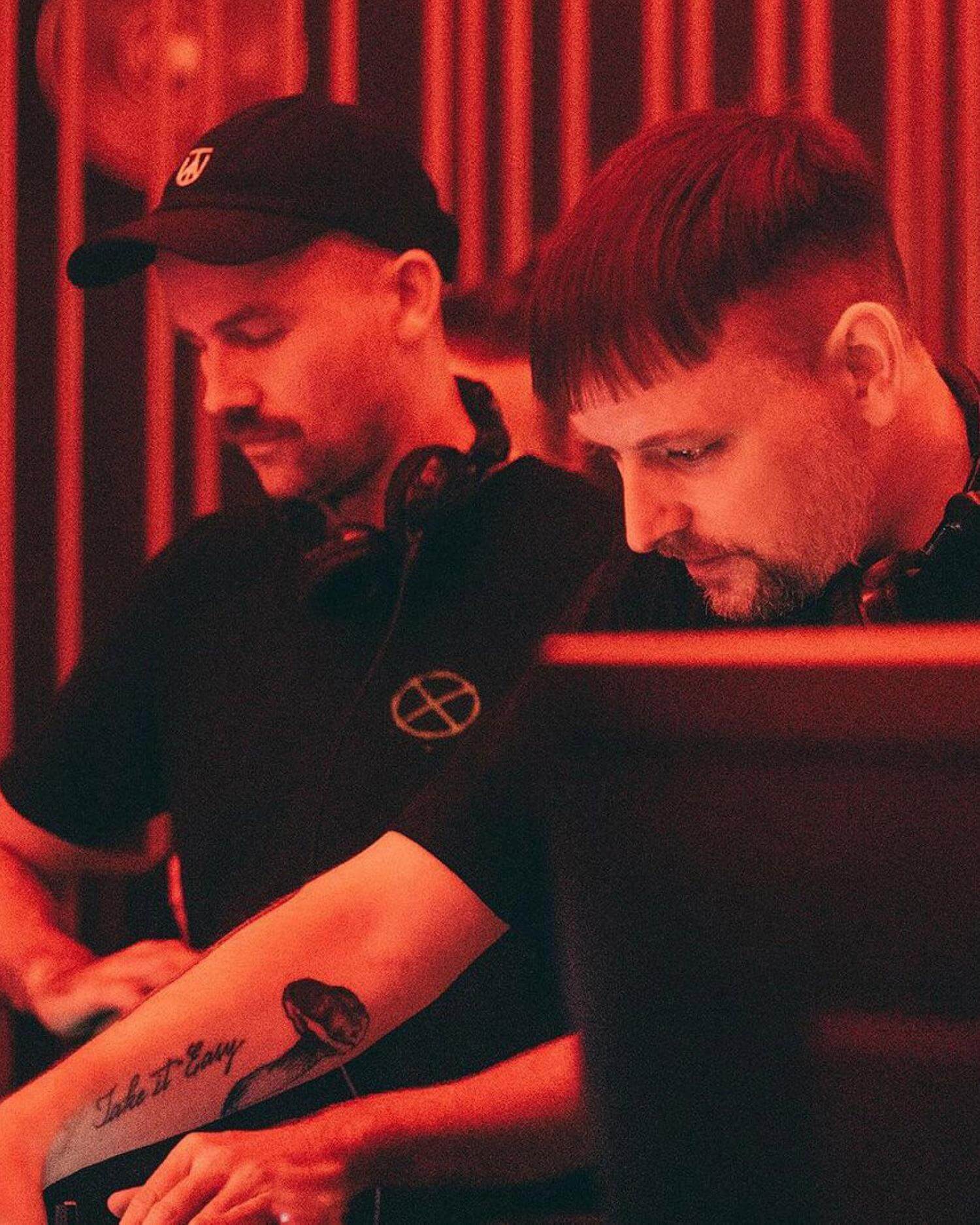
For over a decade, Lukas Haider has provided art direction and executed various projects for the German DJ duo, Adana Twins. The Isolation project highlights one of their collaborations. During the pandemic, Adana Twins & Glowal released a song named “Isolation”, which incorporates the lyrics “In this world of isolation, a computer could rule the nation”. As a giveaway for their fans, they wanted to create merchandise quoting the actual lyrics. Taking the apocalyptic scenario of machines taking over as inspiration for the art direction, a bold digital hacker-style visual world was created, coming to life not only on the T-shirt but also as a digitally animated version serving as promotional pieces on social media.
For over a decade, Lukas Haider has provided art direction and executed various projects for the German DJ duo, Adana Twins. The Isolation project highlights one of their collaborations. During the pandemic, Adana Twins & Glowal released a song named “Isolation”, which incorporates the lyrics “In this world of isolation, a computer could rule the nation”. As a giveaway for their fans, they wanted to create merchandise quoting the actual lyrics. Taking the apocalyptic scenario of machines taking over as inspiration for the art direction, a bold digital hacker-style visual world was created, coming to life not only on the T-shirt but also as a digitally animated version serving as promotional pieces on social media.




Project Information
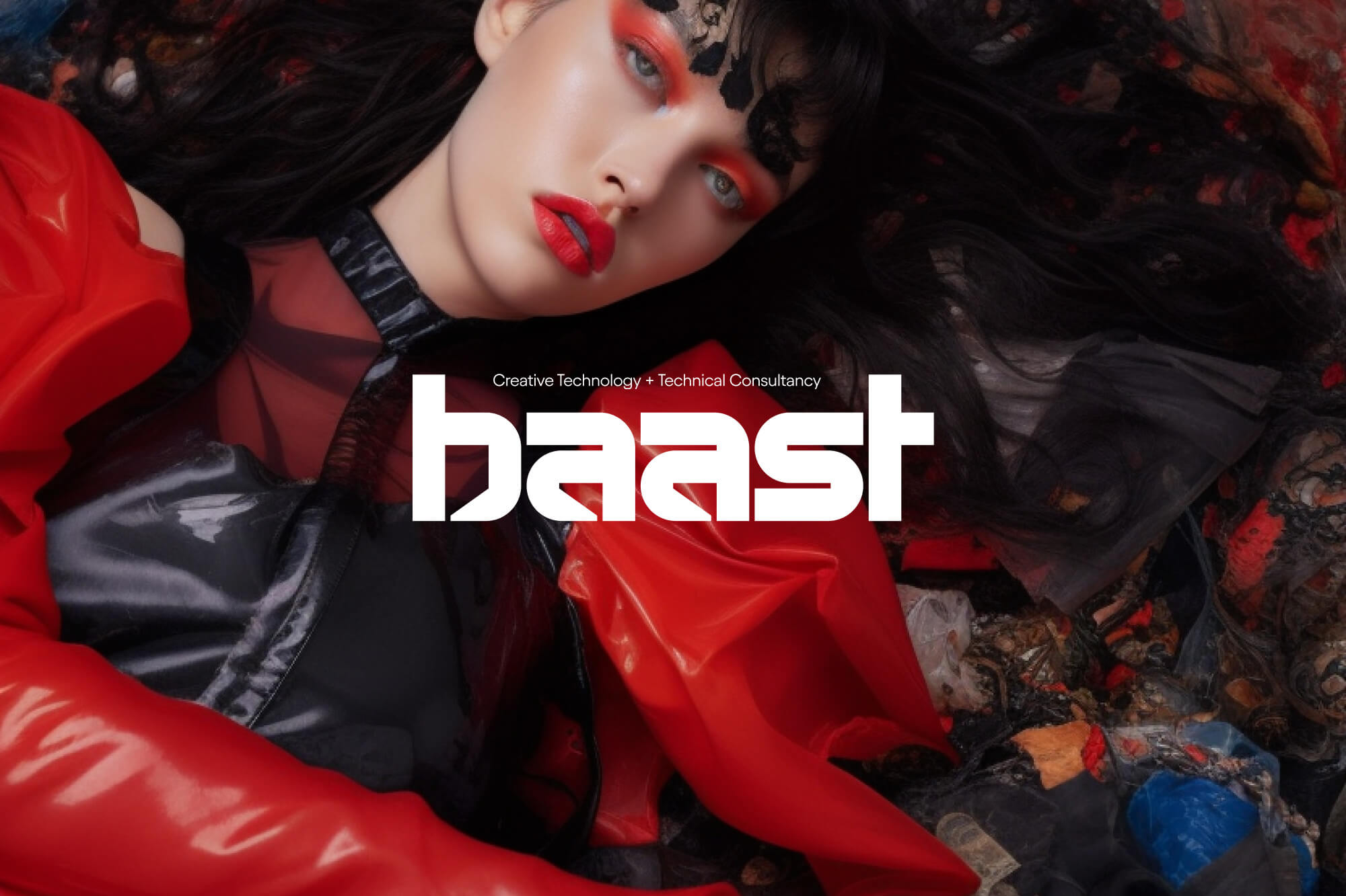
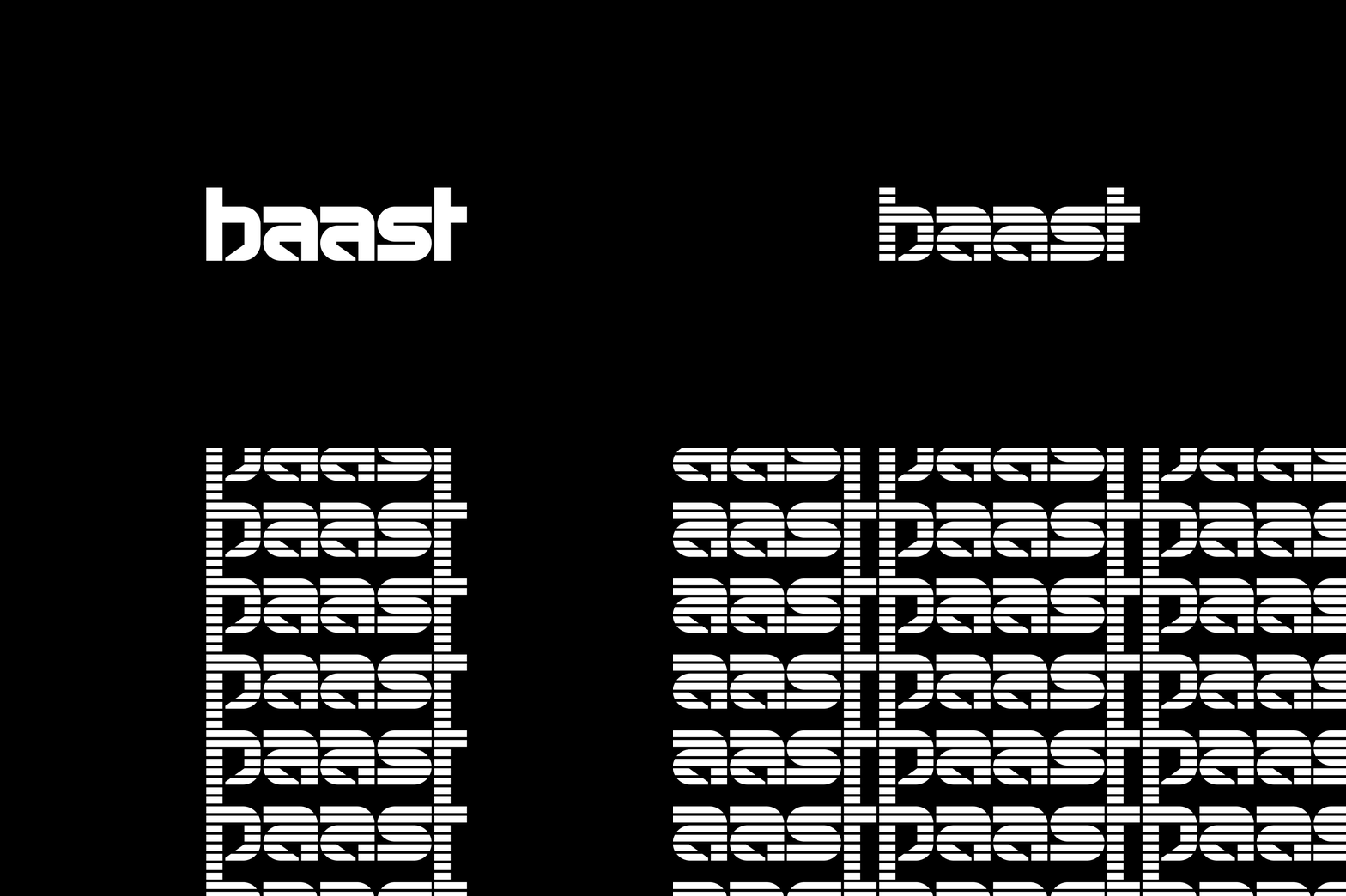
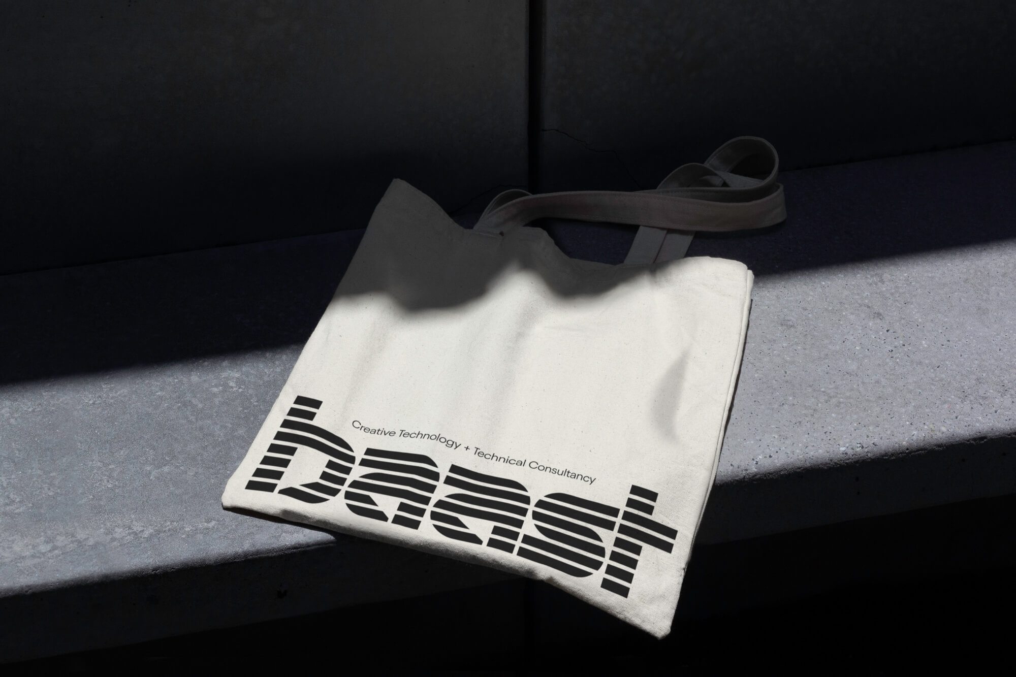
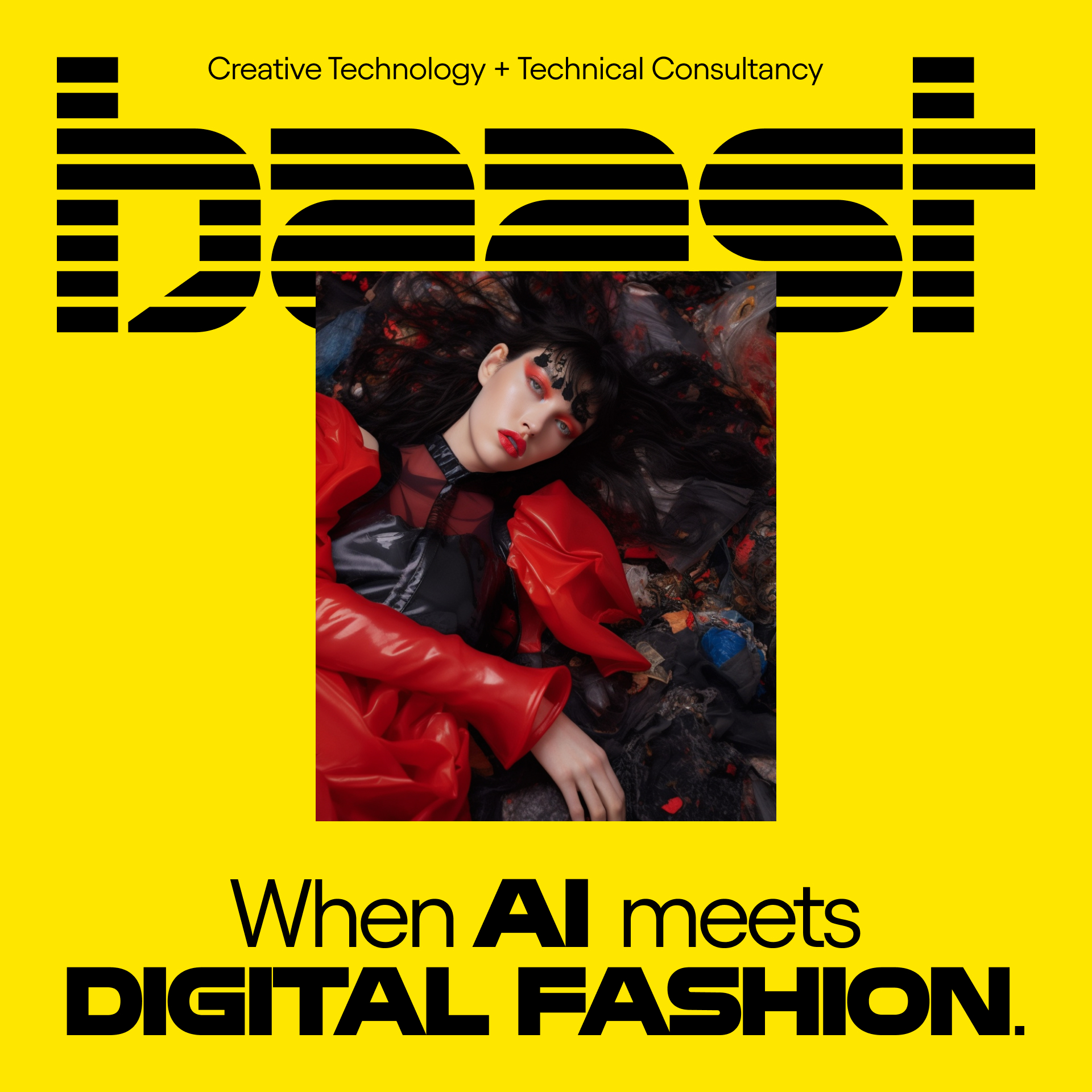
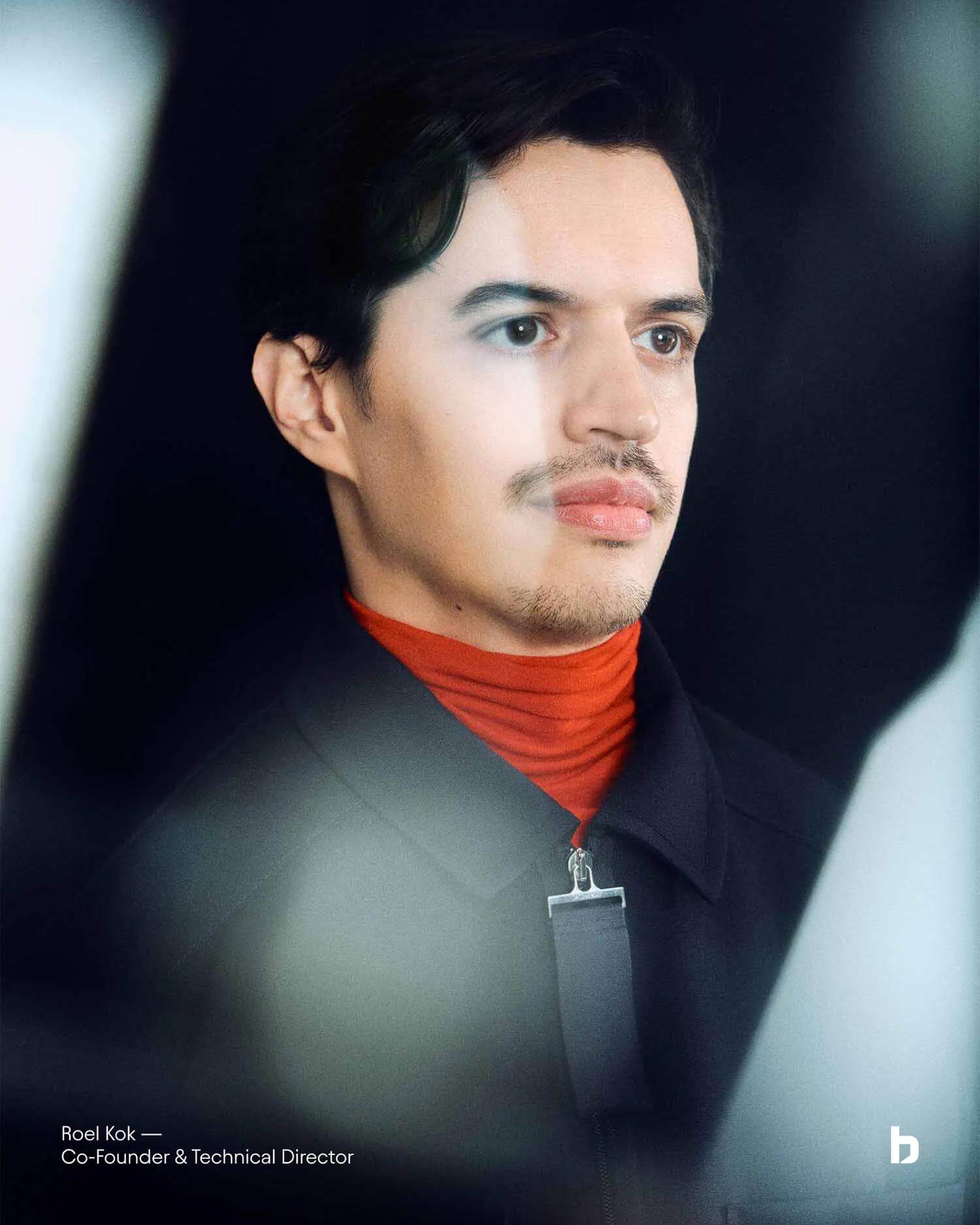
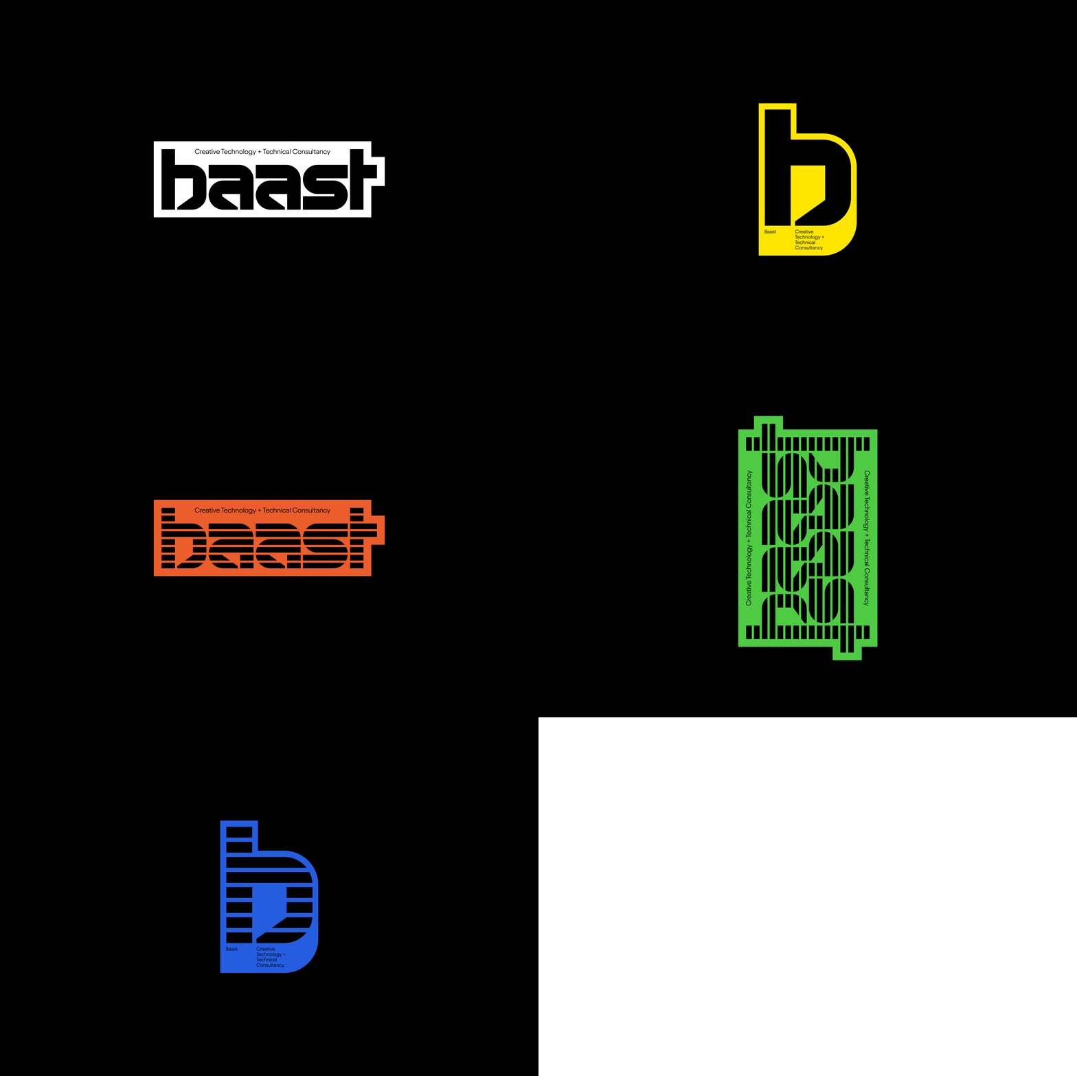
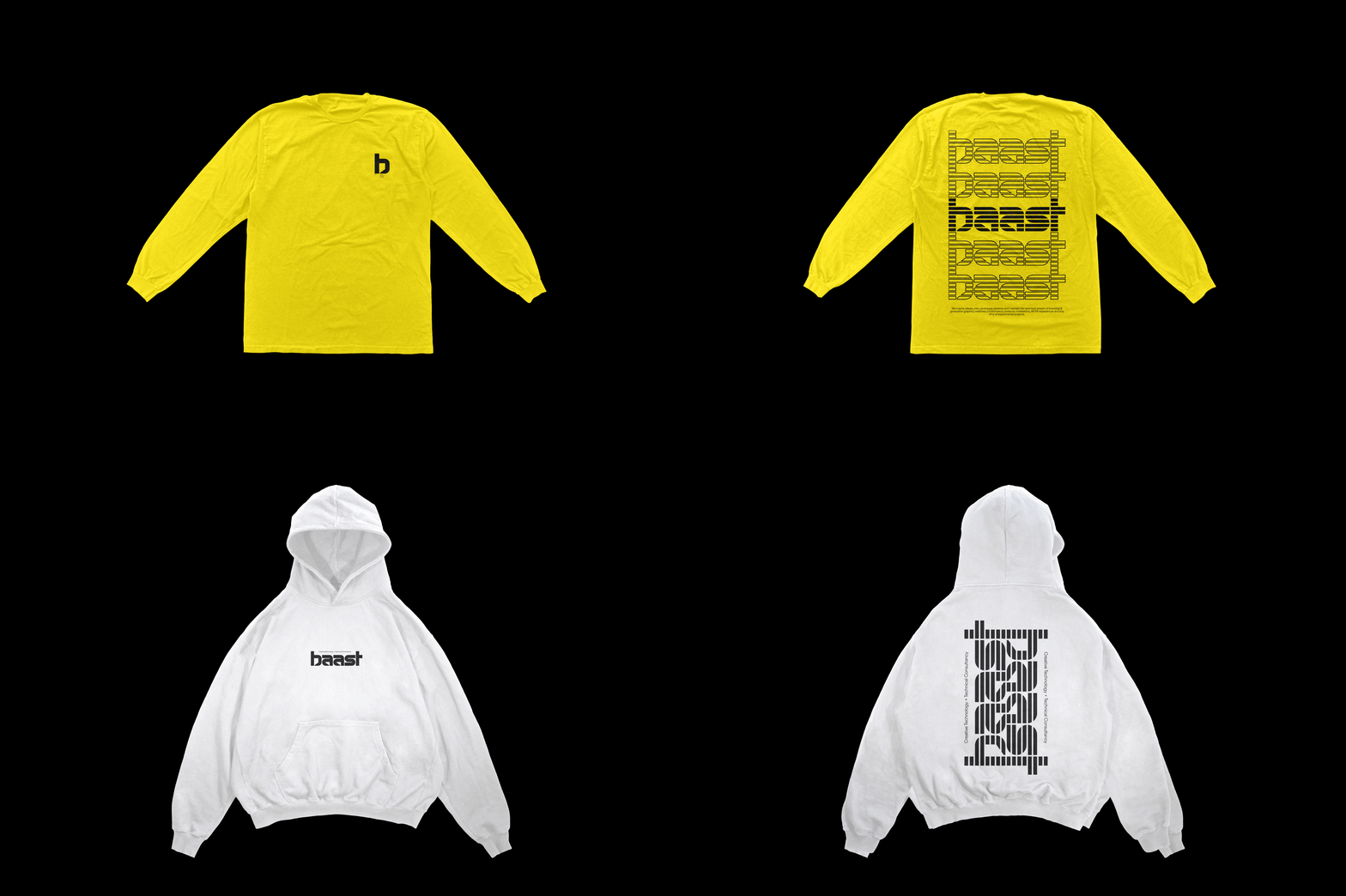
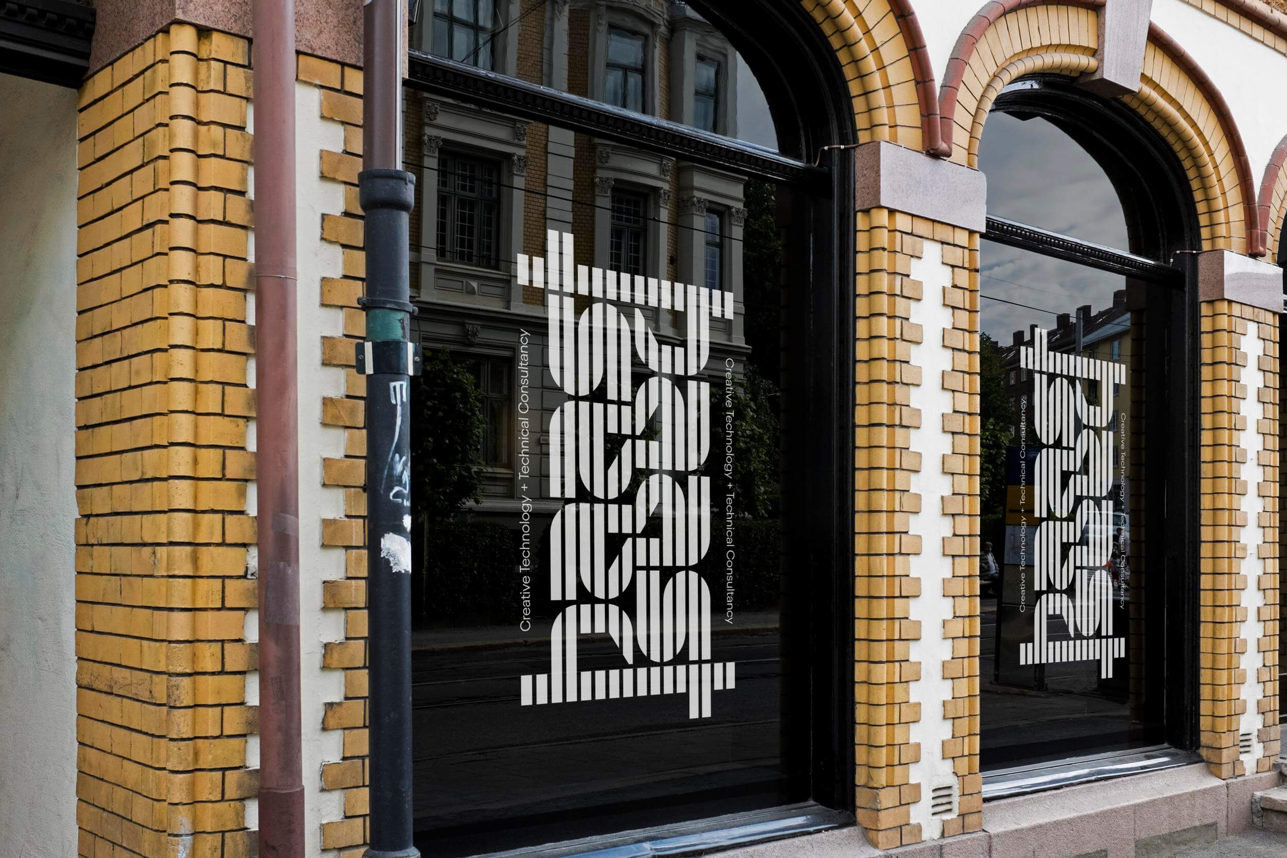
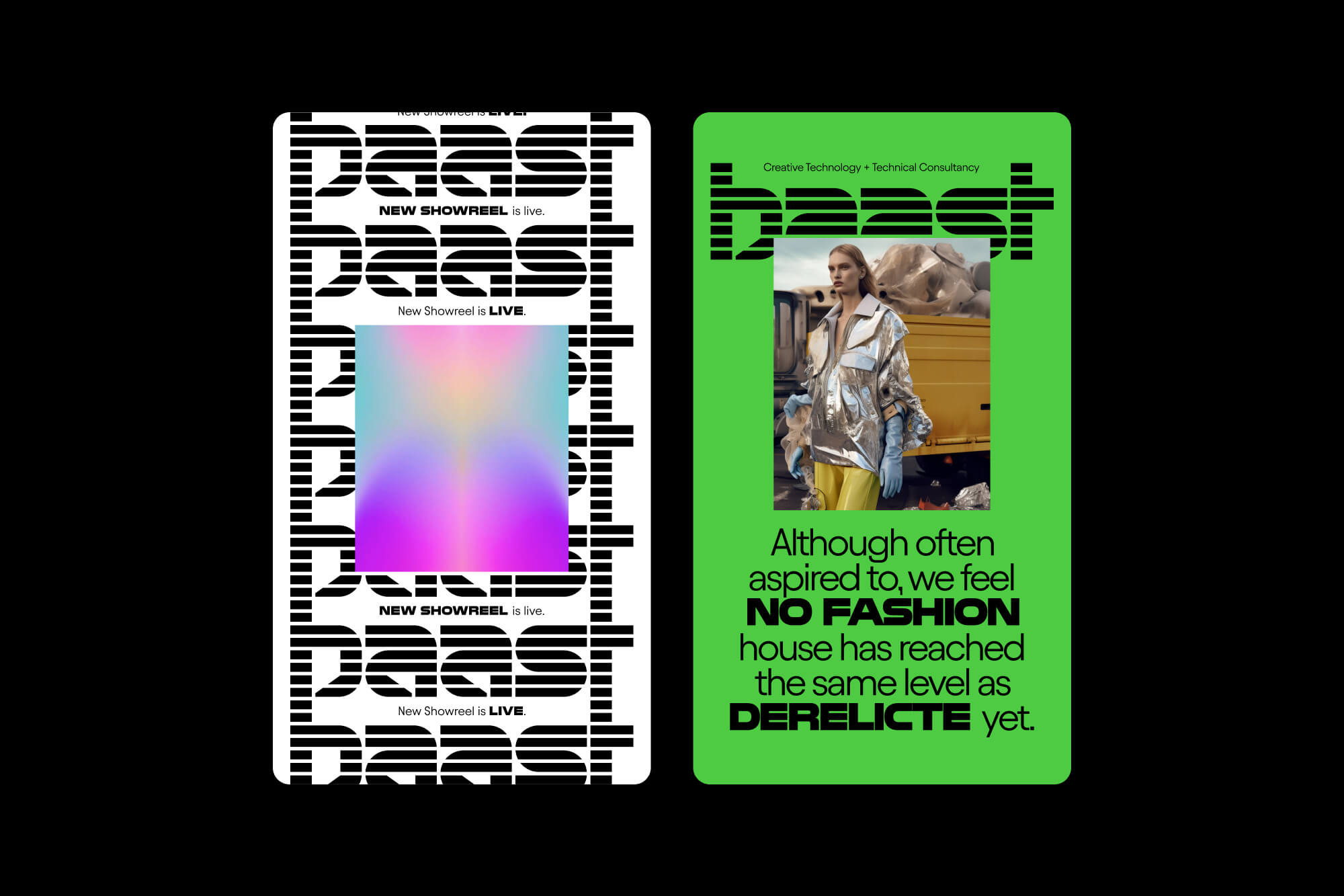
Baast is a creative technology and tech consultancy based in Amsterdam. The duo partners with brands and creatives to bring ideas to life using state-of-the-art technology. To showcase their work and communicate their expertise, they have enlisted the help of Lukas Haider for strategic branding and web design. In-depth conversations with the duo led to a fun approach to the actual redesign, which can be summarized as a modern fusion of IBM and retrofuturism car racing aesthetics, speaking for innovation with style. The holistic branding is able to express itself in its simplest form with a unique custom logo and extends itself with patterns and frames to highlight the work created, as well as to communicate their values throughout digital and physical touchpoints.
Credits
Portrait photography by Maria Bodil.
Peace
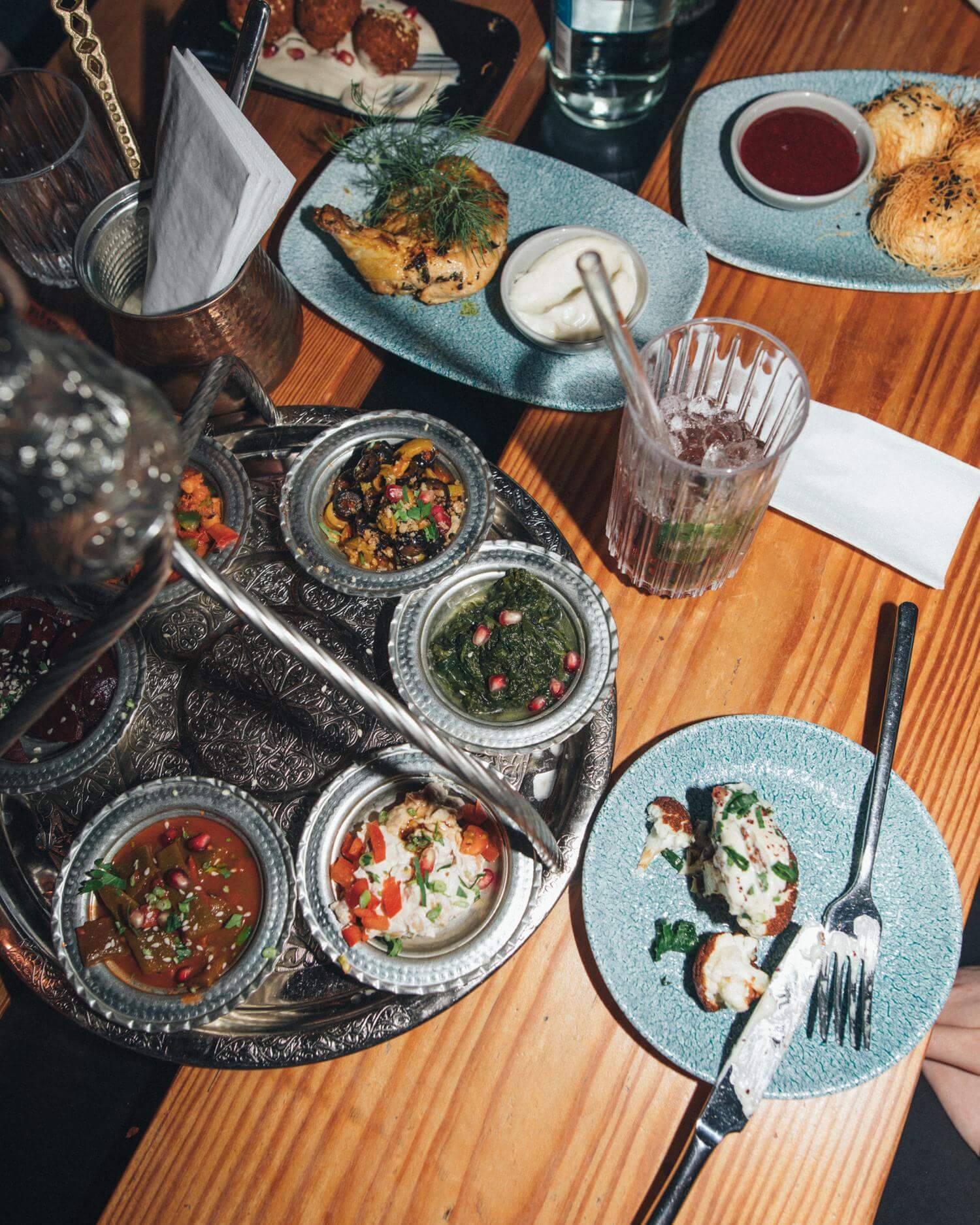
Experience the flavors of the Levant at Peace, a Hamburg-based restaurant in the prestigious Karolinenviertel district. A place where everyone is welcome, and food is meant to be shared.








Project Information
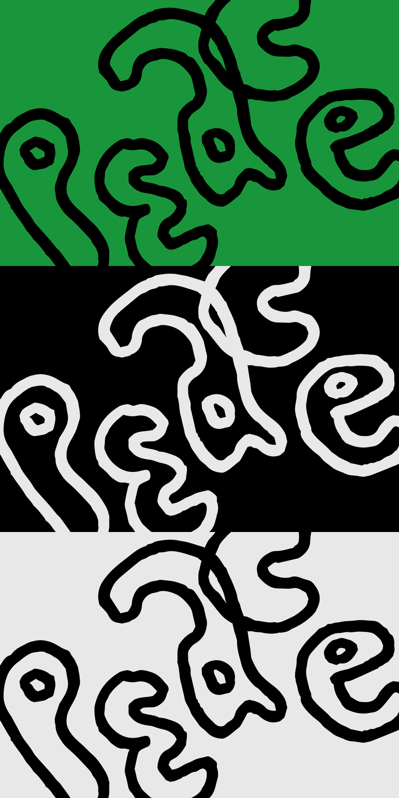
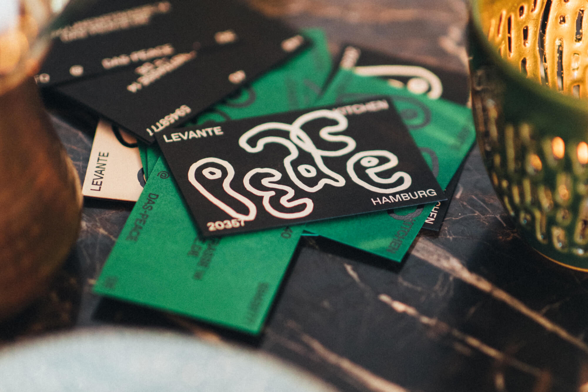
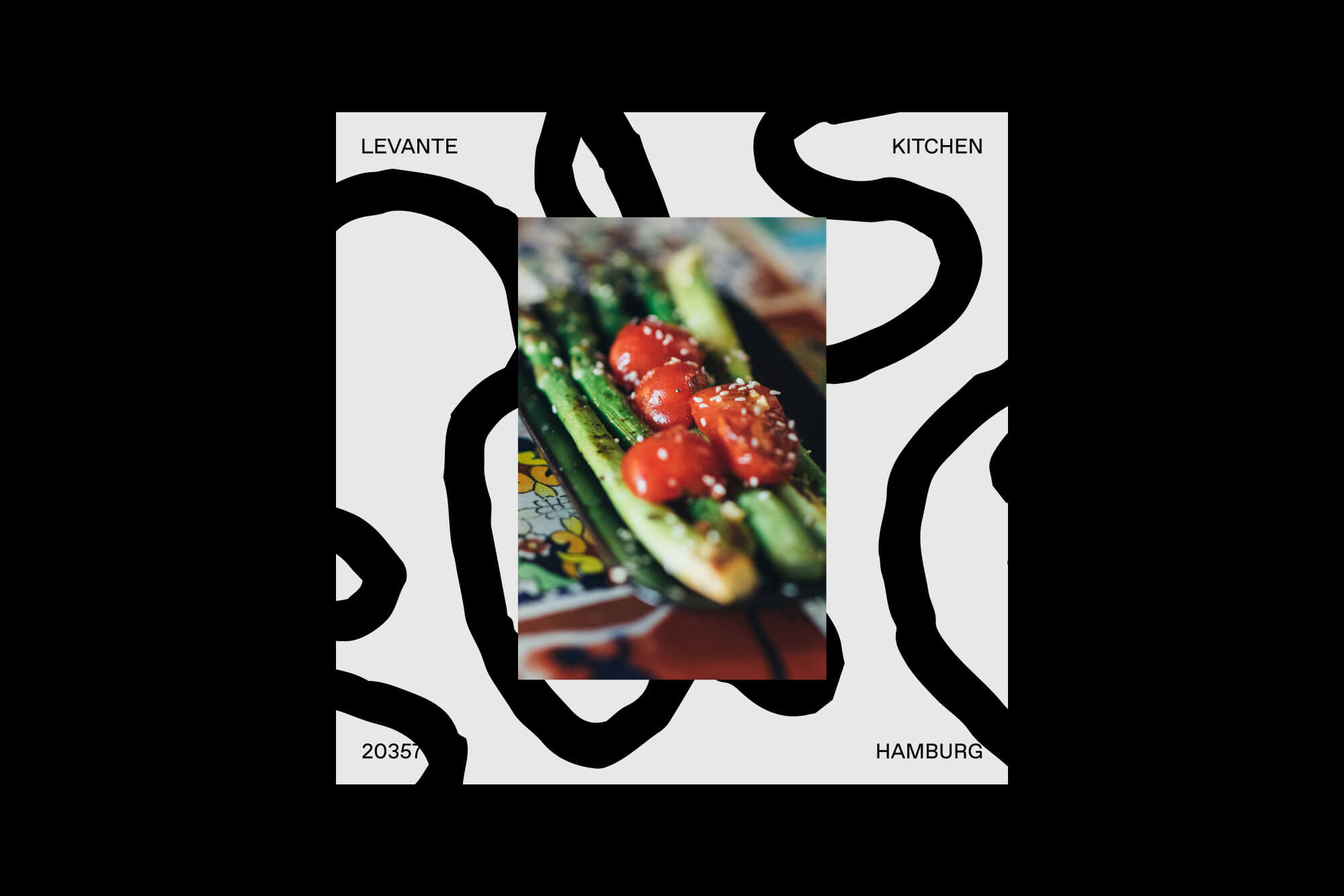
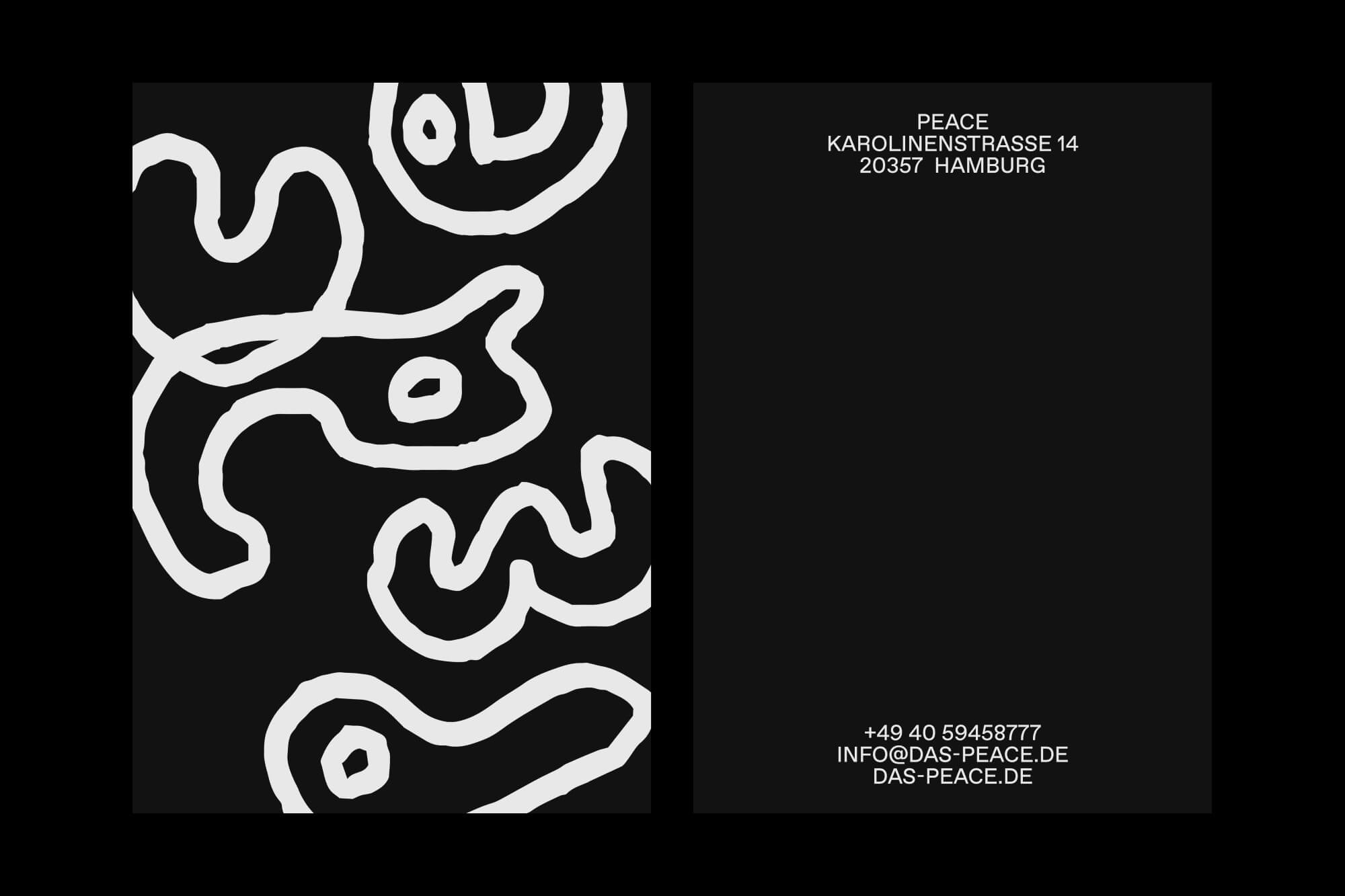
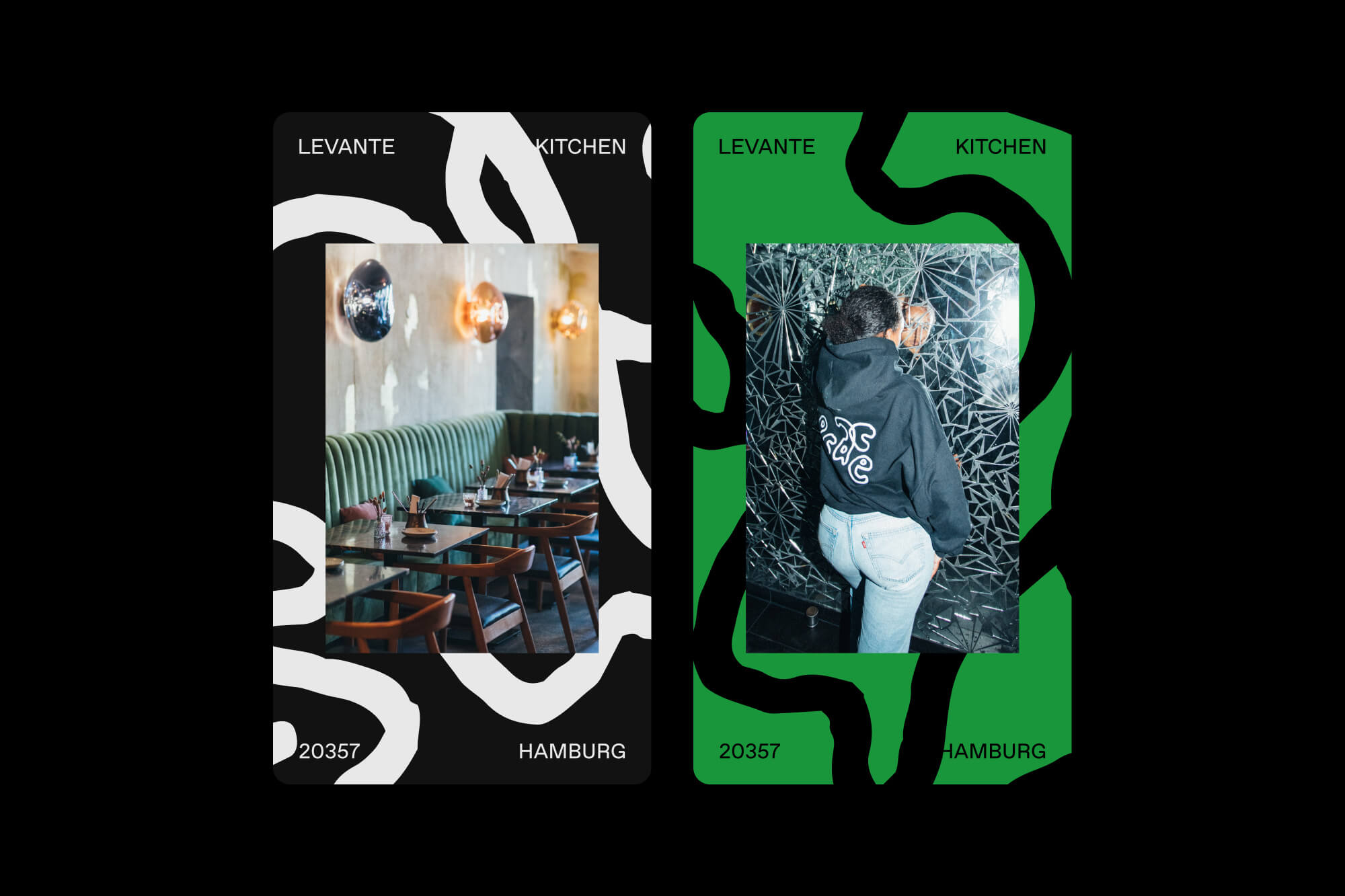
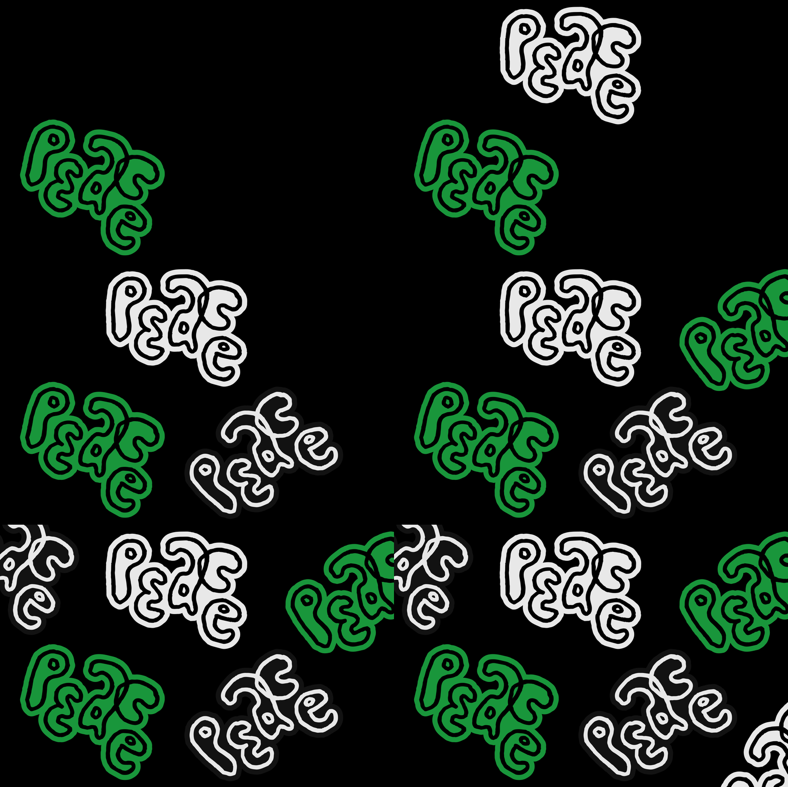
Peace is a Levant restaurant located in the prestigious Karolinenviertel district in Hamburg, Germany. The restaurant offers a wide range of dishes that are not only delicious but also visually stunning when presented on the table. This food is meant to be shared and enjoyed with all your friends together. The name "Peace" communicates that everybody is welcome in this place. This positive message was interpreted by Lukas Haider through a custom, hand-drawn logotype. Additionally, a color scheme matching the restaurant’s interior was carefully selected and integrated into a cohesive brand system, including digital assets and various physical executions.
Credits
Photography by Mario Ilic.

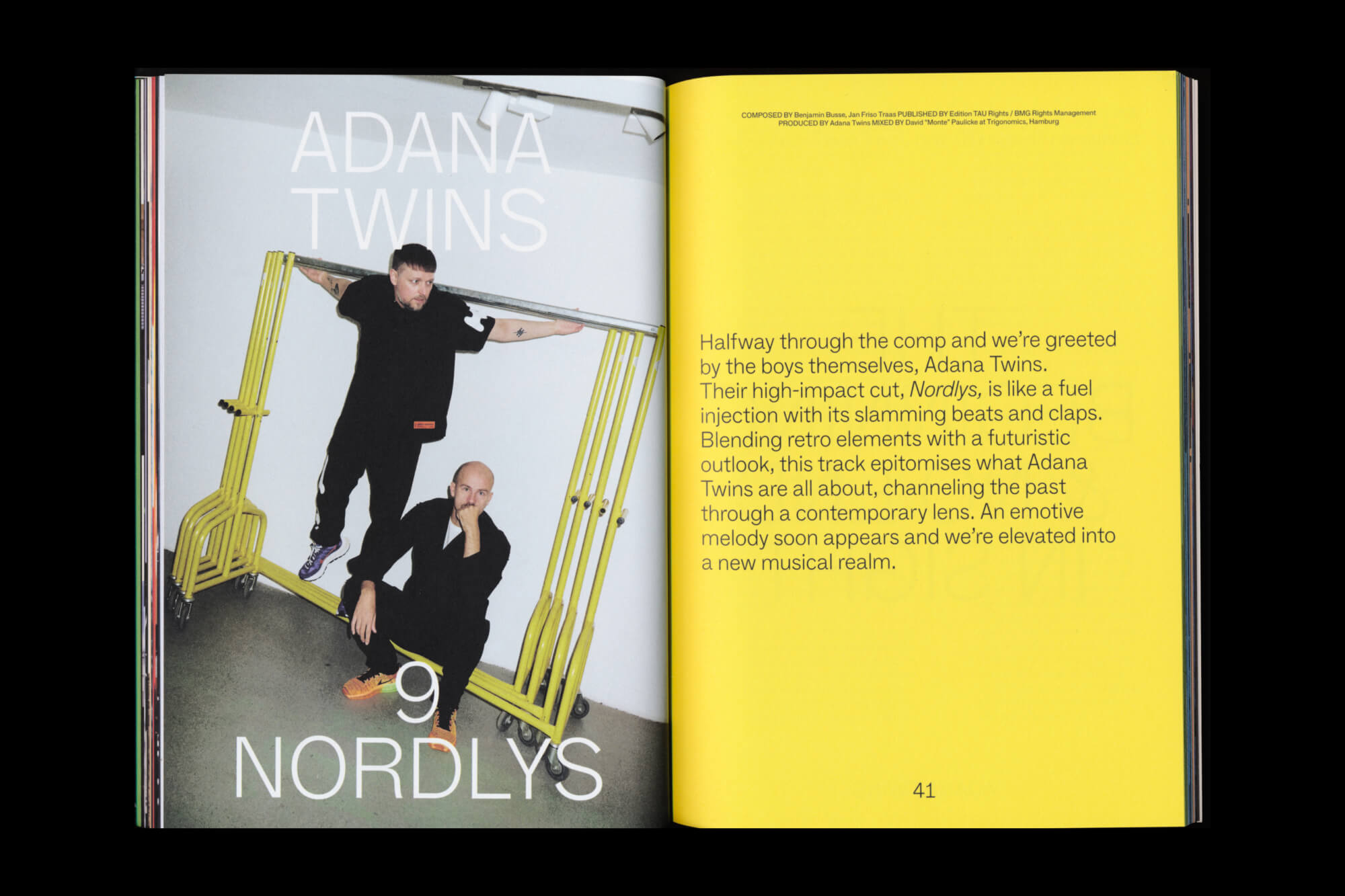
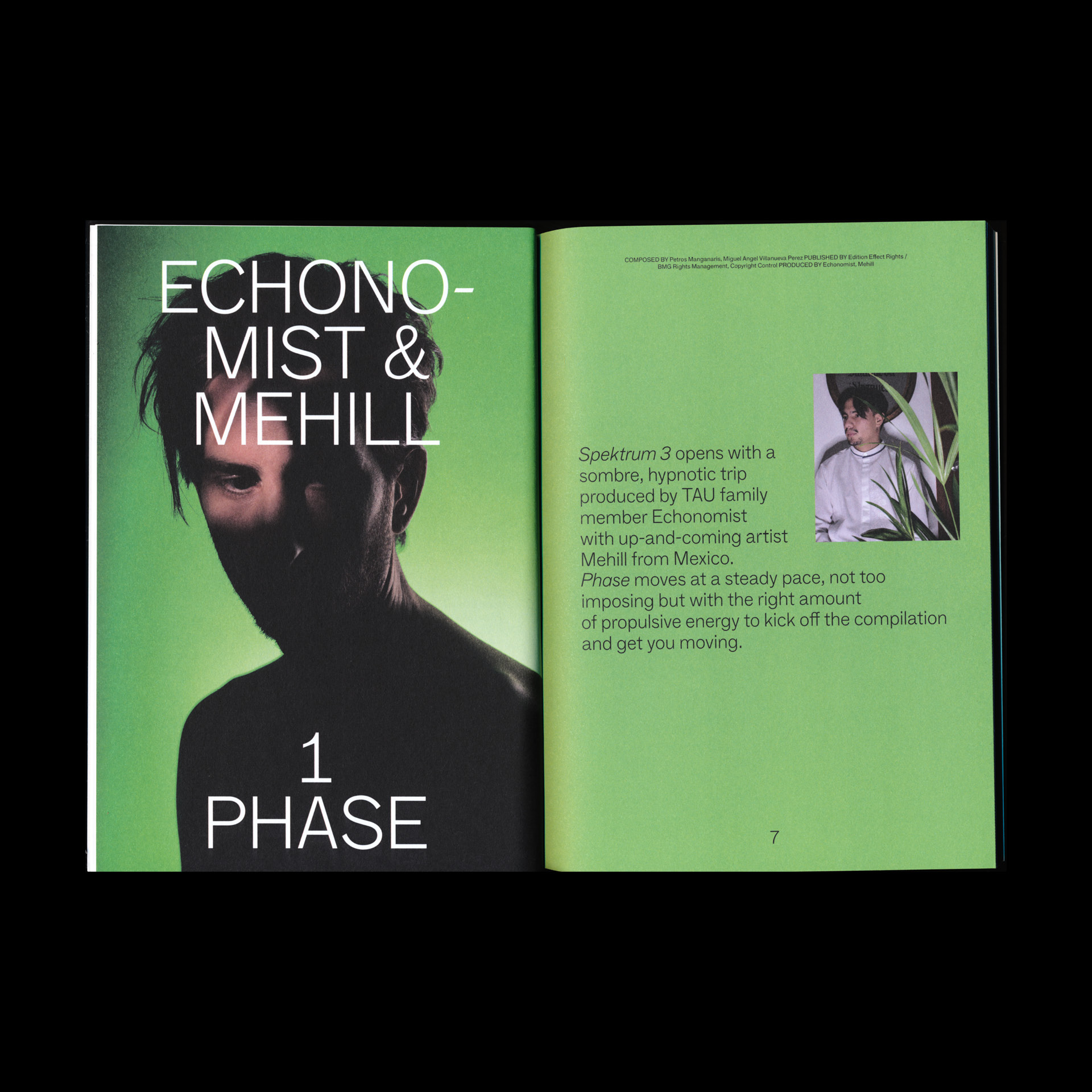
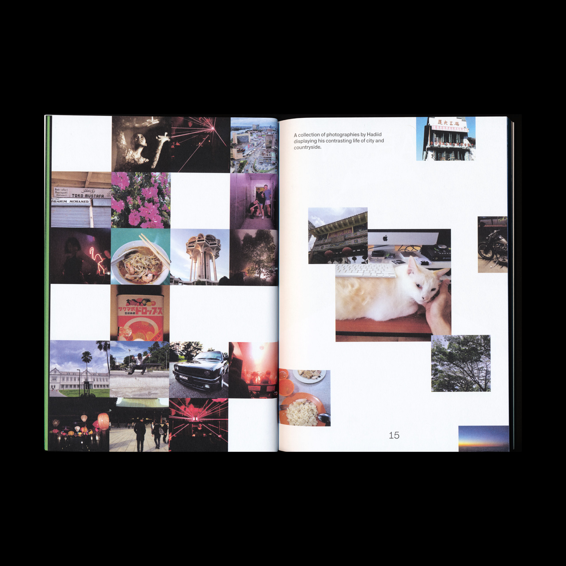
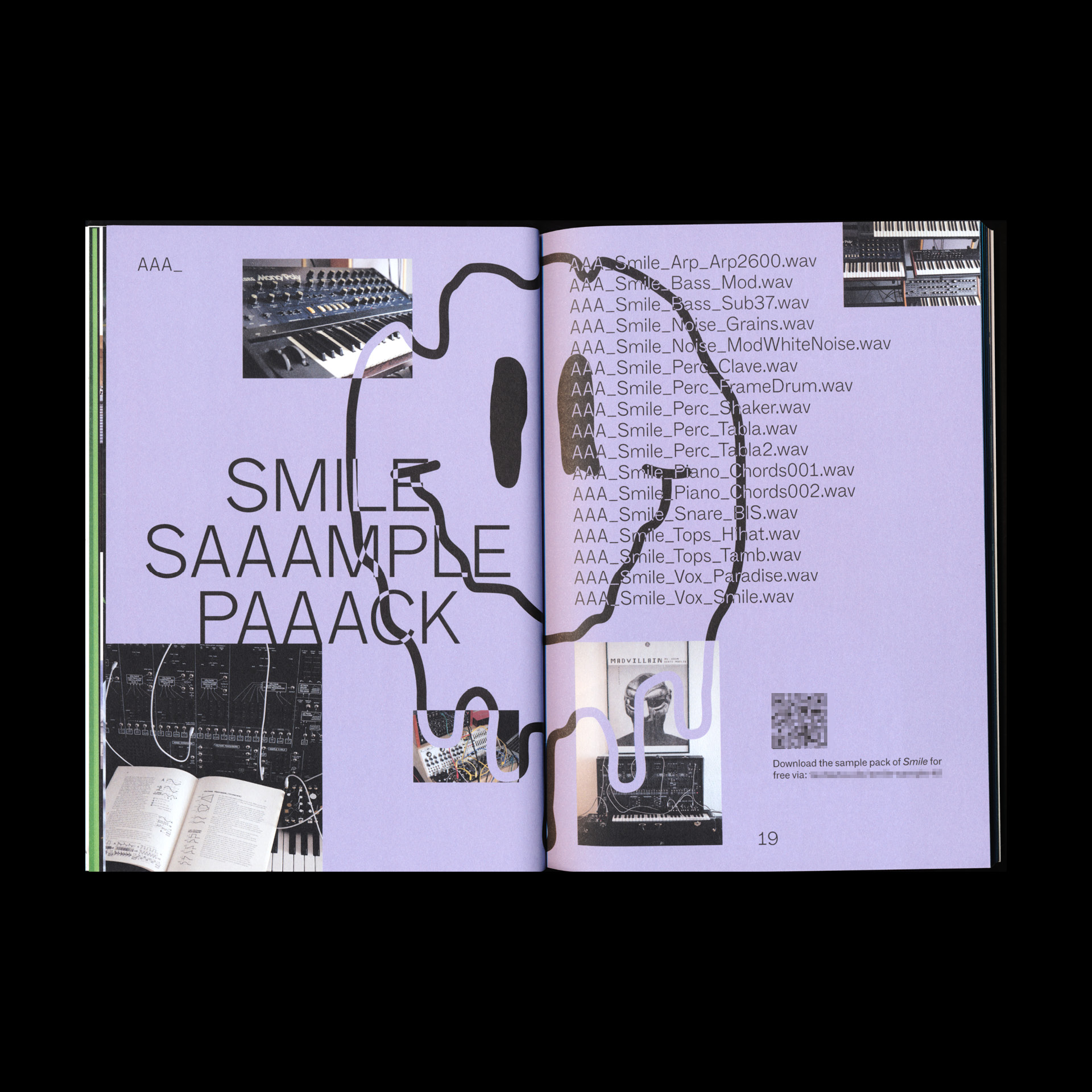




Project Information
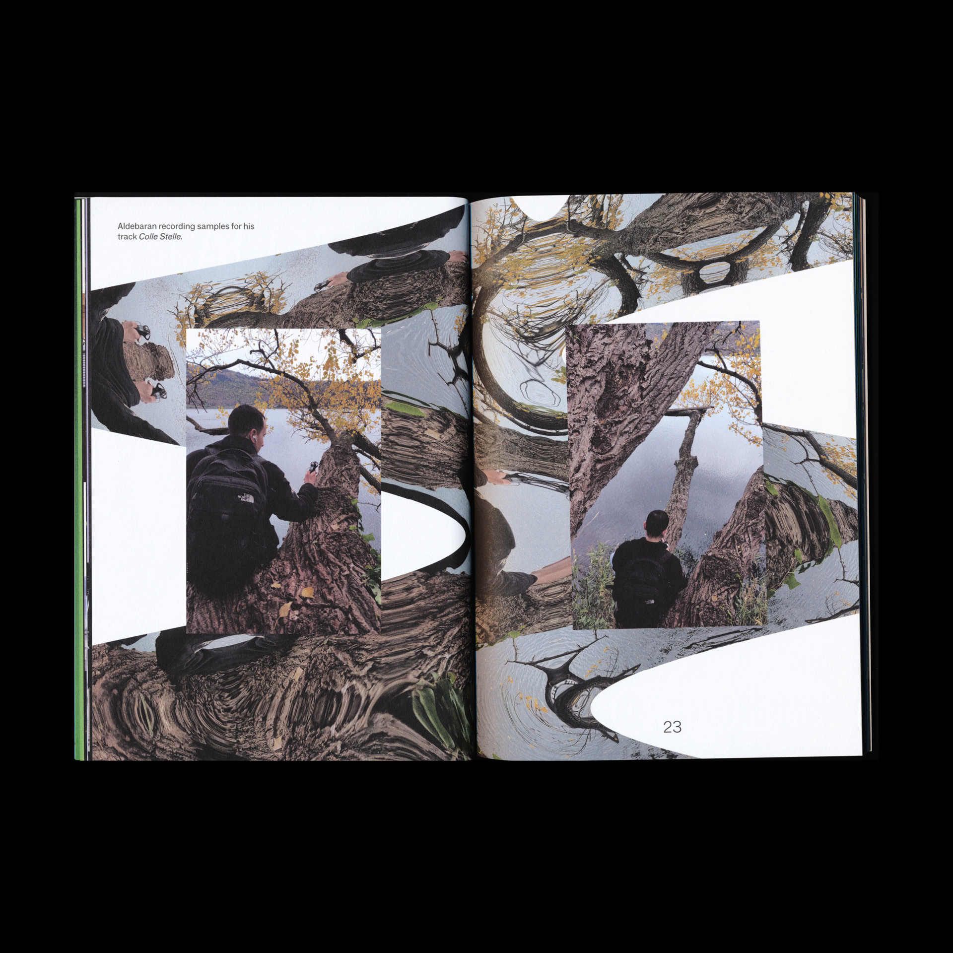
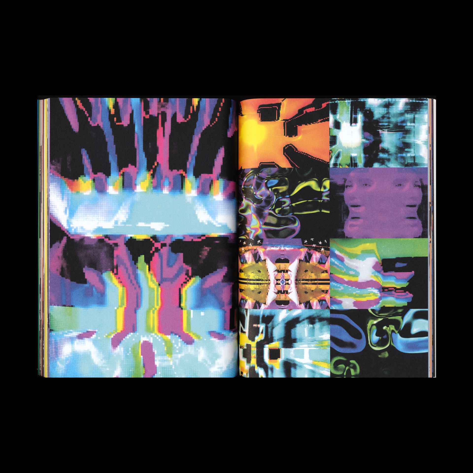
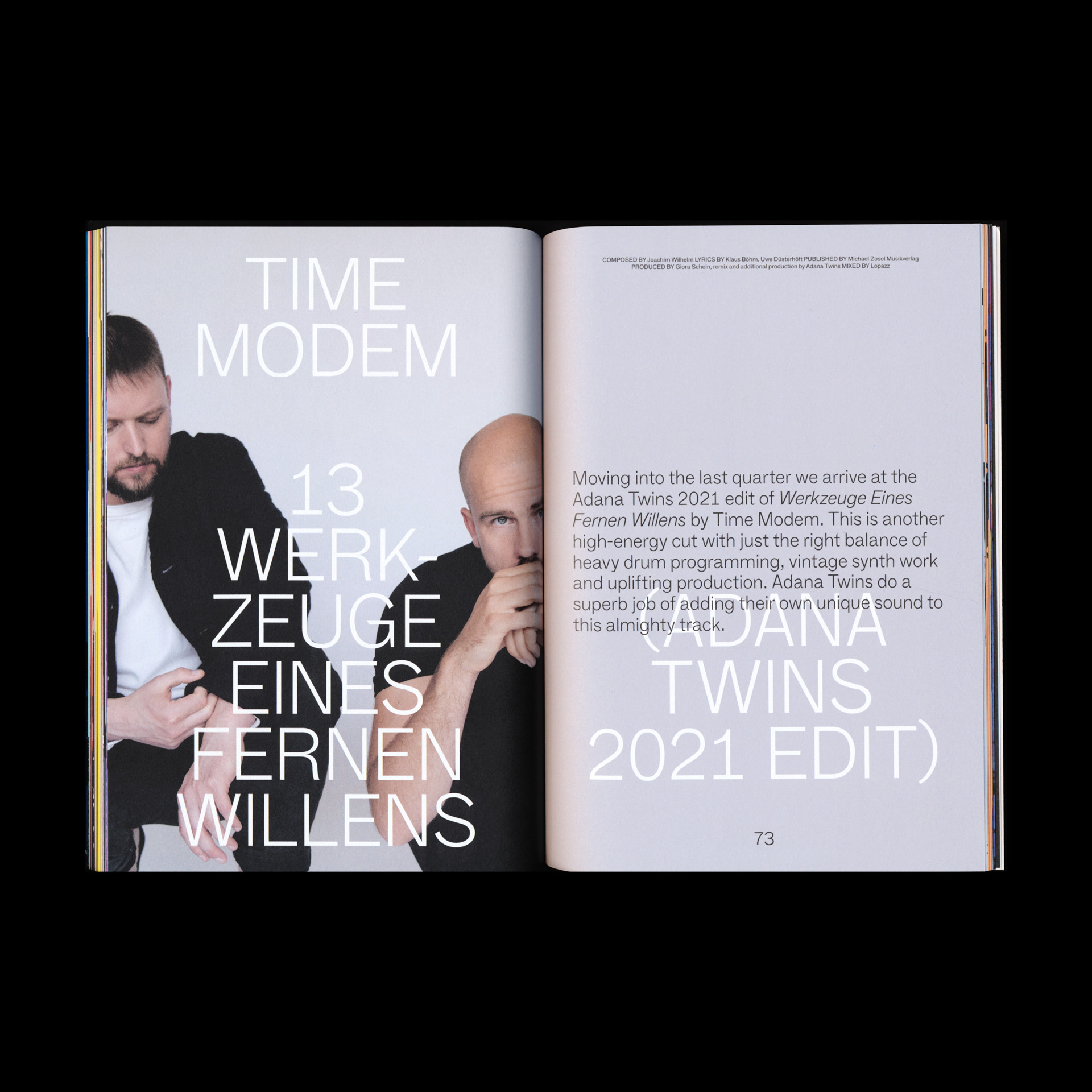
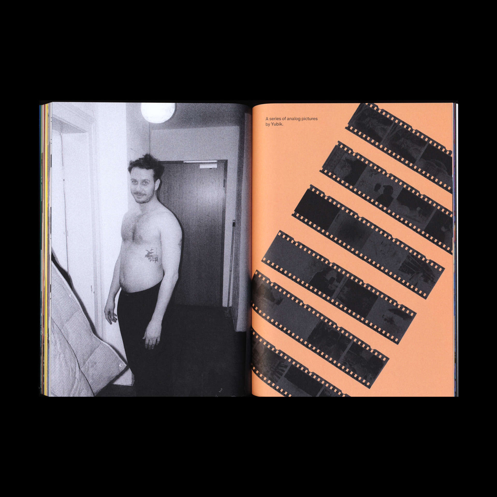
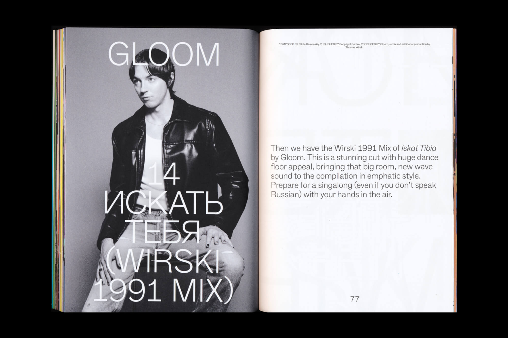
“Spektrum 3” is the third installment in its series, where Lukas Haider challenges conventional music release methods in collaboration with the German record label TAU. In this music compilation, every contributing artist is visually represented uniquely to match the individual song’s mood and statement within a 100+ page magazine. The cover is printed on special holographic paper, showcasing a beautiful color spectrum in reference to the thematic title. Each publication includes a personal download code for the compilation, redeemable on the TAU webshop. Various digital teasers were created ahead of the actual release to promote the physical product in the digital space as well.
Credits
3D by Computer Vincent.
TAU Spektrum 2
A special double audio tape release serving as a reminder to reconnect and deep dive with artists and their creations as in the old days.


Project Information
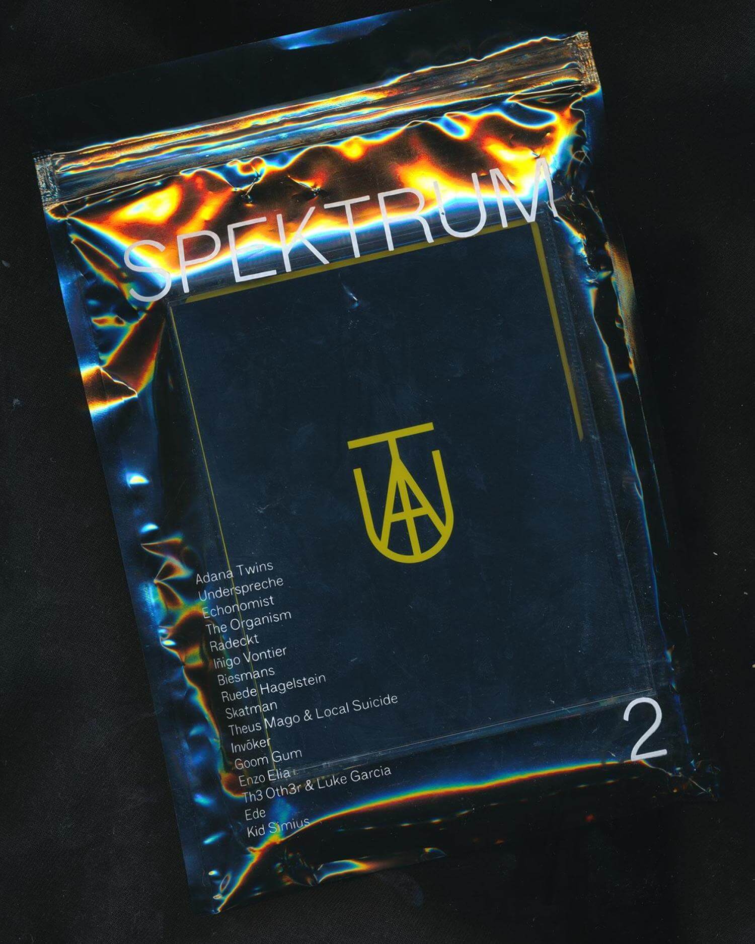
“Spektrum 2” is the second installment in its series, where Lukas Haider challenges conventional music release methods in collaboration with the German record label TAU. In this music compilation, a double-audio tape was used as a counterpart to the fast-paced streaming world in order to reconnect with artists and their creations. The tape was packed in a transparent case with a silkscreen print showcasing the participating artists, making it a must-have for every superfan.
Credits
Teaser video by Henry Bigalke.
UNKNOWN
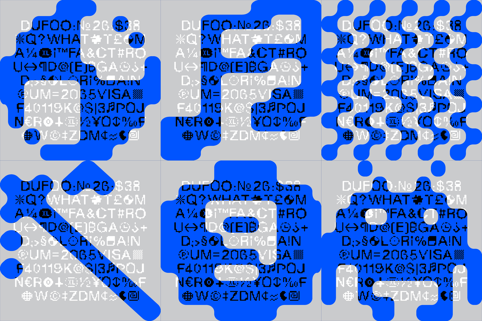
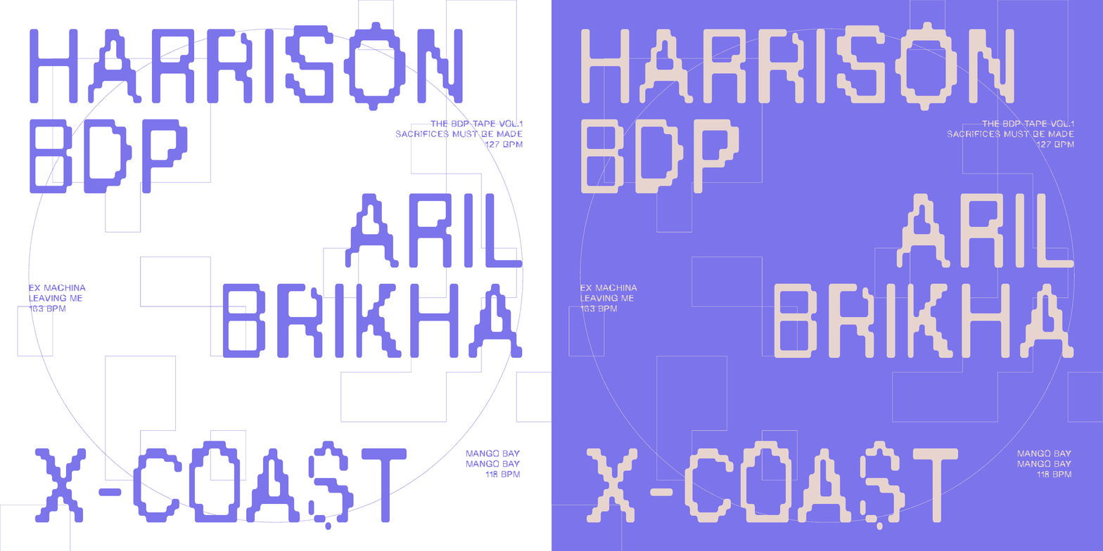
A free contemporary display typeface.











Project information
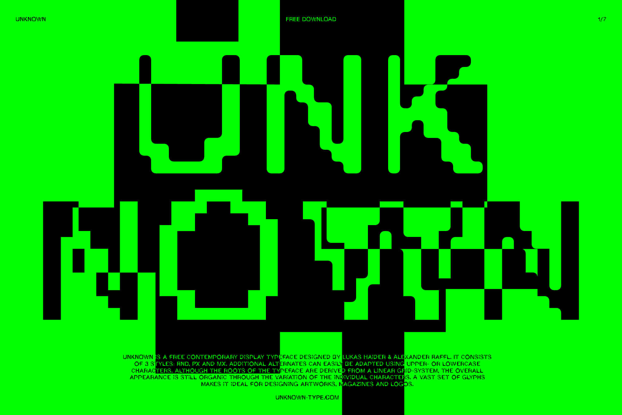
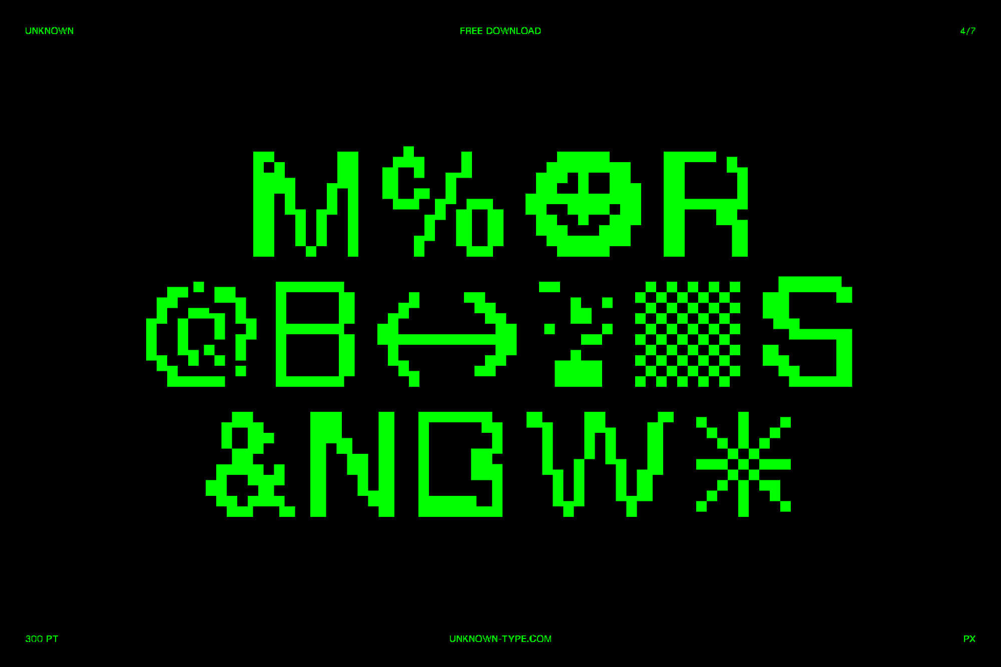
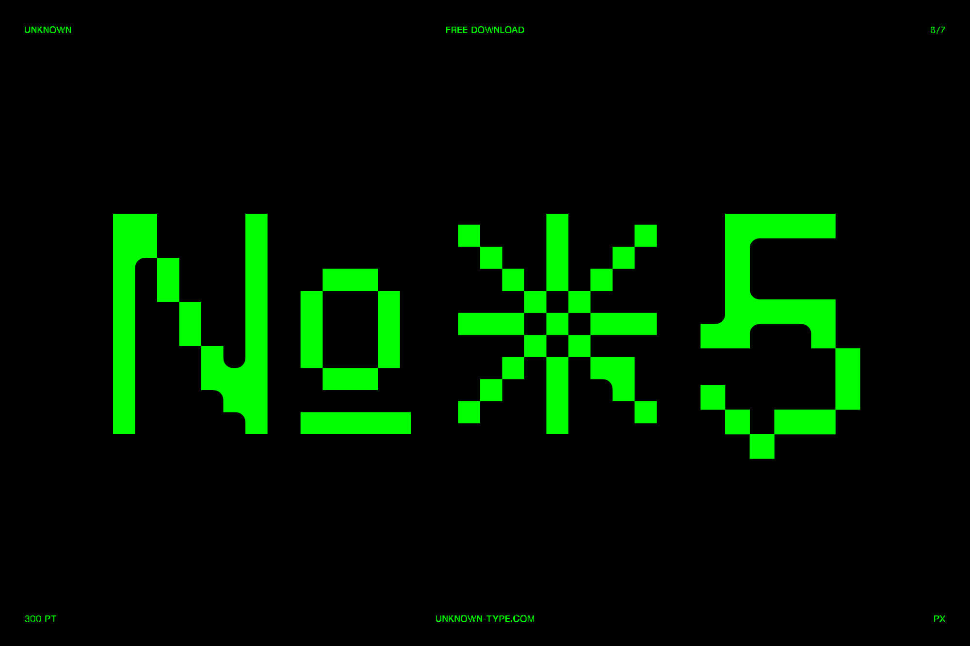
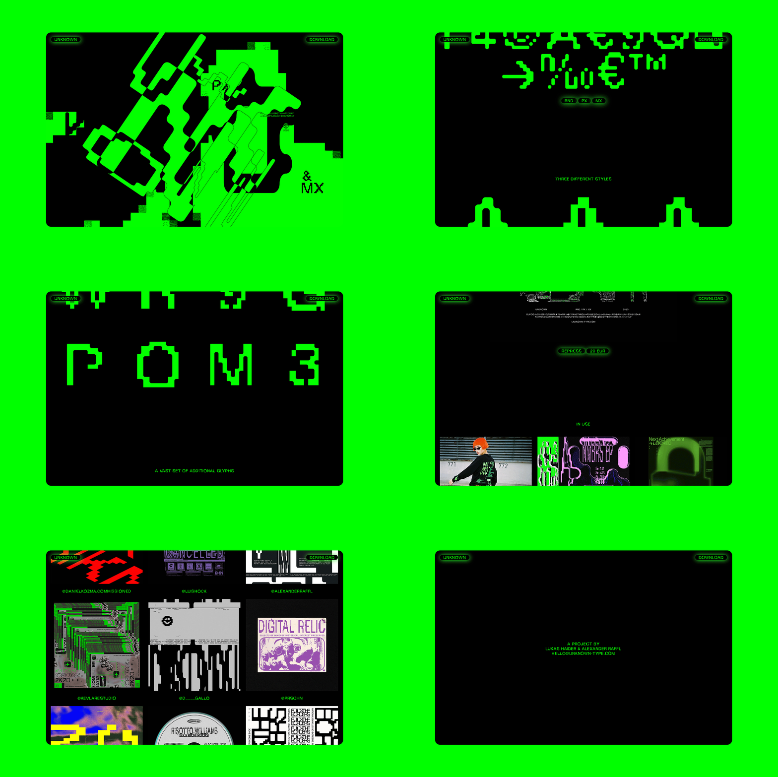
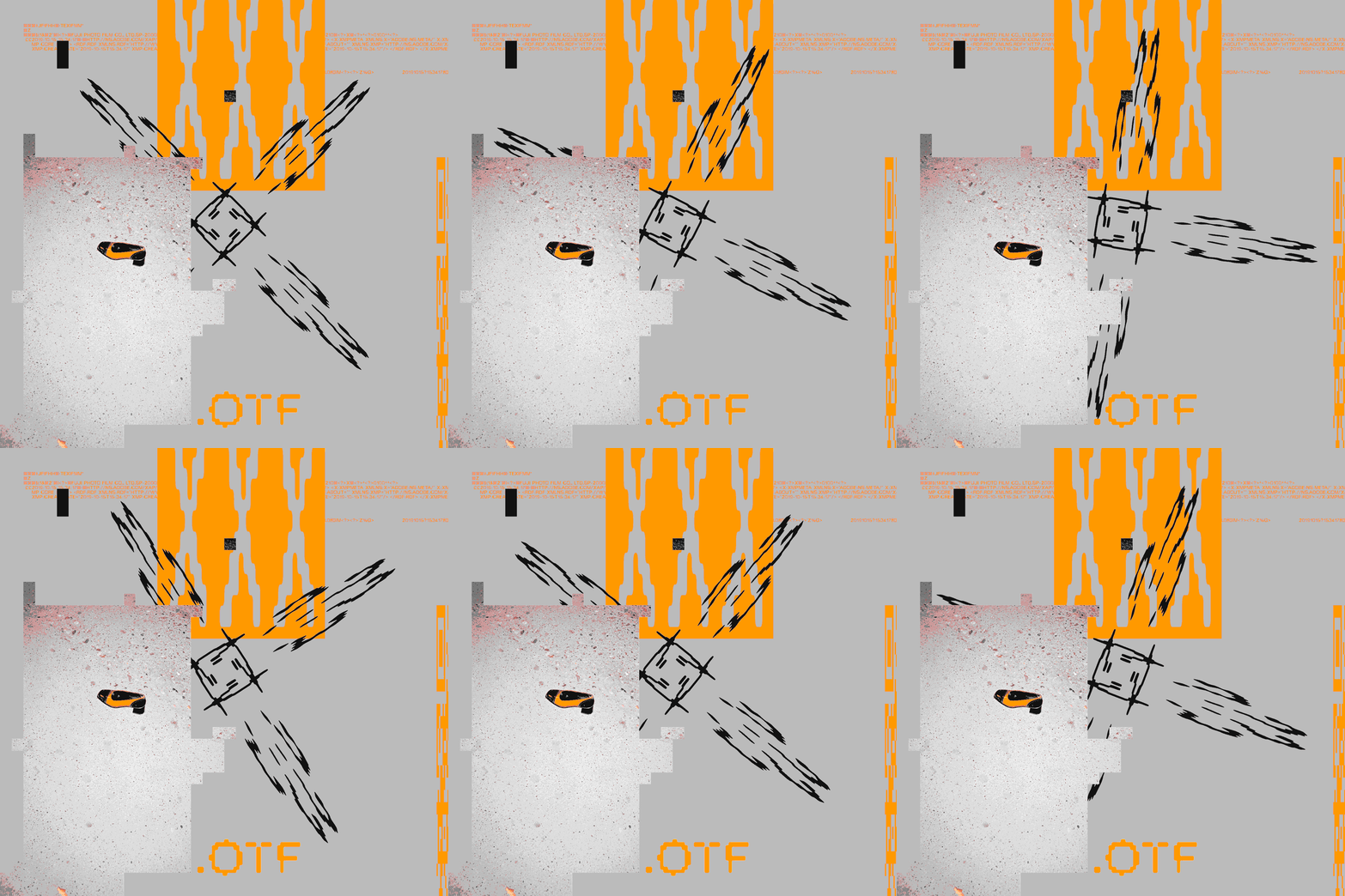
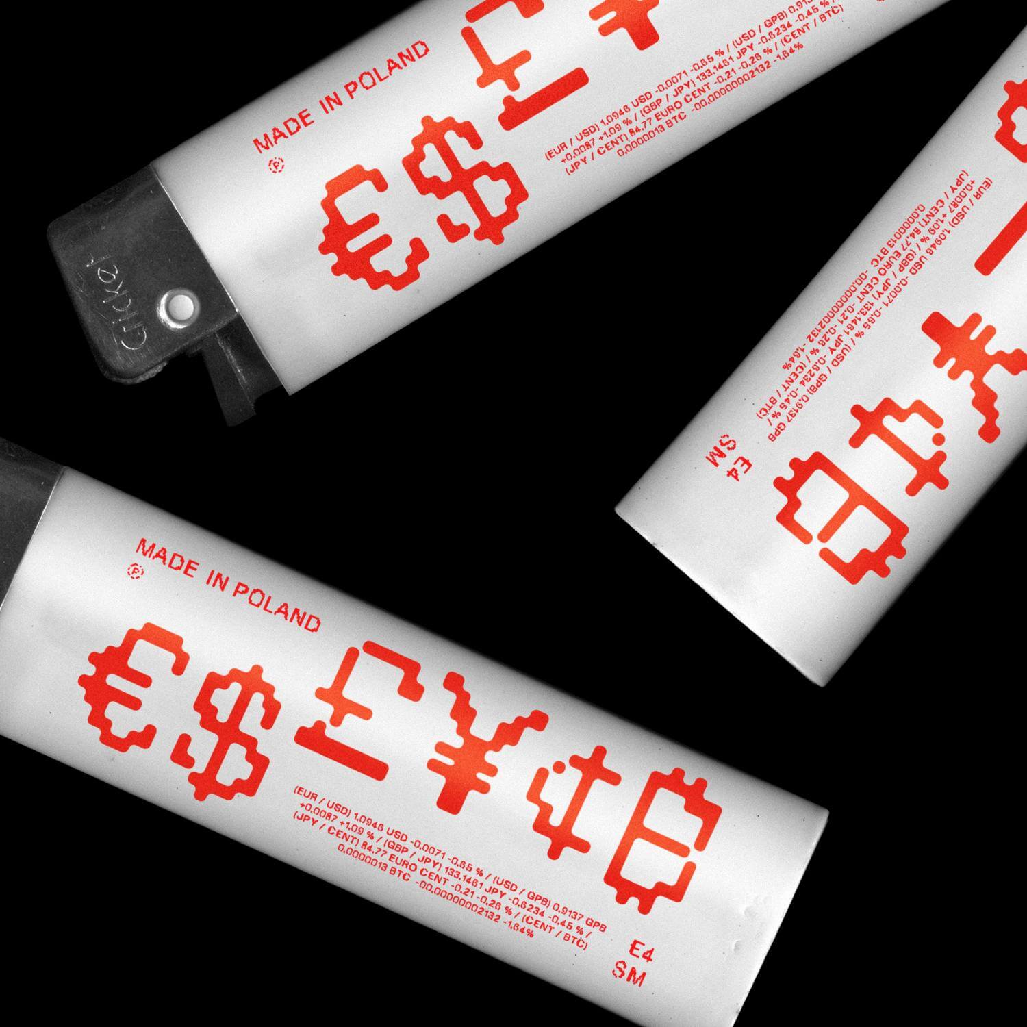
UNKNOWN is a free contemporary display typeface designed by Lukas Haider & Alexander Raffl. It consists of 3 styles: RND, PX and MX. Additional alternates can easily be adapted using upper- or lowercase characters. Although the roots of the typeface are derived from a linear grid-system, the overall appearance is still organic through the variation of the individual characters. A vast set of glyphs makes it ideal for designing artworks, magazines and logos.
Credits
Made in collaboration with Alexander Raffl.








Project Information
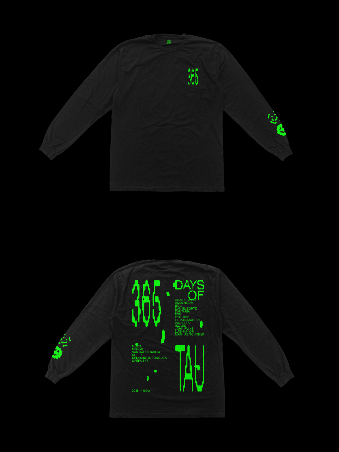
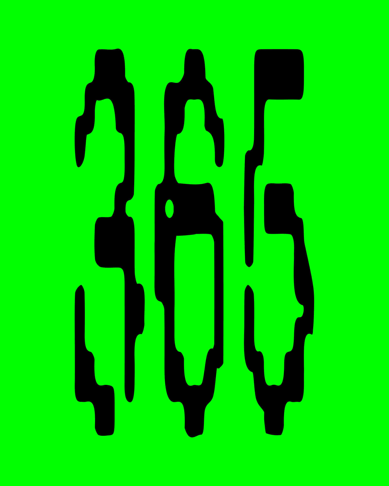
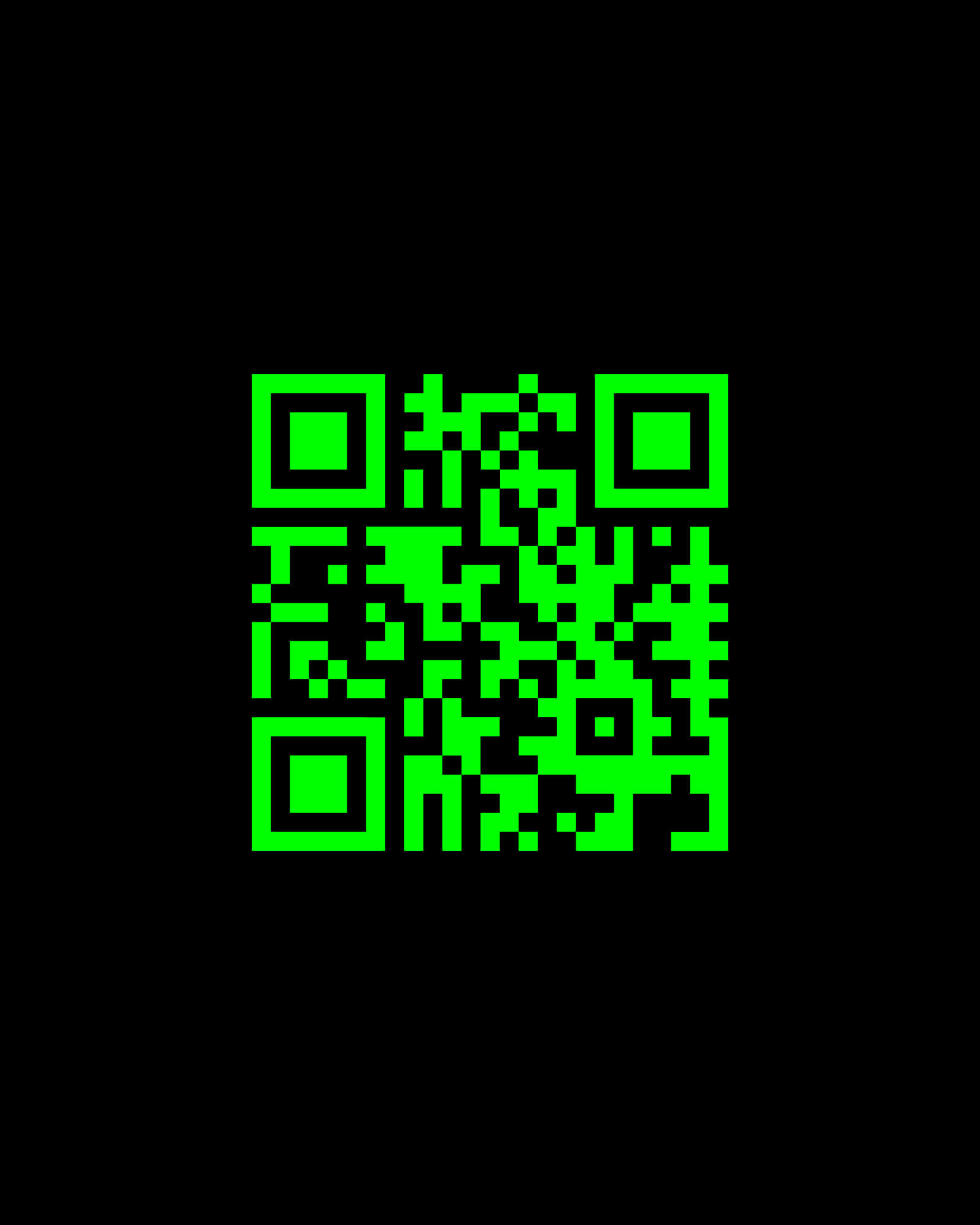
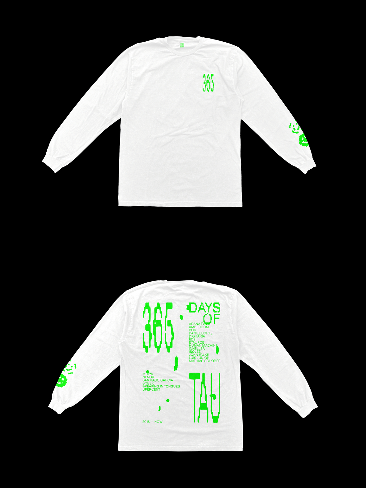
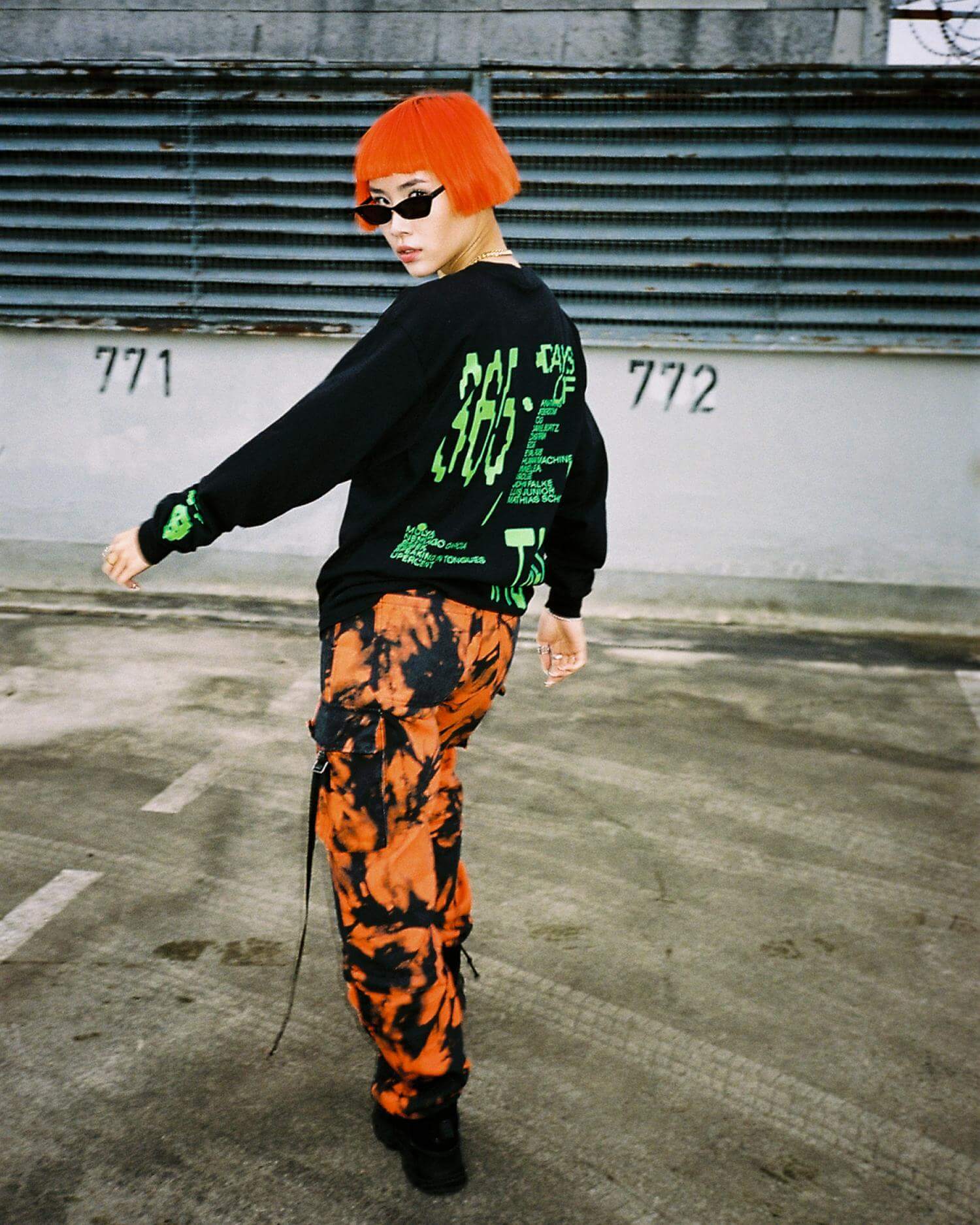
For the one-year anniversary of the German record label TAU, Lukas Haider was asked to celebrate it with a special merchandise collection. The collection features all the artists the label has collaborated with in their first year of existence. These artists were displayed in a custom typeface developed especially for this occasion. As a little Easter egg, the inside of the T-shirt featured a QR code that linked to an unreleased track by the label's founders, the Adana Twins. So when purchasing the T-shirt, you not only get something to wear but also something exclusive to listen to. To promote the merchandise on social media, editorial shots were taken by the German photographer Felix Krüger.
Credits
Photography by Felix Krüger.
TAU
A platform for forward-thinking music.



Project Information
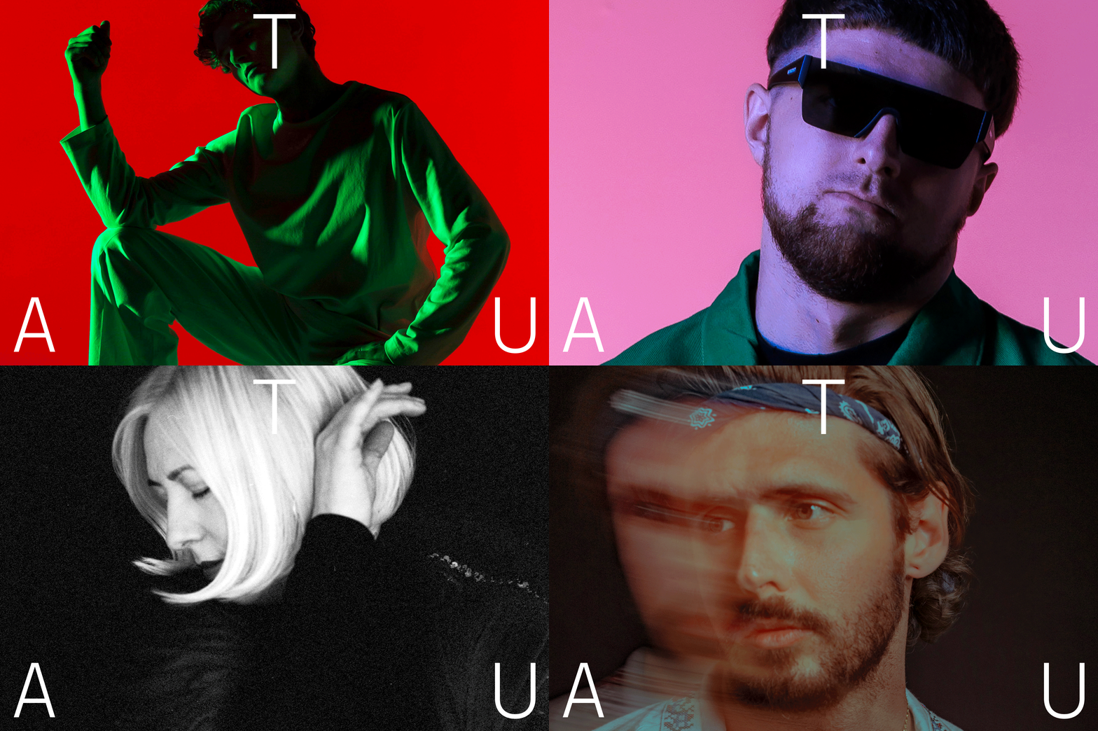
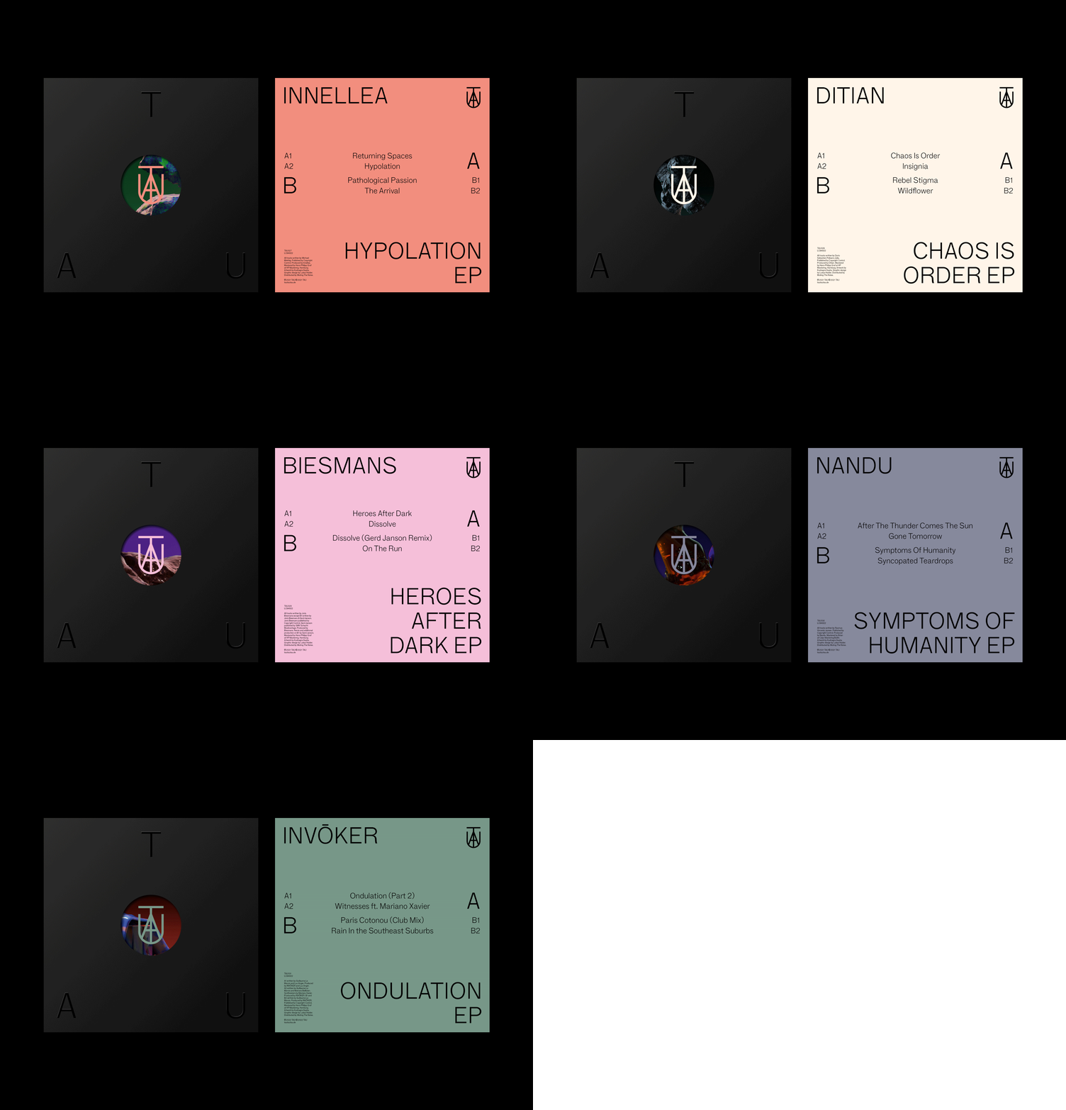
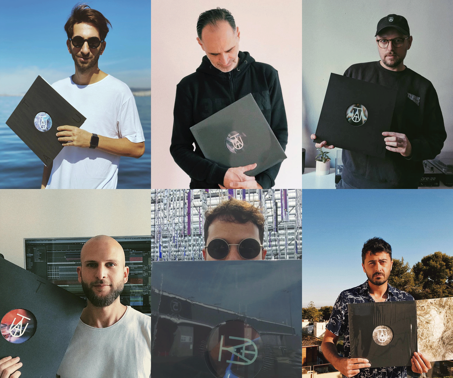
TAU is a record label founded by the German DJ duo Adana Twins and has established itself as a respected platform for forward-thinking music. Since its establishment in 2018, Lukas Haider has been responsible for art directing and branding the label. The core of the branding marks the actual symbol, with the letters “TAU” forming a monogram and also incorporating an anchor, connecting back to the origin of the label - the harbor city of Hamburg. Centered around that symbol, timeless typography gives participating artists enough space to express themselves and identify with the label. Countless executions follow that system, achieving a coherent appearance while remaining flexible for further expressions whenever needed.
Additional credits
3D by Kushlet.
UECKER
Editorial design for the publication from the world-renowned German artist Günther Uecker.



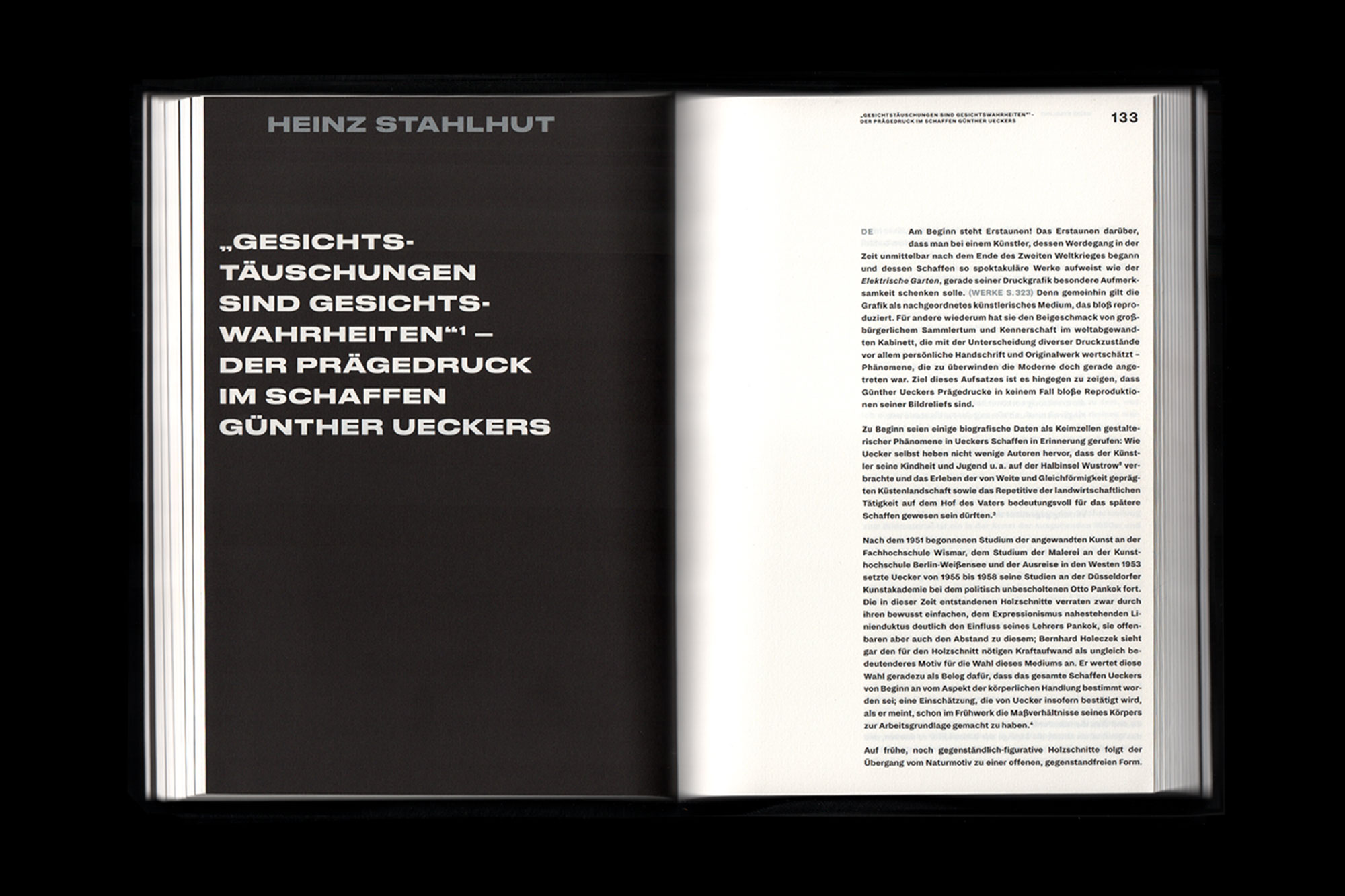


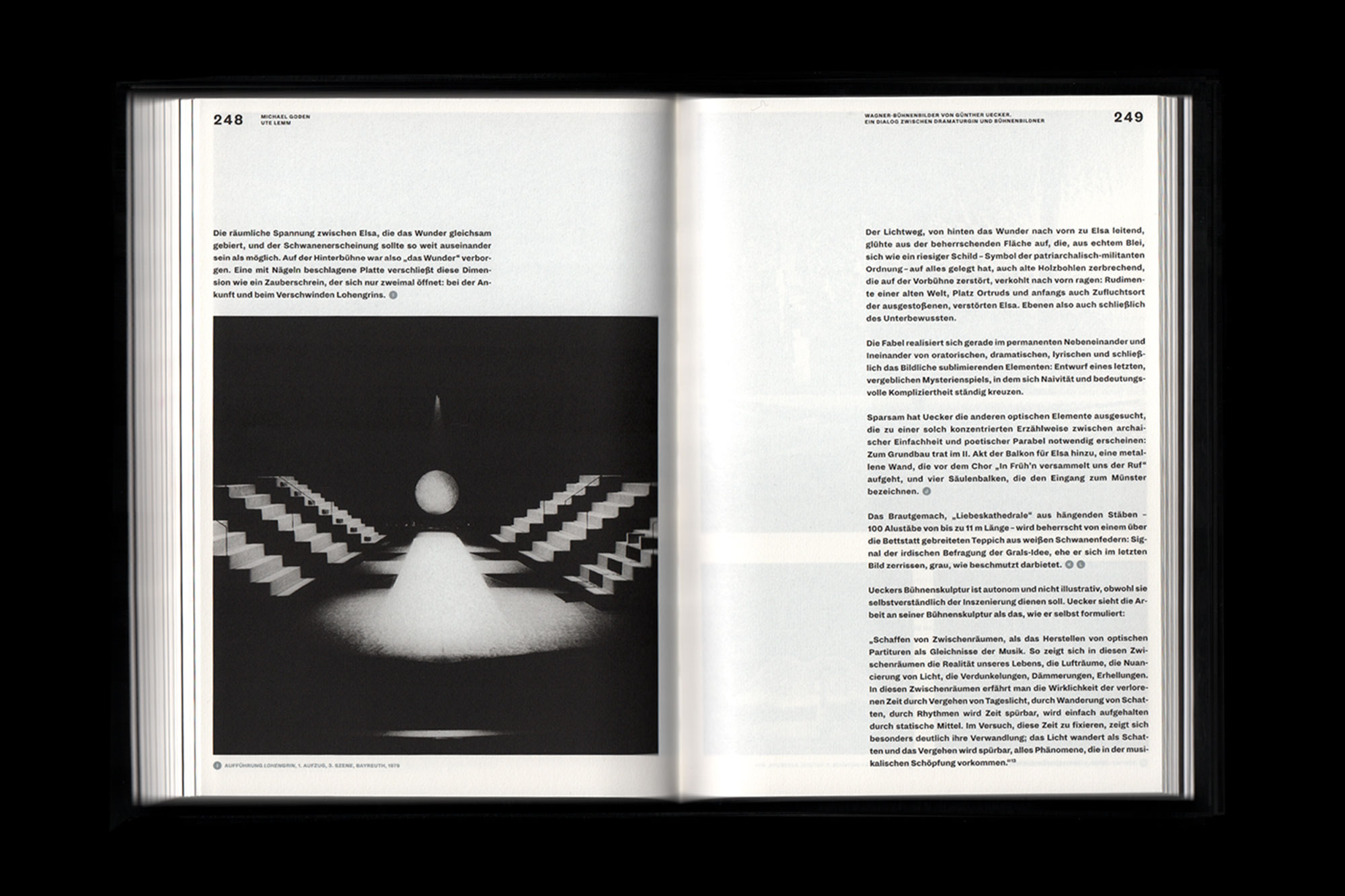


Project Information
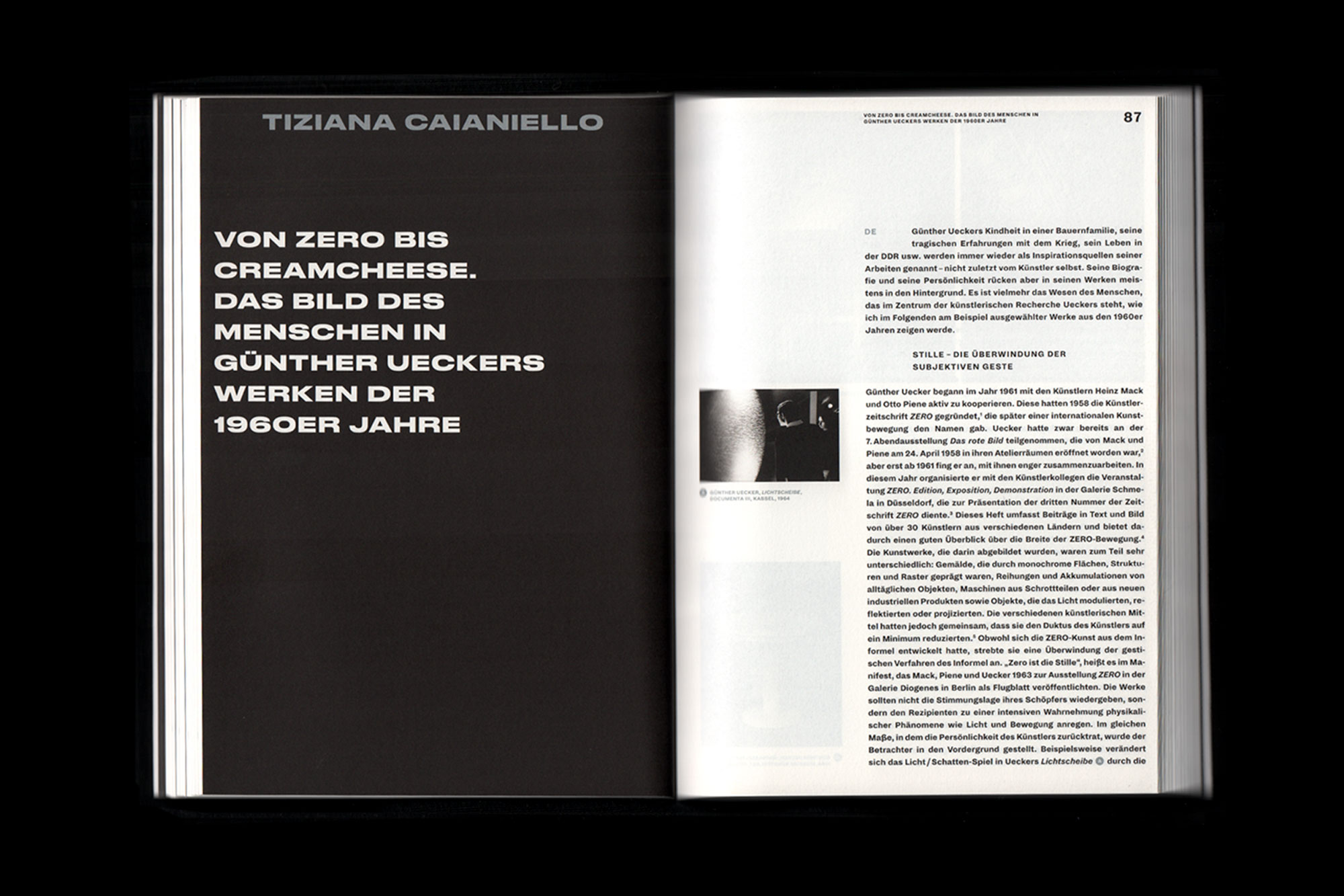
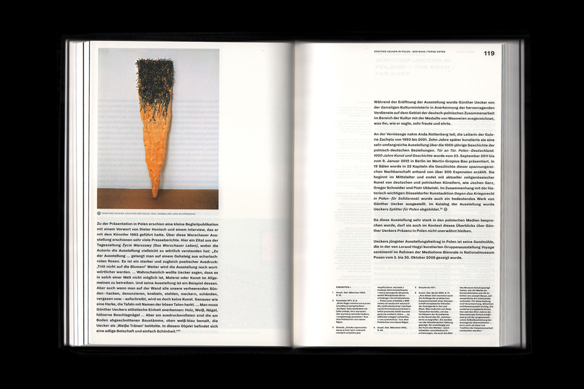
Günther Uecker is among the outstanding German artists of worldwide renown. For several years now Staatliches Museum Schwerin has been working on compiling a comprehensive collection of Günther Uecker’s oeuvre unparalleled among German museums. The collection, resulting from the purchase of a private estate, encompasses objects from the late 1960s to the early 1980s and reflects the sheer diversity of Günther Uecker’s artistic work. The catalogue provides a sound overview of Günther Uecker’s oeuvre in the form of numerous essays, which were written for a major international symposium. It shows various facets of his work, painting a vivid portrait of the artist including his beginnings in Mecklenburg and his involvement in the group ZERO, which put him on the international stage.
Credits
Made in collaboration with Great & VFMK.
Miyavi
A visual narrative of love and pain, amplifying the emotional duality in Miyavi’s album releases.


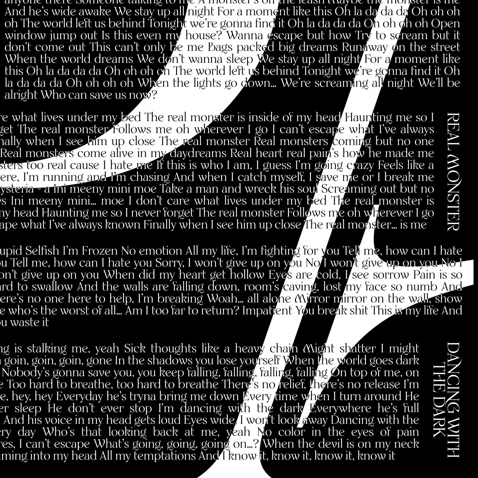


Project Information
Miyavi released his second album of 2024, Found in Pain, following his first album, Lost in Love. At Studio Herrström, we collaborated with Miyavi and his team, as well as Director and Photographer Darren Craig, to define the look and feel for both albums, which were released as physical CDs in Japan and promoted through live concerts. Miyavi’s two-part album, Lost in Love, Found in Pain, explores the contrasting emotions of love and struggle. The albums delve into duality, with Lost in Love capturing emotional vulnerability and connection, while Found in Pain explores themes of hardship and resilience. Throughout the creative process, visually representing this duality was a key focus. We used sharp, striking imagery and type lockups crafted from the Vengeance Serif typeface by Alli Cunanan, helping to bring to life the contrasting emotions Miyavi expressed through his music.
Credits
Made in collaboration with Studio Herrström.
Photography / Direction by Darren Craig.
Spotify Made in Colombia
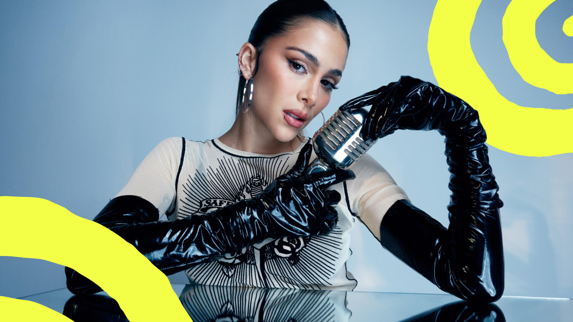
Vibrant rhythms from Colombia have reshaped global soundscapes. A bold identity was crafted to spotlight the artists and music making waves worldwide.
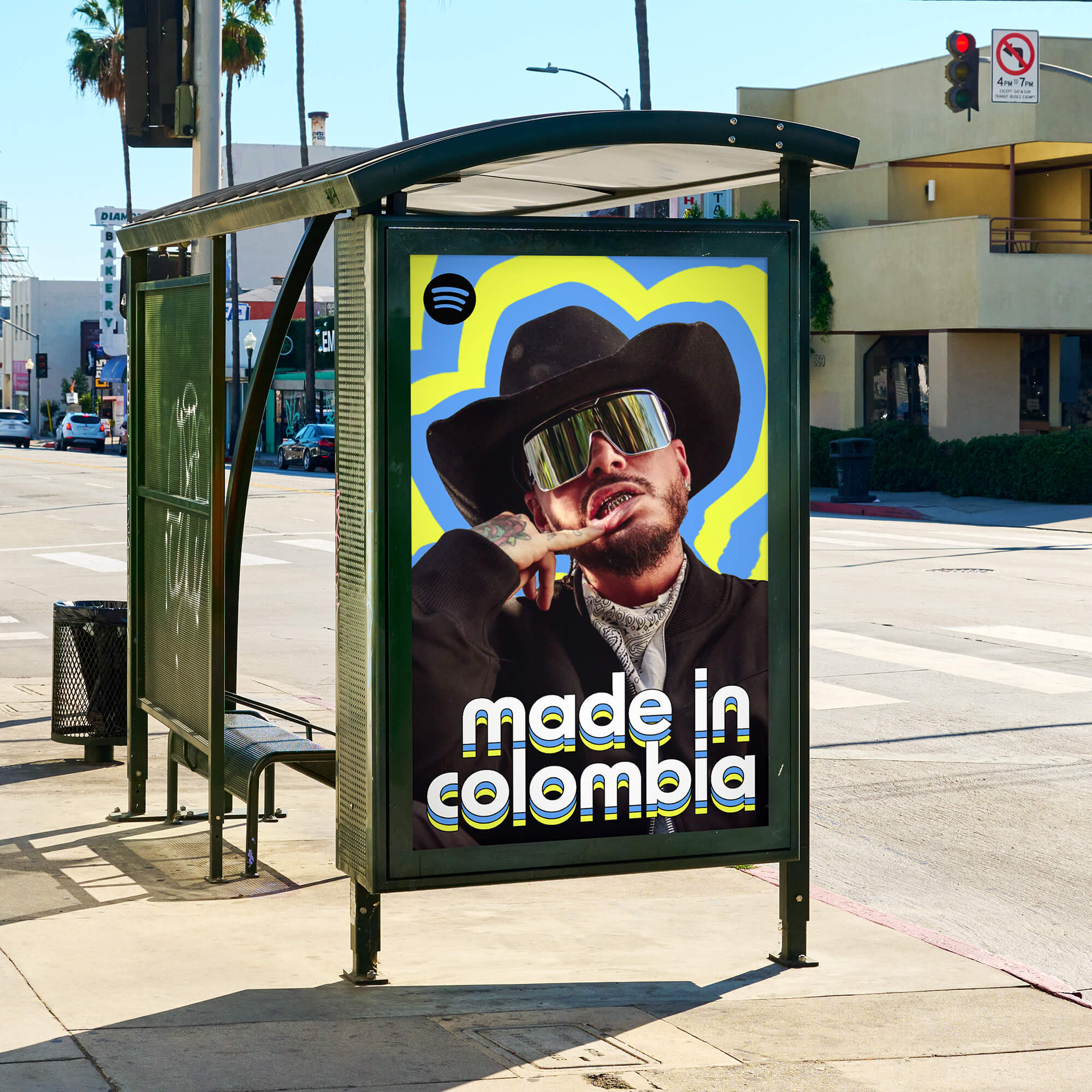

Project Information
Colombian music has always been a tapestry of rich rhythms and vibrant traditions, from the soulful cumbia to the bold reggaeton beats of Medellín. Over the years, what once defined local celebrations has transformed into a global movement. Artists like Feid, KAROL G, and J Balvin now fill arenas worldwide, proving that Colombia’s sound is as universal as it is unique.
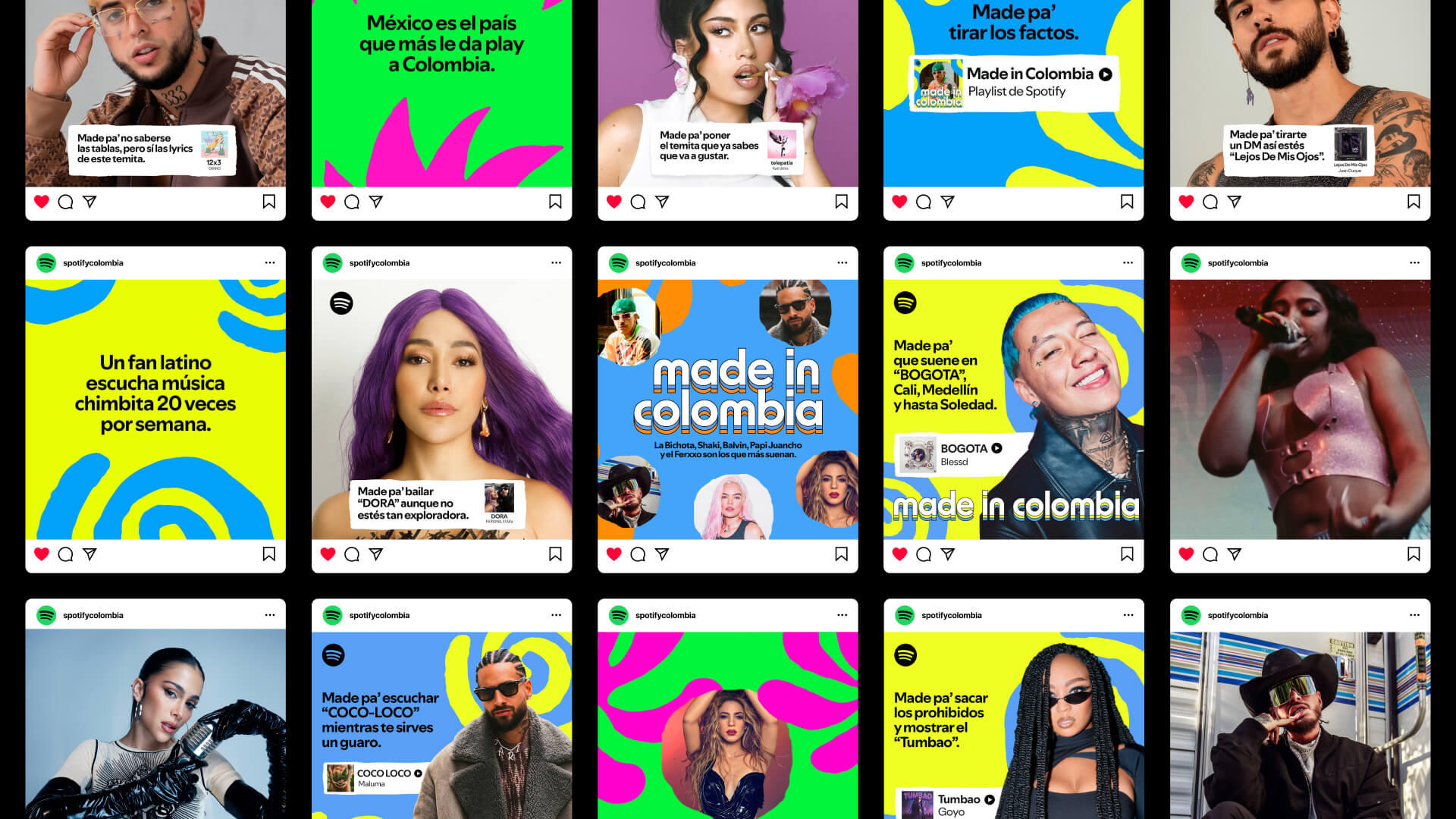
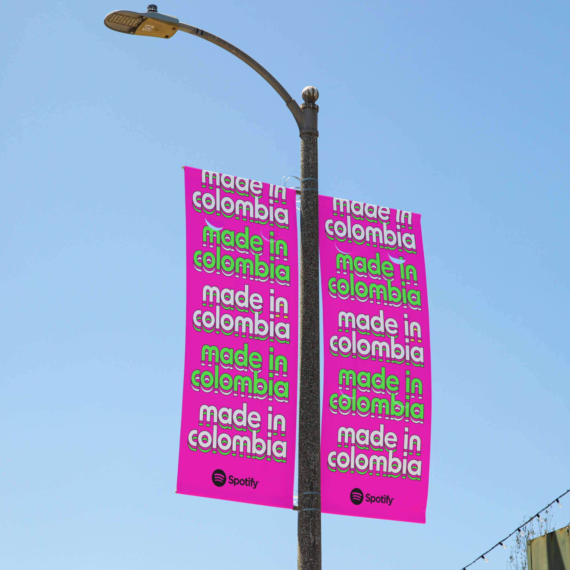
We were tasked with giving Spotify’s Made in Colombia playlist the identity it deserves—one that not only celebrates this evolution but amplifies it. The goal was to create a visual story as dynamic as Colombia’s rhythms and as global as their reach. The design takes its cues from the essence of Colombian music: movement, diversity, and vibrancy. Organic shapes ripple outward, symbolizing the global influence of local rhythms. A rich, tropical palette captures the bold, eclectic energy of Colombian culture, while the fluidity and vibrancy reflect the dynamism of a playlist that bridges genres and generations.
This wasn’t just about aesthetics—it was about resonance. Made in Colombia is now a visual celebration of a cultural powerhouse, inviting audiences everywhere to feel the pulse of Colombian music. Through our process, we ensured every detail of the design was culturally relevant and strategically aligned with the local team’s vision. By immersing ourselves in Colombia’s musical heritage and through collaborating with the local Spotify team, we translated its spirit into a design that aims to feel authentic to its roots while projecting its energy globally.
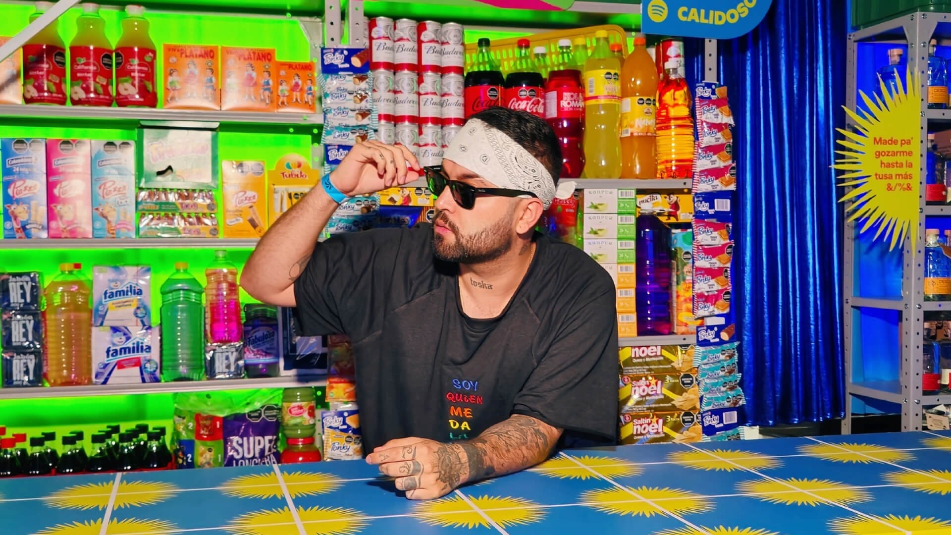
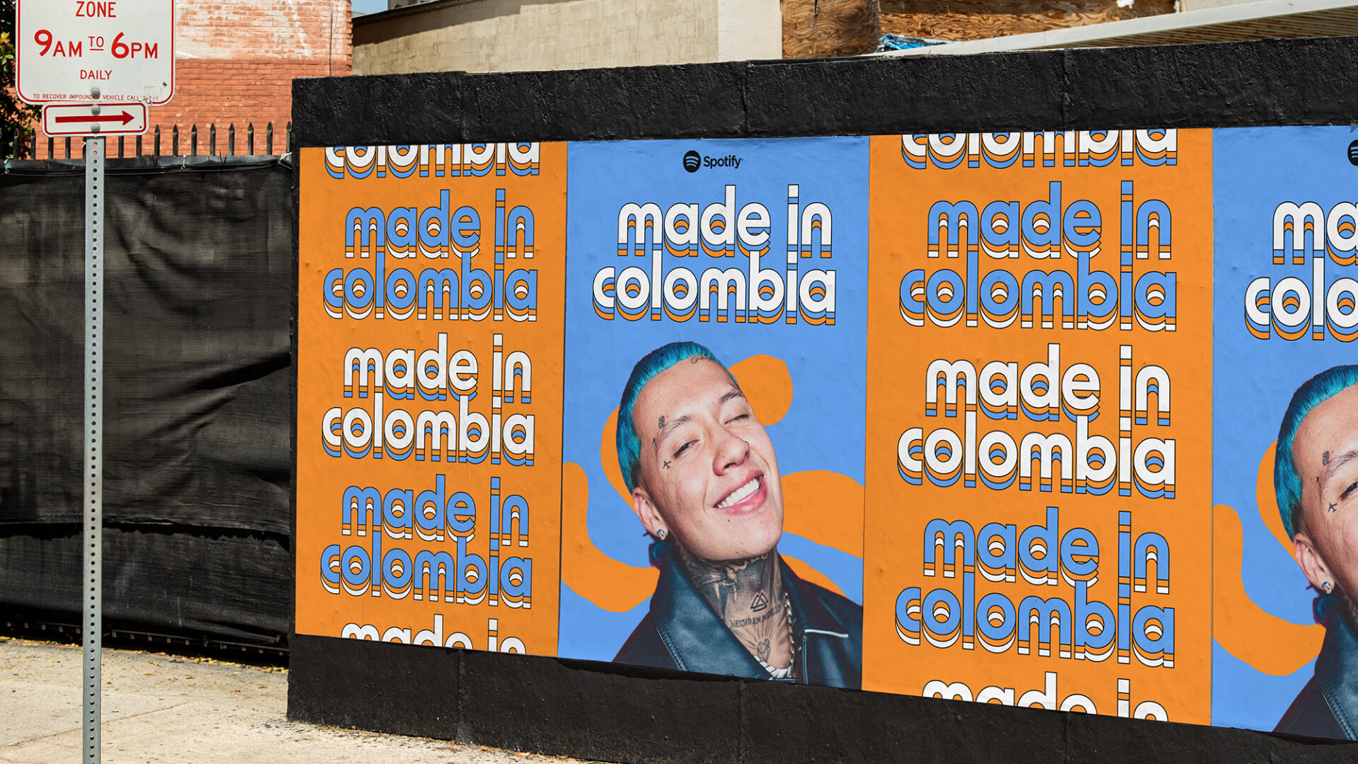
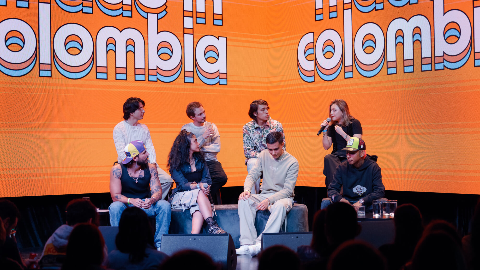
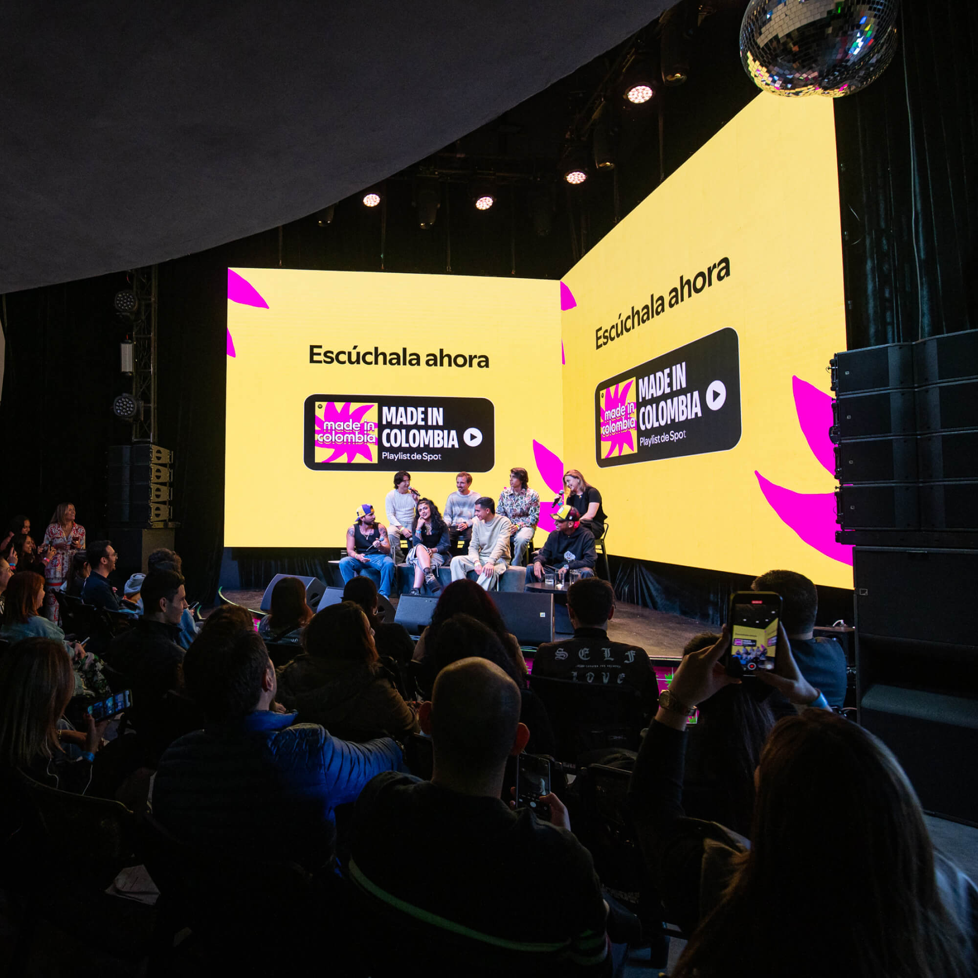
With its new identity, Made in Colombia is no longer just a playlist—it’s a celebration of Colombian artistry and a testament to the power of music to unite cultures. The visual identity has been used at events in Bogotá, in outdoor marketing campaigns in the U.S., and locally in Colombia. It was also featured prominently across Spotify Colombia’s social media channels.
Credits
Made in collaboration with Studio Herrström.
Erik Herrström
Marcell Gulyas
Lindsey Skipworth
Kara Griffin Cushman
Kerstin Herrström
Spotify
Alex Mira
Carlos Ardila
Juan Manuel Rótulo
Maykol Sanchez
Yasmin Muller
Laura Marín Rodríguez
Manuela Echeverry M.
Shahin Haghjou
Loren Lee
Michelle Pham
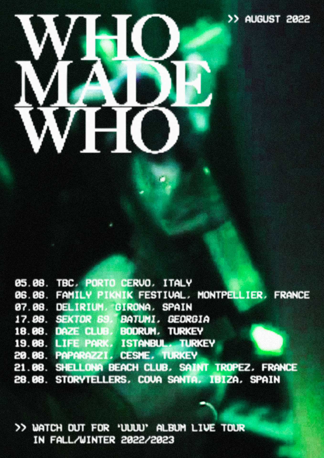
WhoMadeWho
Tour promotion that captures the emotional depth of the experimental pop trio.

Project Information
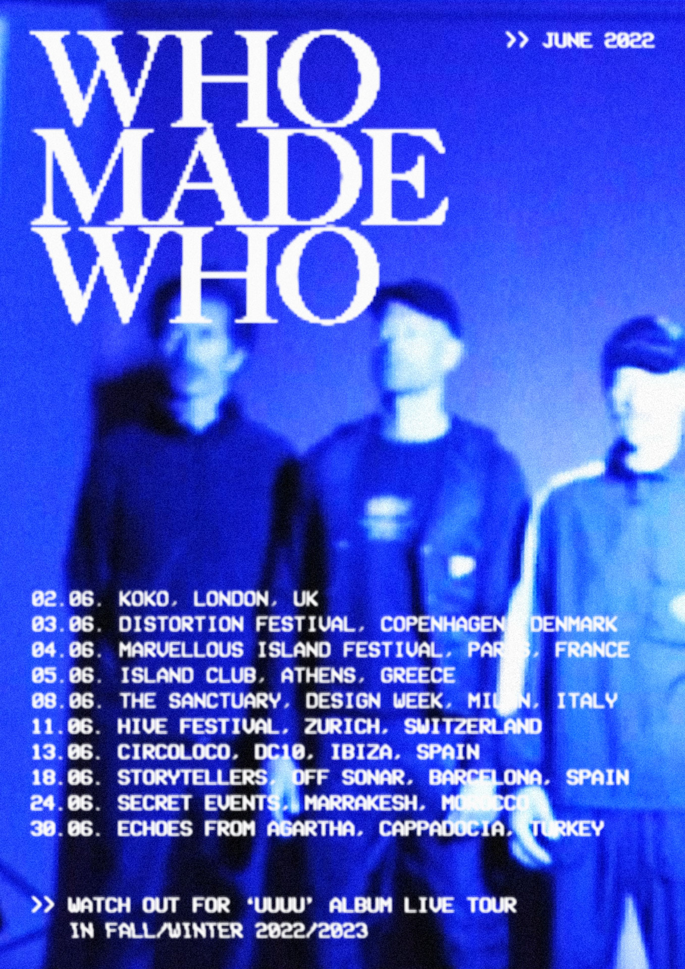
To capture the unique emotional experience of WhoMadeWho’s live shows, a warm, analog aesthetic was developed to promote their upcoming summer tour dates. Original analog video footage by Lasse Bak Mejlvang was combined with CRT-inspired typography, inviting fans to immerse themselves in the world of WhoMadeWho.
Credits
Video footage by Lasse Bak Mejlvang.
WhoMadeWho logo by Ta-Trung.
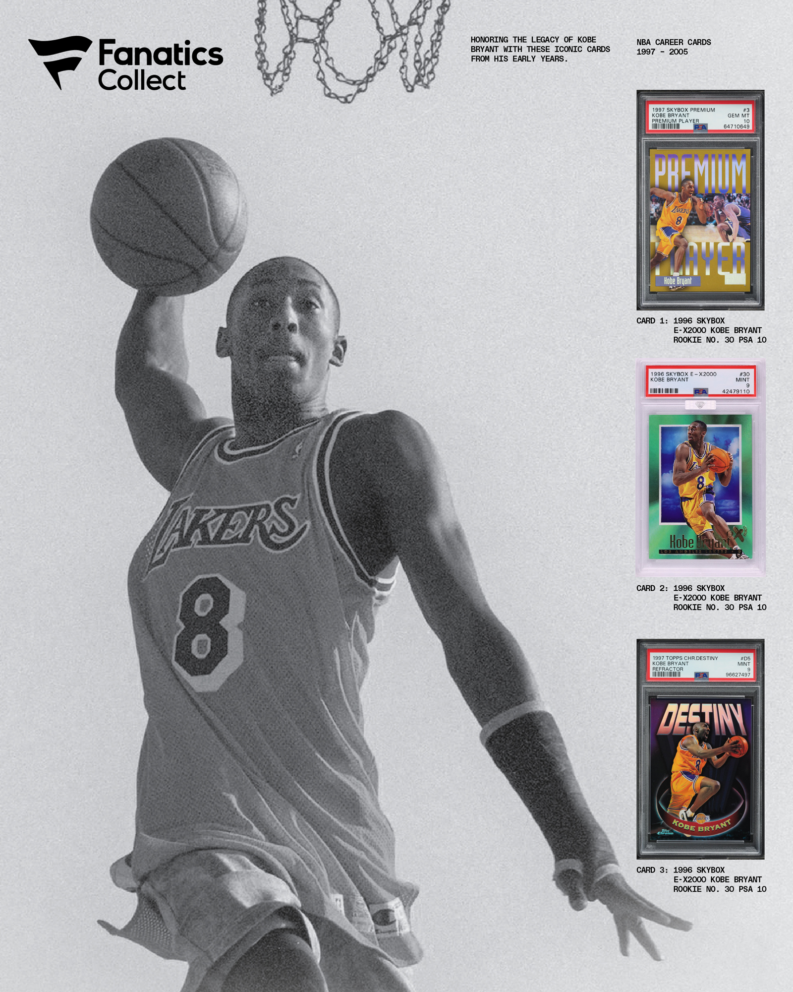
Fanatics
Where collectors buy, sell, and bid on rare cards.



Project Information
In early 2024 we helped Fanatics push deeper into the world of Cards and Collectibles, developing a new visual identity for Fanatics Collect. Introducing a vibrant system to announce their entry into the category by maintaining ties to the iconic parent brand, while developing unique expressions authentic to ‘The Hobby’. The system is designed to feel both structured and dynamic — able to organize a vast array of information while injecting energy through color, pattern, and motion that reflects the momentum of the category. Through our strategy, positioning, and brand work, and with the Fanatics team, we were able to carve out a unique whitespace for Collect that reflects its position as one of the world’s largest marketplaces and auction houses for sports cards, memorabilia, and collectibles. A dream project that brought us back to our childhoods. Thank you to the Fanatics Collect team for the collaboration and guidance.
Credits
In cooperation with The New Company & Studio Herrström.
